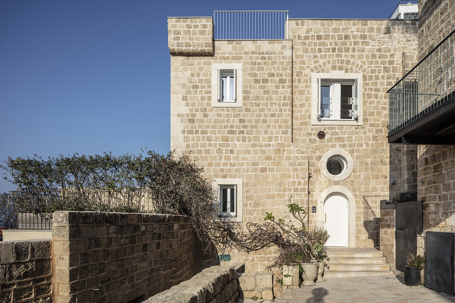
The exterior of the Tipo949 renovation project by architects Raz Melamed and Omer Danan drew our attention first. We absolutely love the way this two-level apartment both stands out from and fits in within the sea-front walls of the 300-year-old stone structure.
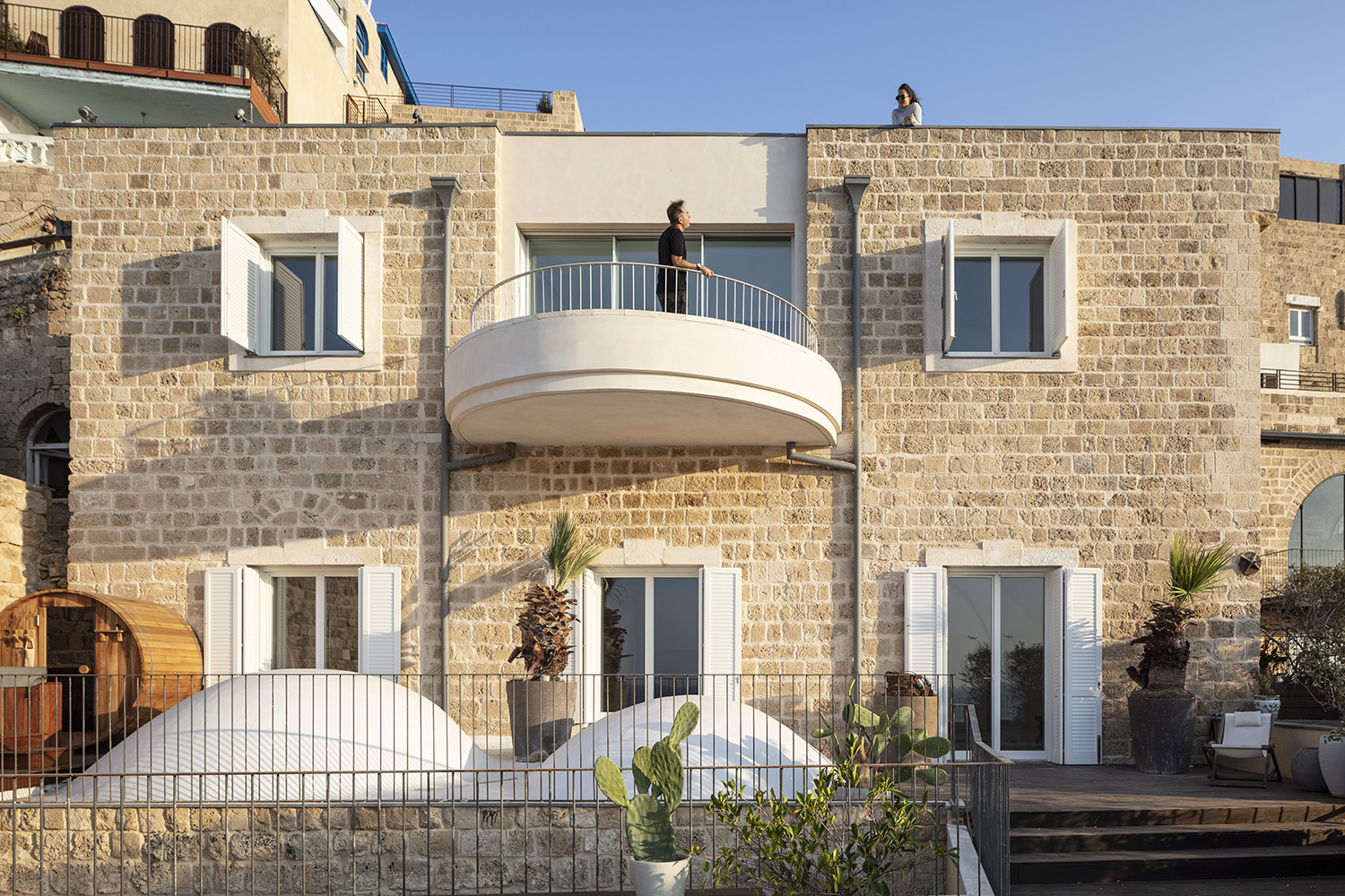
Overlooking the Mediterranean Sea in the ancient port city of Jaffa, the oldest part of the Tel Aviv-Jaffa municipality, this residence is the height of urban cool in our opinion. It ticks off all of our favourites: renovation instead of a new-build, sensitive restoration, smart use of space, overall minimalist approach, open plan, gorgeous views … we could go on and on.
In addition to the balcony and the terrace, we really fell in love with the overall livability of the residence. In fact, for this project, we could (and do!) repeat what we wrote in 2013 about another restoration of another residence in another 300-year-old stone building by Raz Melamed who at the time worked for Pitsou Kedem Architects as did Omer Danan.
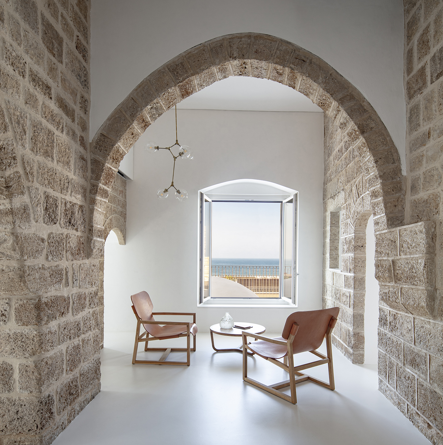
We wrote about that project: “Our main attraction points in this cool sanctuary are the gorgeous arches, the exposed texture of the old stone, the subdued colour pattern, and the lovely balance between the old and the new. It looks so easy and natural, but it is very tough to achieve such poise.” Exactly.
And as Melamed and Danan explain to us, this recent project was a close collaboration with the clients – a young couple and their two children – who needed a functional home, not an architectural show piece. In our view they received both.
The family had already lived in this residence for several years and they were clear about what they wanted and needed, and what they didn’t. They were seeking an interior-only renovation so that the traditional façade would not be disturbed. They also loved their home and while they were open to new ideas, they did not want changes just for the sake of changes – each alteration needed to earn its OK from both a practical and an aesthetic perspective.
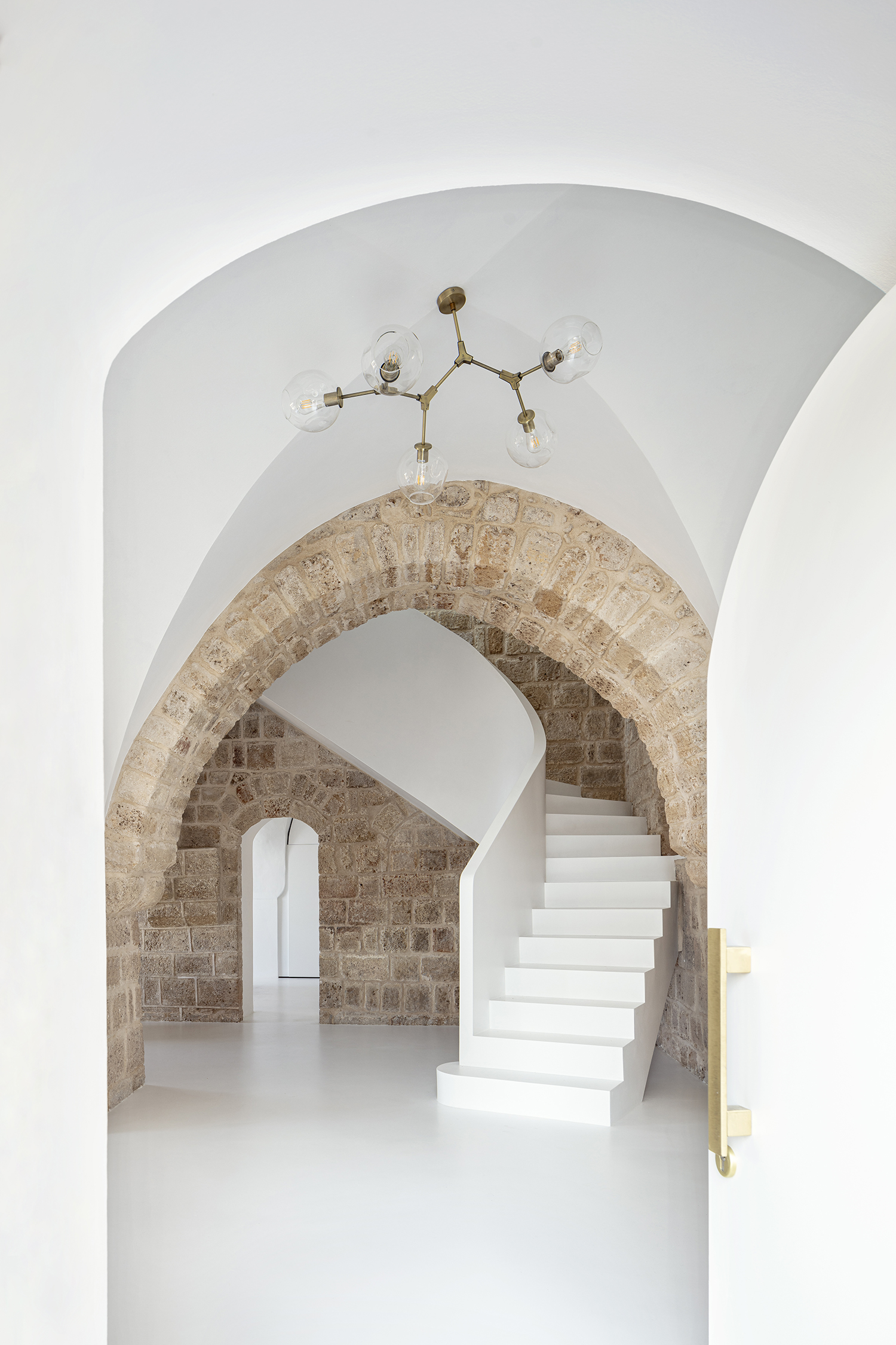
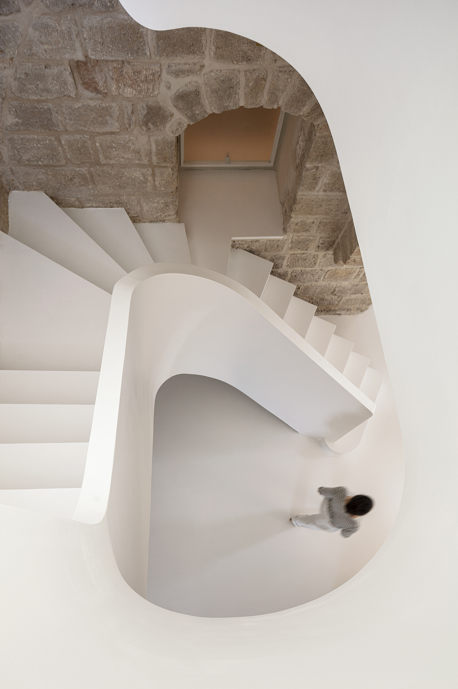
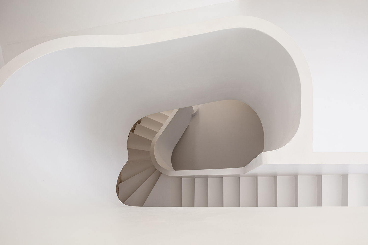
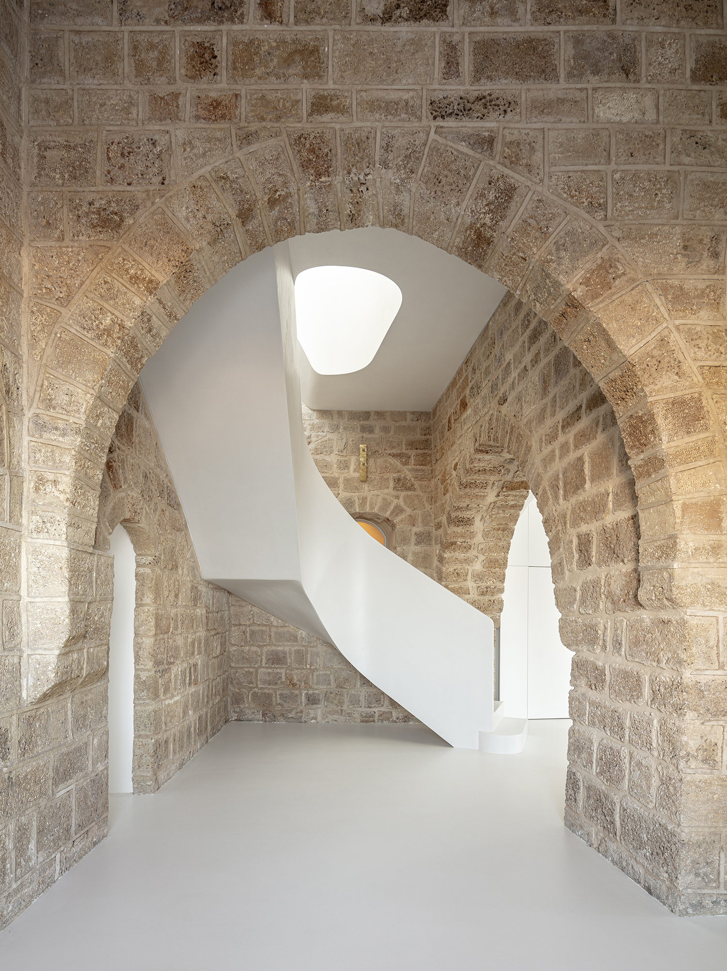
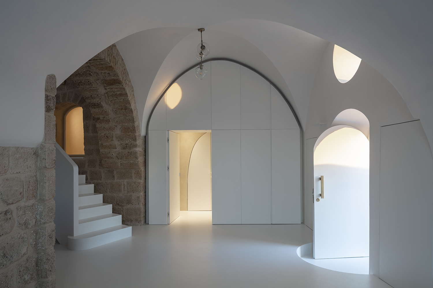
After the year-long renovation process, the open entrance area with its arches leads the eye to the curving white staircase, and starts the interaction between arches and views. Throughout the residence, arches lead the eye and frame the views. The walls and floor are white, which further emphasizes the subtle tones and textures of the old stone.
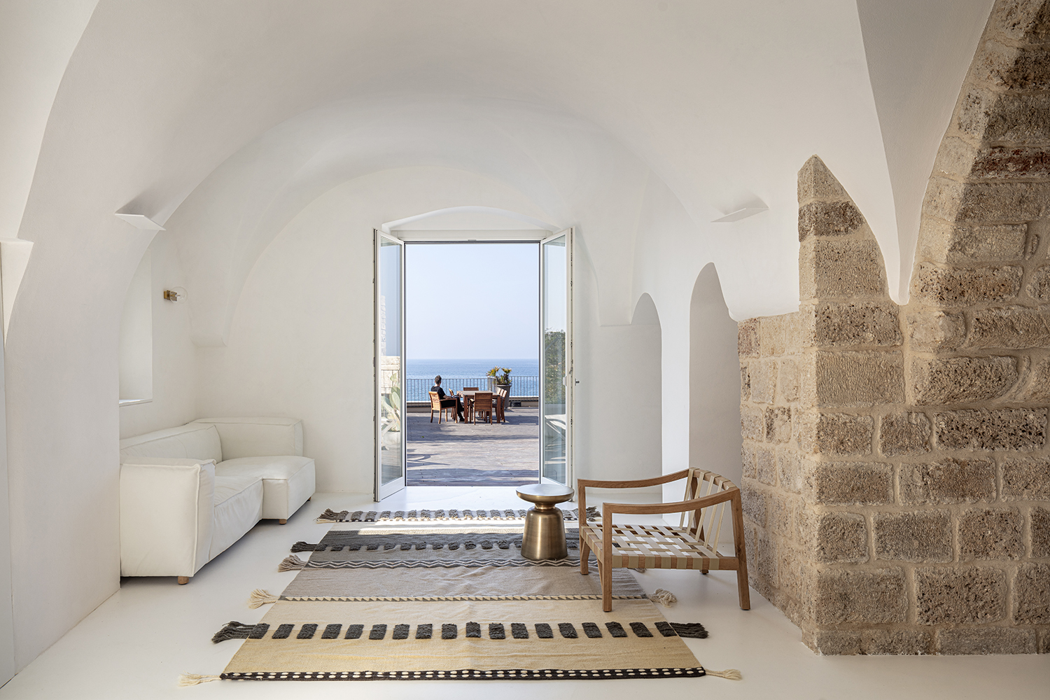
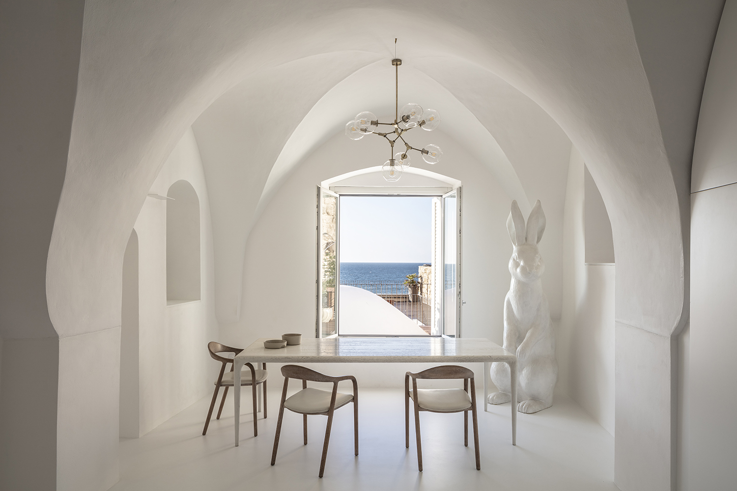
With the redesign of the interior layout, the architects sought to free up additional space for either visible use or hidden storage. The rough texture of the old stone and the smooth curves of the white plaster provide a perfect background for the family’s minimalist furnishings. The new layout provides a designated space for all of the family’s and their guests’ needs, yet leaves an open, spacious feel. The ceiling height and minimalist material palette add to the sense of balance and calm.
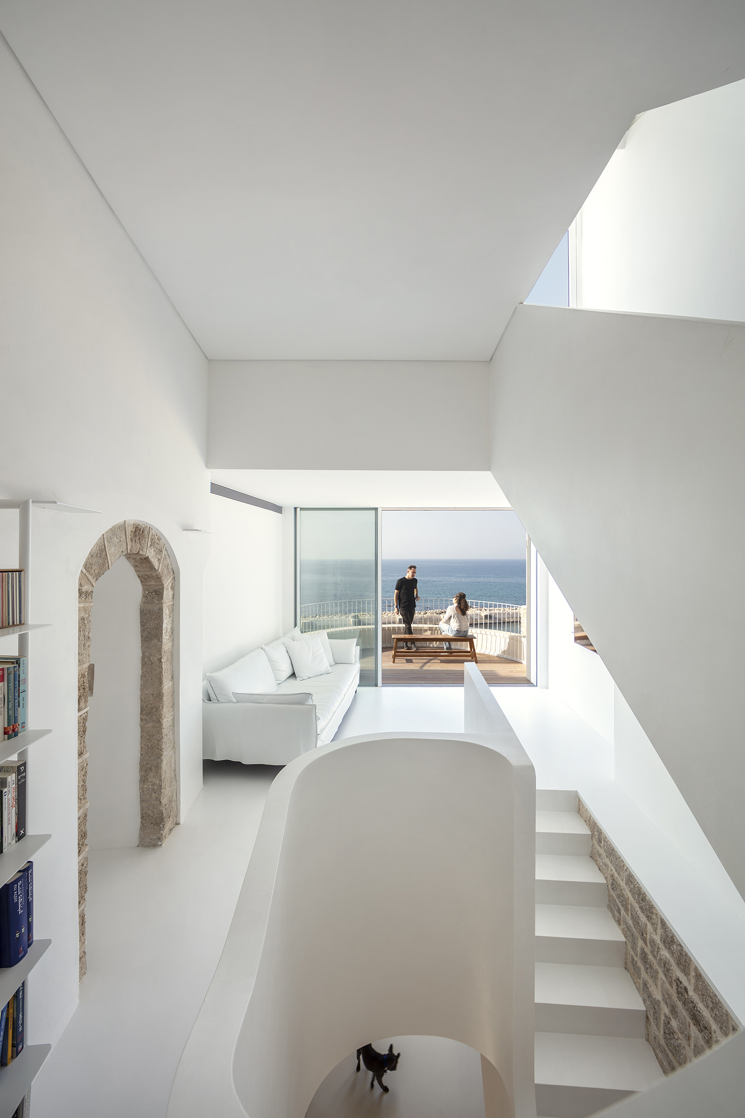
And the curving white balcony and the huge rooftop terrace are not just beautiful to look at, they are now essential parts of everyday life for the family and their guests. Tuija Seipell
Images: Amit Geron


