Many people say they crave cozy during this time of crisis but we seem to gravitate even more than usually towards stark clarity. We are also drawn to buildings that exude a definite character. We respect architecture and design that boldly declare what they are, rather than trying to ingratiate itself with some trend or another, or create whatever seems to be the easiest to sell at the moment.
For these reasons, we’d love to visit Tennyson 205 in Mexico City personally to determine if the apartment building really feels as great as it looks. Photographs can make tight spaces appear spacious, dark corners seem bathed in light and cramped rooms seem liveable.
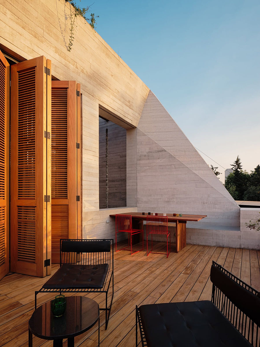
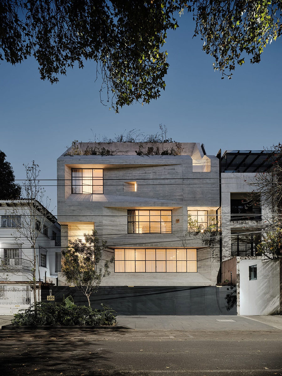
Whatever the actual physical experience, we love the look of the structure. Monolithic and straining to contain itself. A meteorite that happened to fall from the sky and wedge itself between two existing buildings. It is a sculpture, especially at night with the lit windows breaking up the façade and helping the building appear just about ready to take off again.
 The five-story new apartment building is located at Tennyson 205 – hence the name– — in the swank neighbourhood of Polanco famous for its expensive residences, upscale shopping, hotels and restaurants, and also known as the Beverly Hills of Mexico City.
Designed by Tucson, Arizona-based Studio Rick Joy in cooperation with several local firms including FRB Arquitectos Asociados.
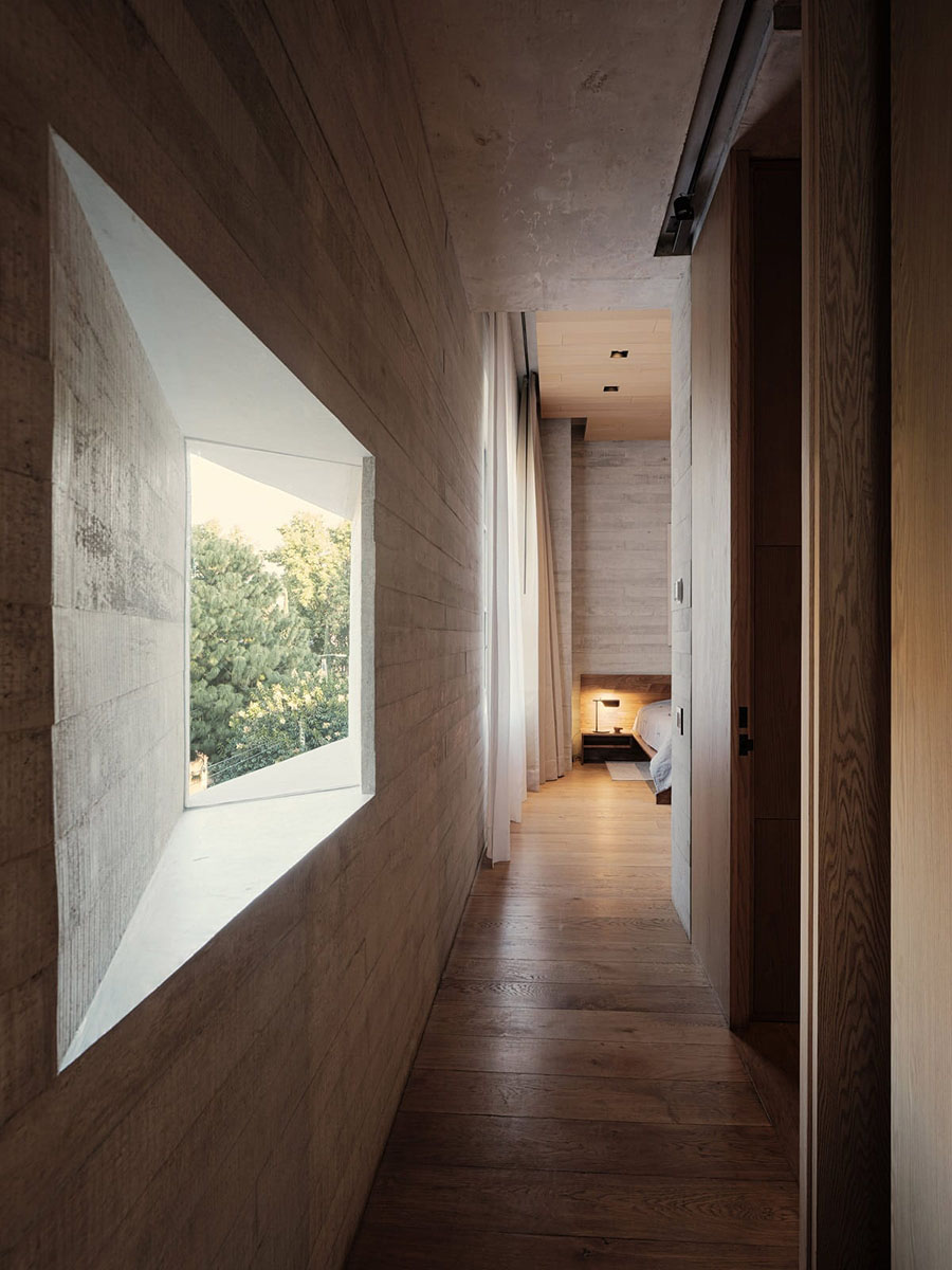
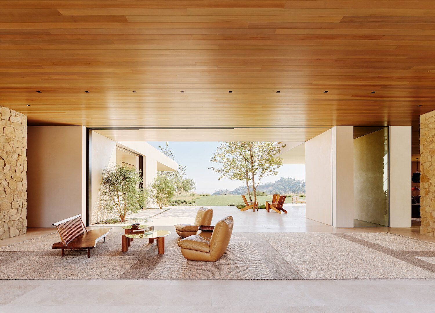
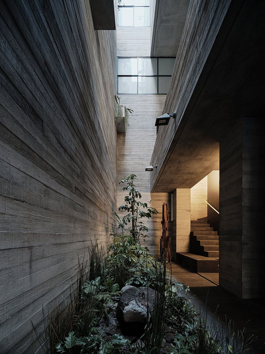
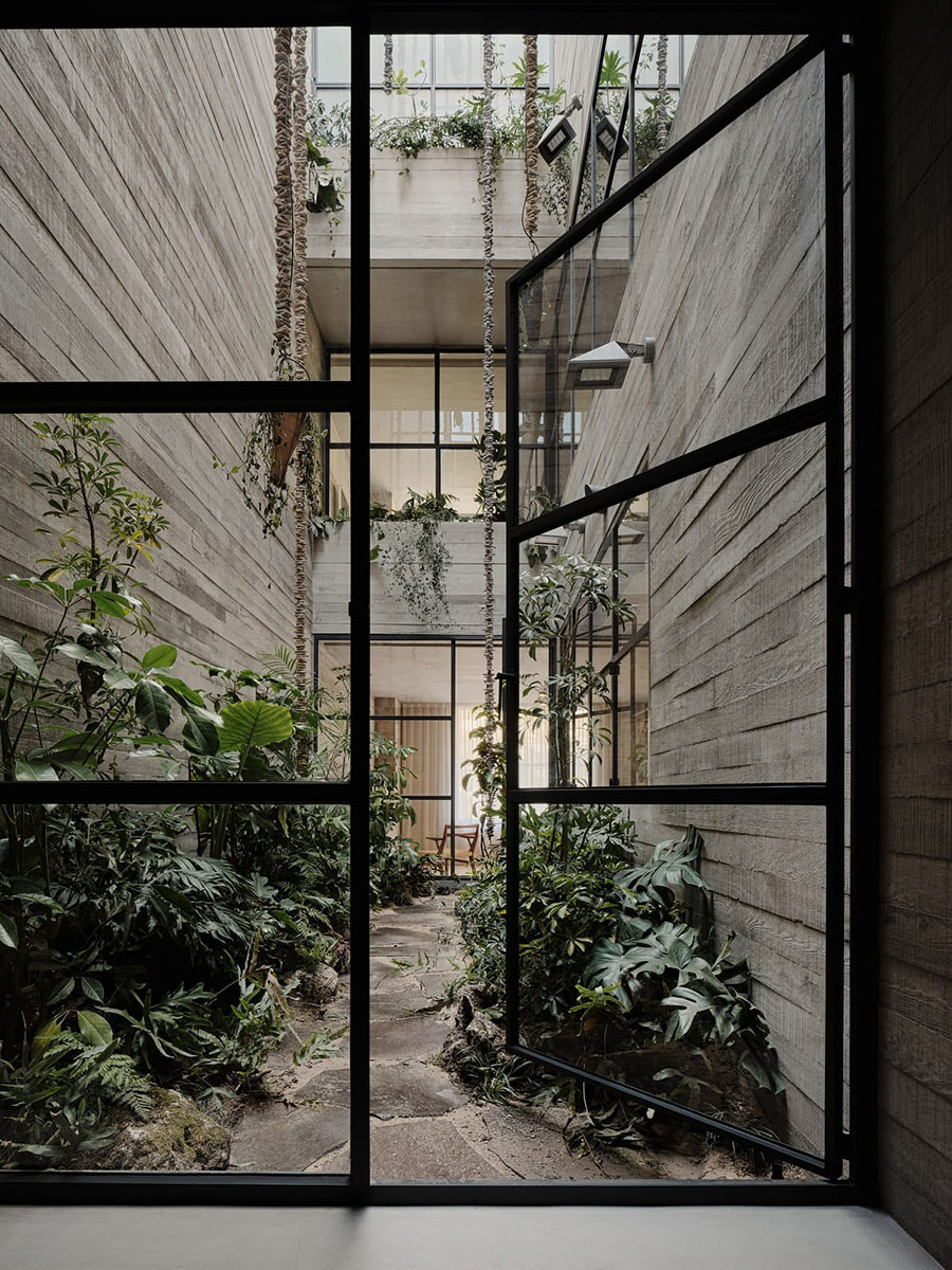
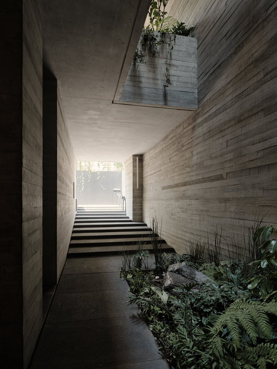
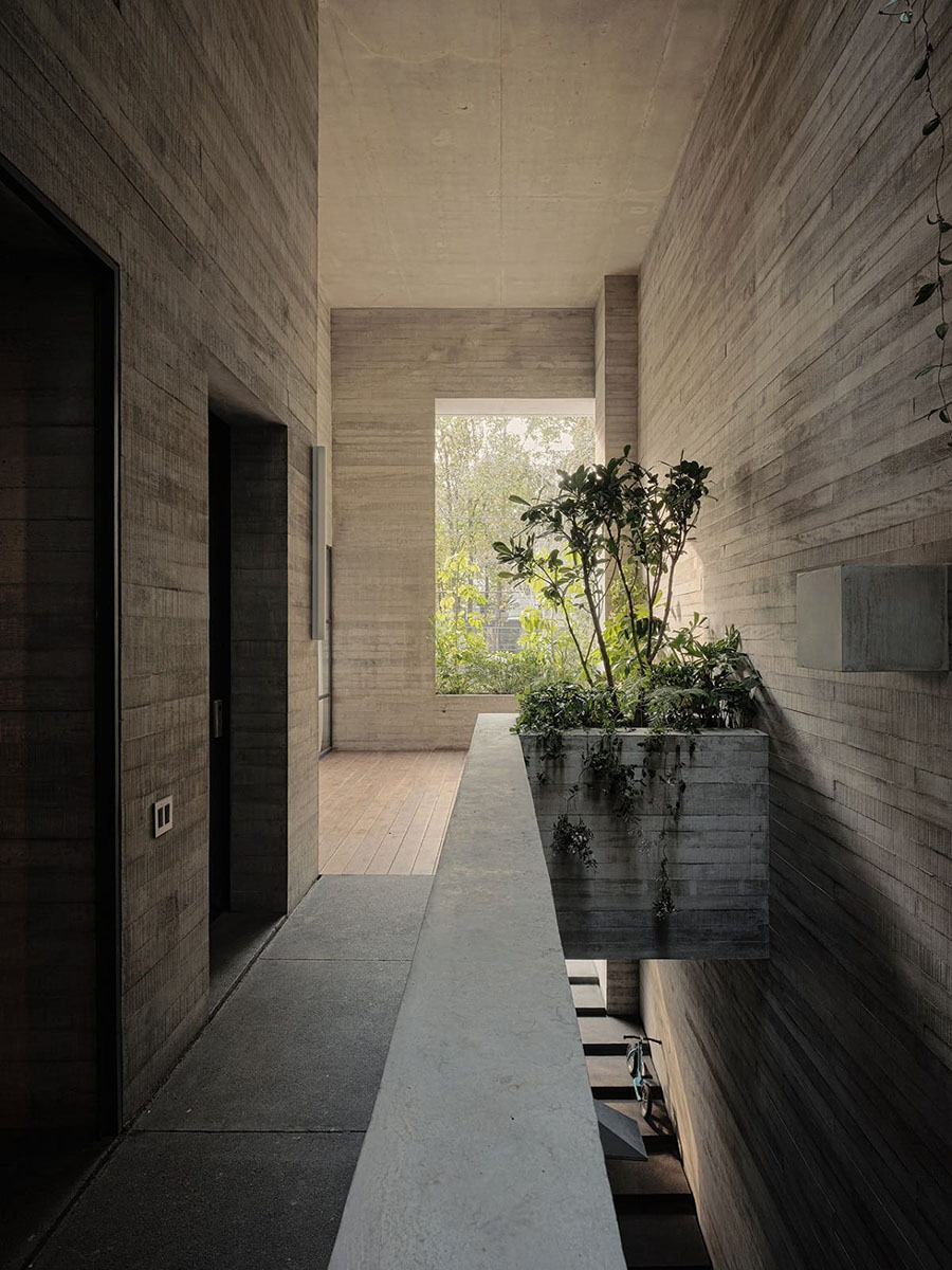
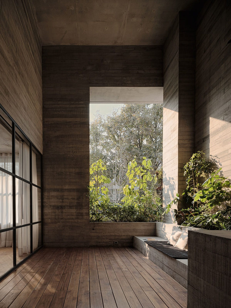
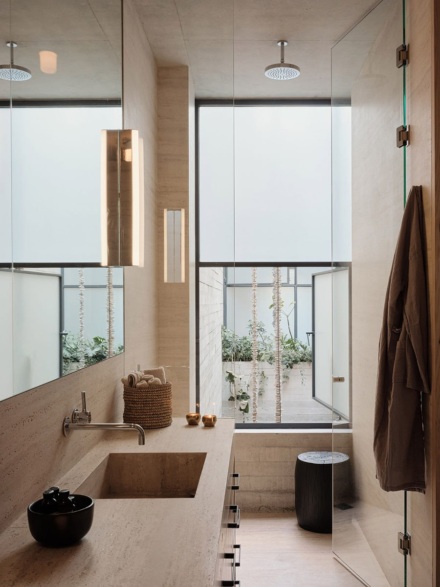
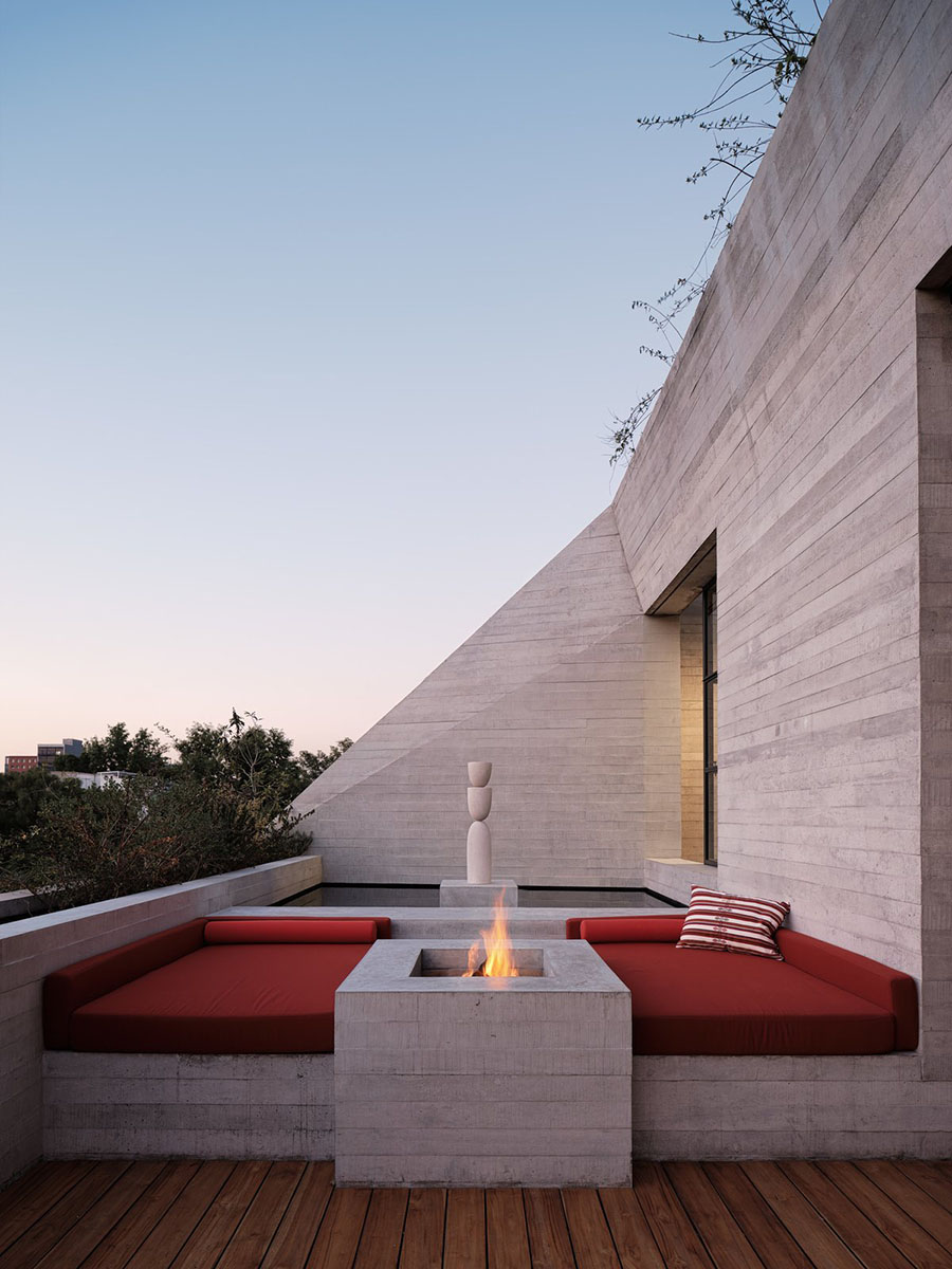
 Tennyson 205 does not apologize for the lack of a yard, garden or green space. Instead natural light and greenery, numerous windows and terraces, and multi-storey, open light corridors create an overall feeling of openness and freedom.
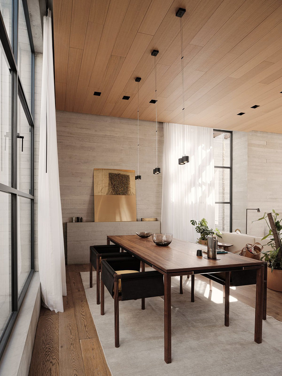
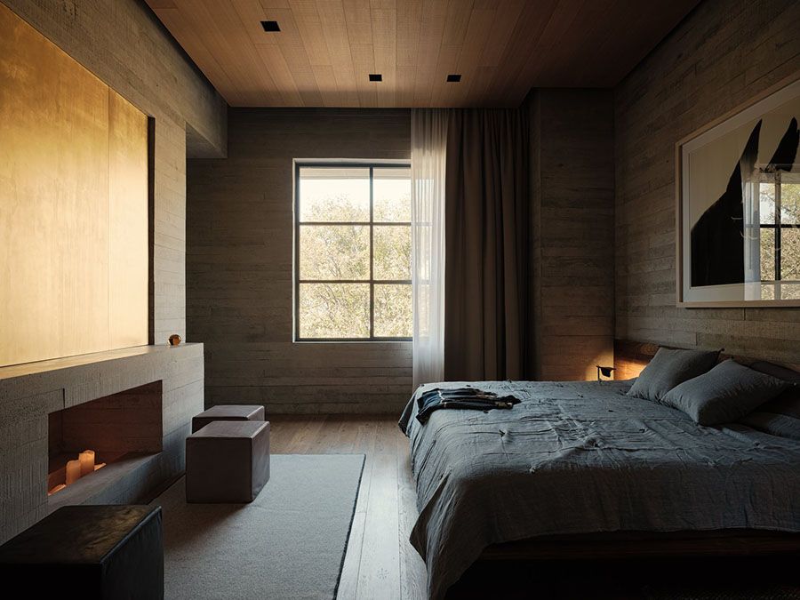
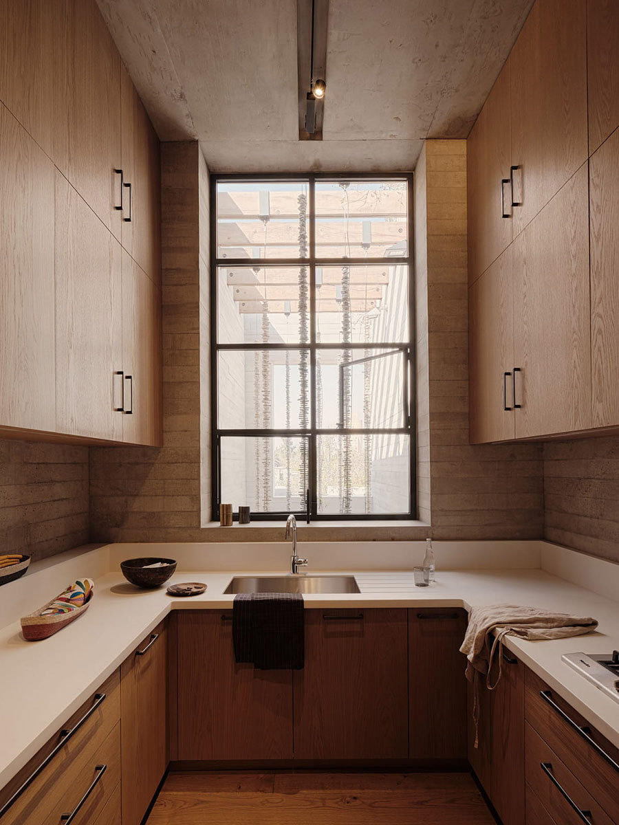
There are two apartments in the building, both two storeys high plus an above-ground garage as the bottom level. The steel-reinforced concrete structure shows its character in its patterned surface, the result of the board-formed casting process.
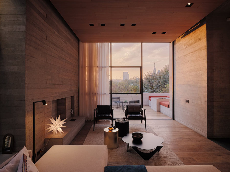
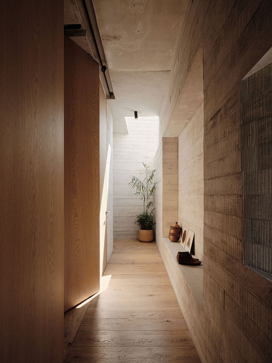
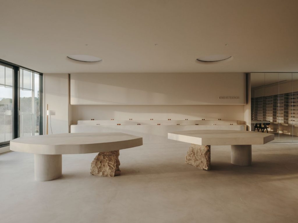
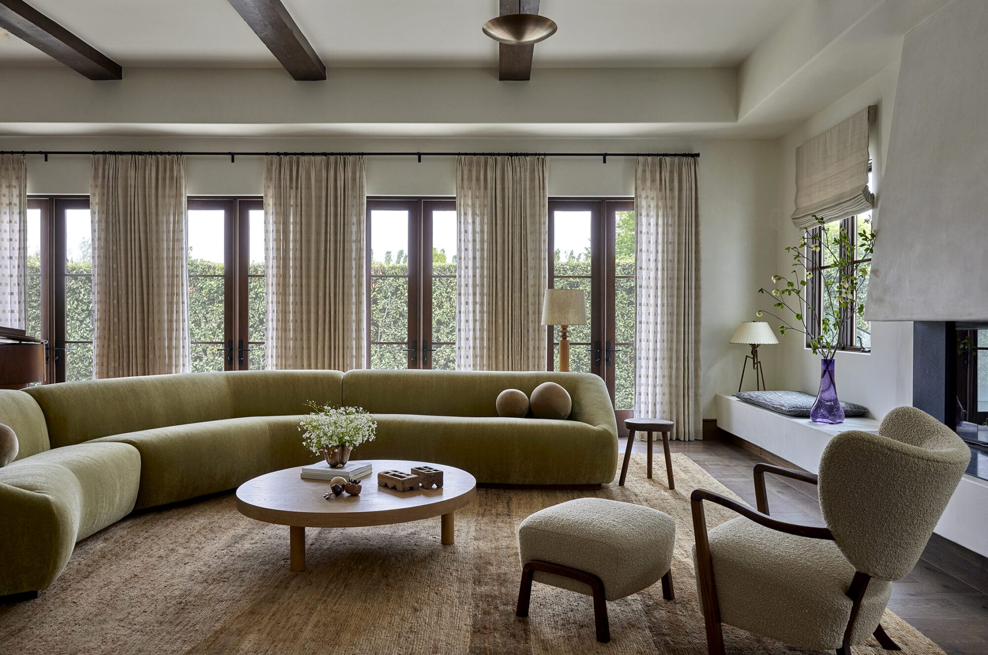
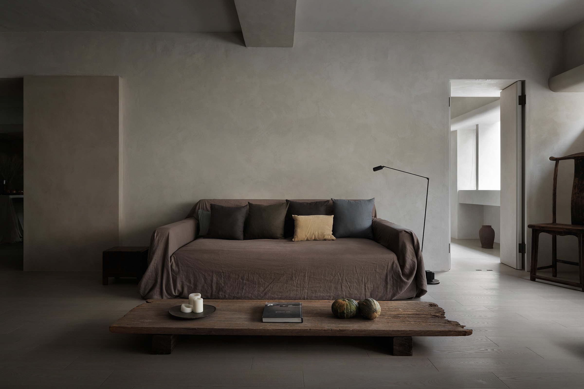
The large windows and the limited material palette give the indoor spaces a strong framework. Not much adornment or superfluous objects are needed. This is the kind of interior space that invites and demands constant editing. Almost everything looks like excessive visual noise. Not needed. Not adding anything to the already complete, empty space.
Again, we must say we love this kind of coherence where the exterior and the interior speak the same language and where both avoid unnecessary ornamentation. It gives room to breathe and think. Something we all need right now. Tuija Seipell.
Photography: Joe Fletcher