Anyone who has ever designed food and beverage packaging knows how difficult it is to stand out in the crowded sameness of food stores. This difficulty is magnified in the wine category. You must, in essence, express the wine’s distinctive qualities in the tiny space of the label, the cap, and perhaps some carton or POS applications.
To make matters worse, various laws and regulations require that much of the label space is taken up by small print. There is also very little cost-effective wiggle room in the basic package: the bottle.
Bottles are universally more or less the same, and the sameness is dictated by standardized manufacturing, transportation, storage and displays. Wine quality plays a major role in this as well, as does consumer perception. Wine that comes out of a box or a plastic container just doesn’t feel quite right.
In the retail selling environment, education and information now also demand their share of space as more and more novices want to know about wine.
For the wine retailer, and for the designer of spaces where wine is sold, all of this poses a challenge: How to display hundreds of seemingly similar bottles in an attractive, interesting and functionally effective way. How to make shopping enjoyable and easy, and how to help consumers learn more about wine.

We have written about some cool wineries and retail environments before, but here are a few that deserve attention as well.

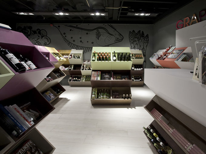
Dutch online wine seller Grapy hired the Amsterdam-based Storeage to design its first physical selling space. Located in the Het Verbogen Rijk bookstore in Roosendaal, the shop-in-shop helps integrate the bookstore’s wine and cook books with the wine.

We love the massive graphics and the simple, clear ‘signage’ that gives only minimal direction: creamy whites, fresh whites, bubbles. This simplicity – rather than the common and confusing information overload – is what makes shopping easy. Storeage used minimalist, mobile and modular displays to facilitate the move of this shop into other locations.
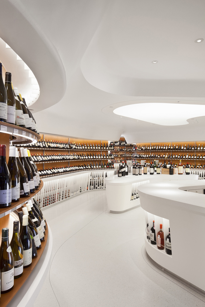
It will come as no surprise to our readers that we love wood, minimalism and Scandinavian design. Mistral Wine & Champagne Bar in São Paulo, Brazil, is the Mistral wine company’s first physical space.
Designed by local architect Arthur Casas it is a perfect example of how to make a boring, long space look magnificent. We like the bottle display system that shows each bottle label-up, and eliminates the need to handle the bottles. The long ‘selection hall’ leads to a bar area, designed for learning about wine by reading and tasting.
.jpg)
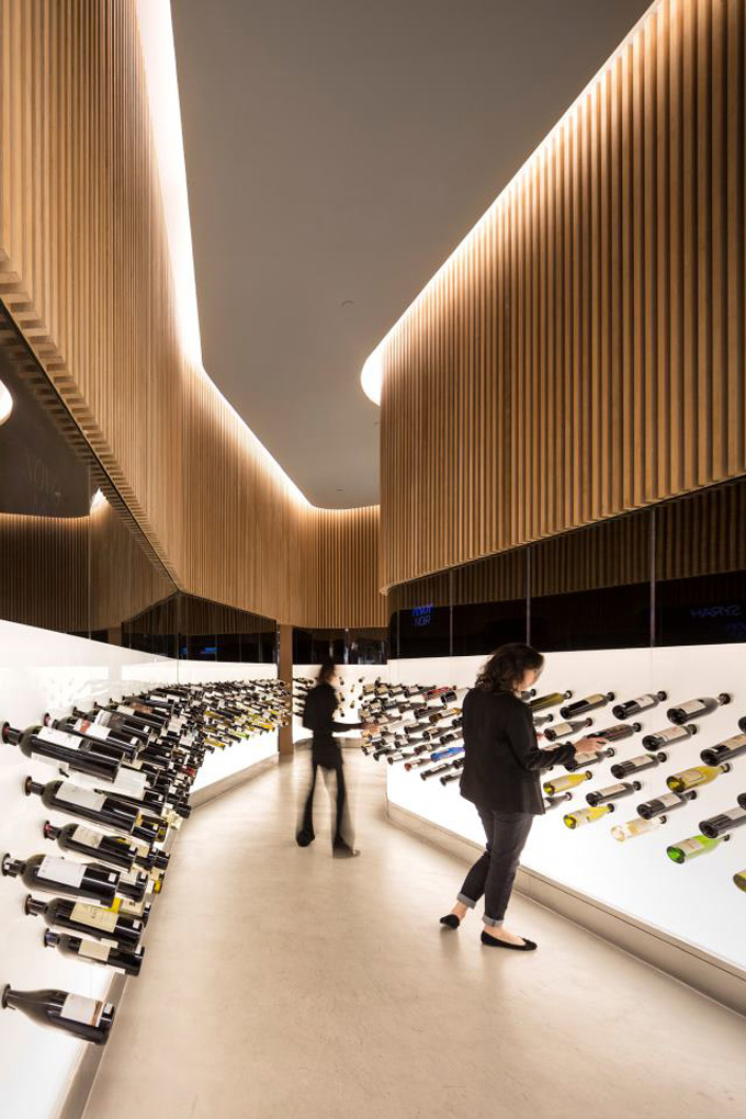
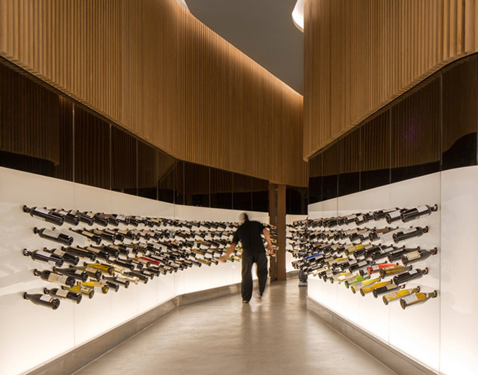
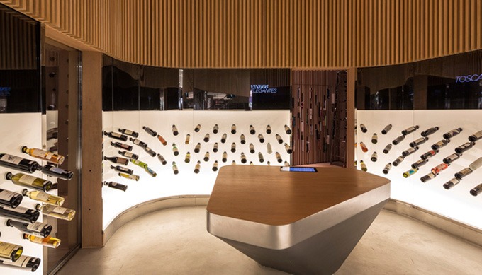
Peter Poulakos, son of Sparta, Greece-born restaurateur Harry Poulakos, operates not just 22 restaurants, including the well-known Harry’s in New York City, but also the focus of our interest here: Vintry Fine Wines
According to Rogers Marvel Architects, the designers of the Battery Park neighbourhood store, the design is based on the parallel rows and rolling hills of wine country. In addition to the beauty of the clean lines, we love the clarity of the space, and the fact that the educational aspect is handled though simple tablets mounted in the central table.

With more than 2,500 bottles on display, the ease of finding what you need is absolutely essential.
.jpg)
In our review of wine stores, we have seen a fairly clear division into two categories: The earthy and traditional winery-related, rustic concepts, and the minimalist, pared down, urban schemes.
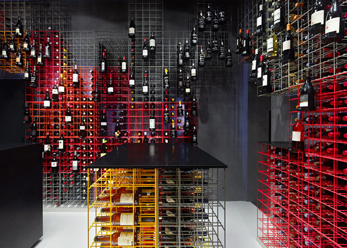
The latter was taken to the extreme in this small wine shop in central Stuttgart, Germany, where the designers at Furch Gestaltung + Produktion had to take drastic measures to fit 1,200 types of wine in about 12,000 bottles into a selling space that was not really fit for the task at all.
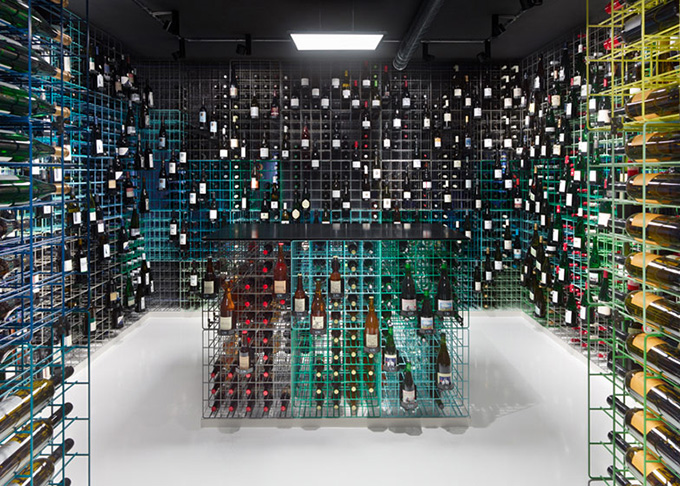
The store, located at Dorotheenstraße 2 (at Schillerplatz) and operated by Weinhandlung Kreis, is only 70 square meters (about 753 sq.ft) in size on two floors, and has no storage.
Here, the uniformity of wine packaging became the solution. The standards of wine bottling (more or less all bottles are the same size), storage and transportation became the literal and conceptual framework for the entire store.
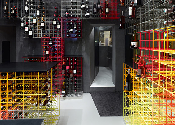
The designers created a utilitarian, spreadsheet -like metal grid from wire mats that were welded together to form cubes, each with space for 25 bottles.
The real genius of the concept, however, is in the color. The tall stacks of industrial-looking racks could have appeared unappealing and daunting to the consumer – and yes, this is still probably a bit of a challenge to shop for the first time around – but the color adds a significant uptick to the mood.
.jpg)
The store looks cool and playful, and the shelf colors can become a way finding color code for shoppers to find their favourite wines the next time around. – Tuija Seipell
* See also the rise of the designer bakery