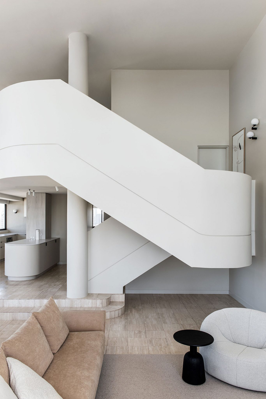
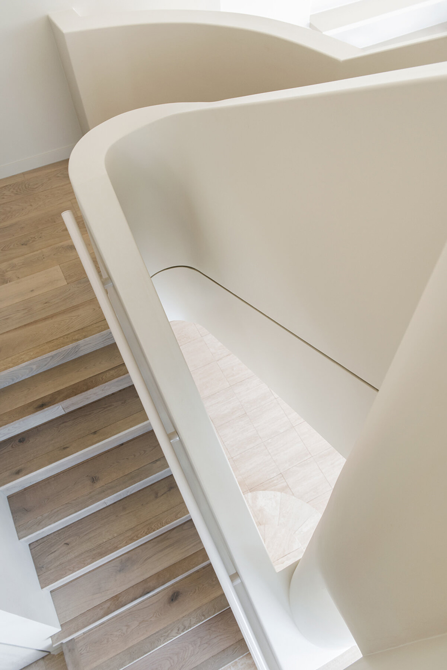
Those familiar with the 1980s architecture will recall the curved whiteness and plastic-y expanses that were so modern then but today seem like tacky cruise-ship design. Some globally recognized buildings of that era include the Pan Pacific Hotel in Vancouver. Designed by architect Eberhard Zeidler the hotel is part of the original Canada Place created for Vancouver’s Expo ’86.

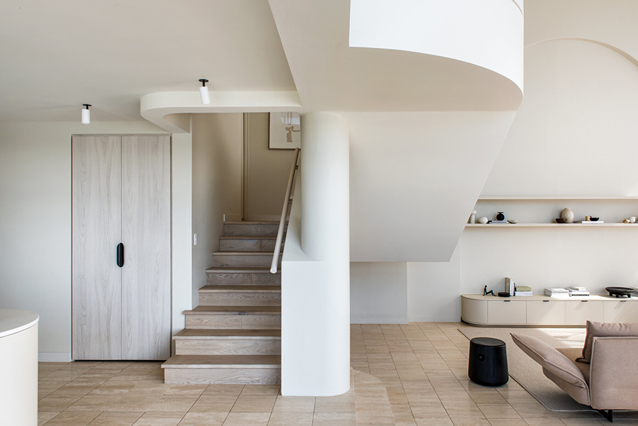
The recently renovated Penthouse M in Australia’s Gold Coast near Brisbane reminded us of the Pan Pacific in Vancouver & The Calile Hotel in Brisbane. The penthouse residence is located on the top floor of a building that dates back to the same era and has the same style.
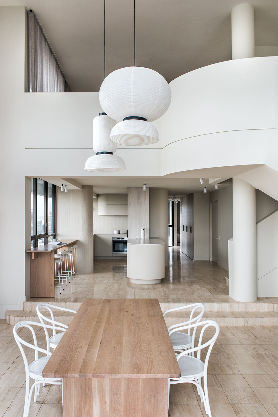
In this penthouse, even after renovation, the curvy whiteness could have resulted in a tired, sterile and lifeless retro feel, but Melbourne-based CJH Studio managed navigate through the pitfalls while still retaining the 1980s feel.
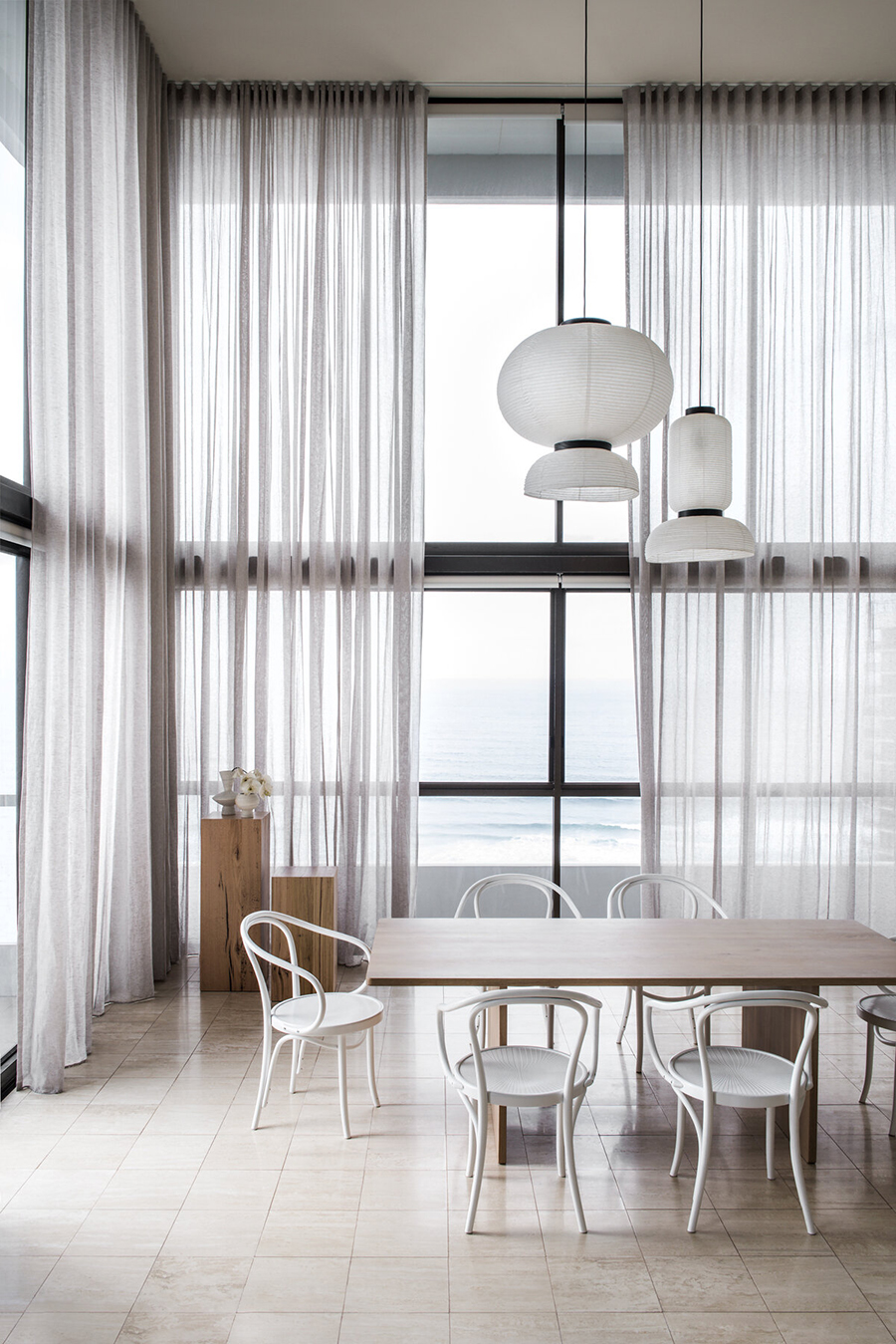
The two-level residence was previously owned by the original developer of the building and the interior had been left almost completely intact from when the building was completed in the 1980s. The new owners are a small but growing young family and they wanted to preserve the style of the apartment and the building but they also wished to upgrade and update the home.
CJH Studio took full advantage of the best features of the apartment – it’s two-level main room with huge windows, the overall white tone and the travertine marble flooring. The 250 square-metre (2,690 sq.ft) penthouse now has a distinctly contemporary atmosphere although the initial design is clearly visible as well.
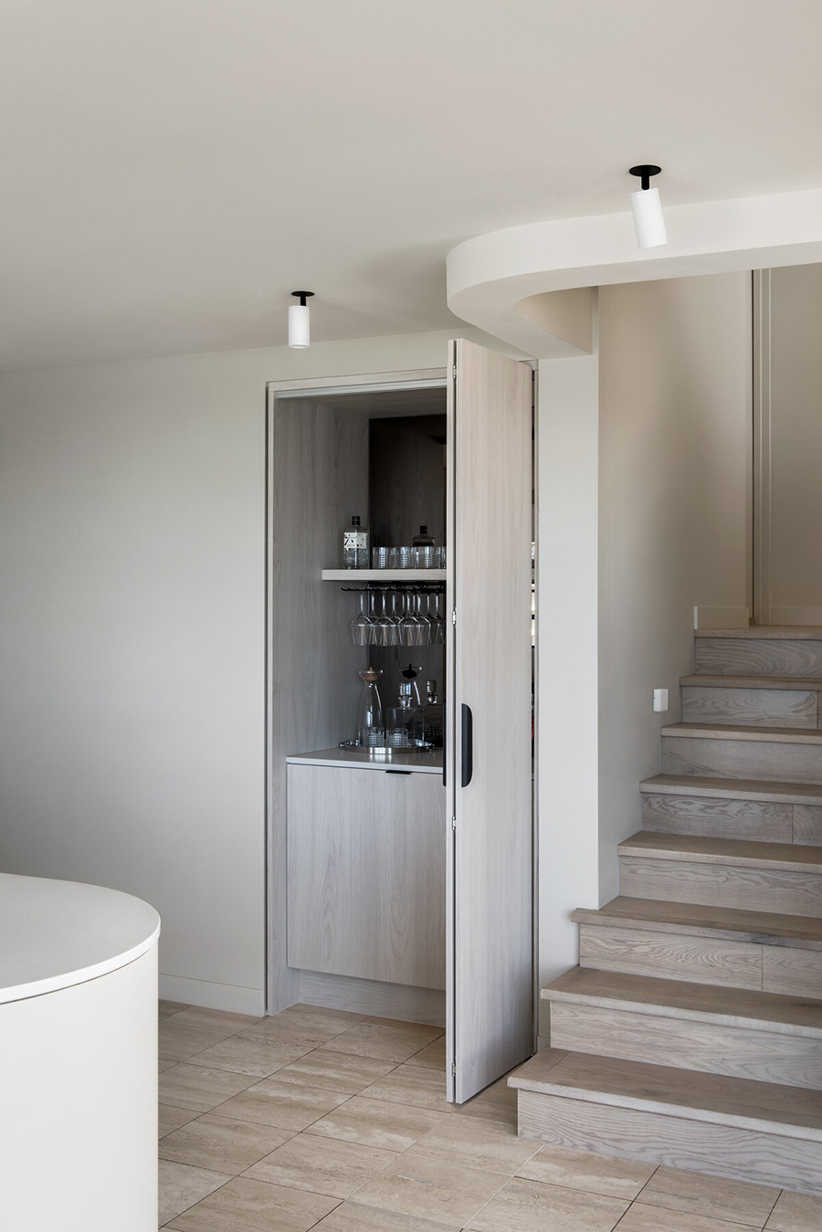
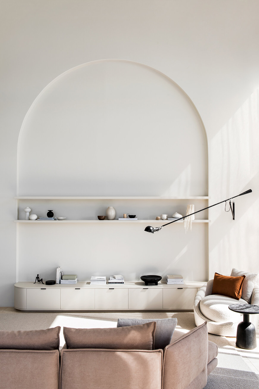
In addition to restoring the marble flooring that provides much of the ‘colour’ in the apartment CJH Studio founder, interior designer Cassie James-Herrick, added such details as linen and oak, and soft-toned upholstered pieces to insert softness and texture as the natural light changes the ambiance of the rooms during the day.
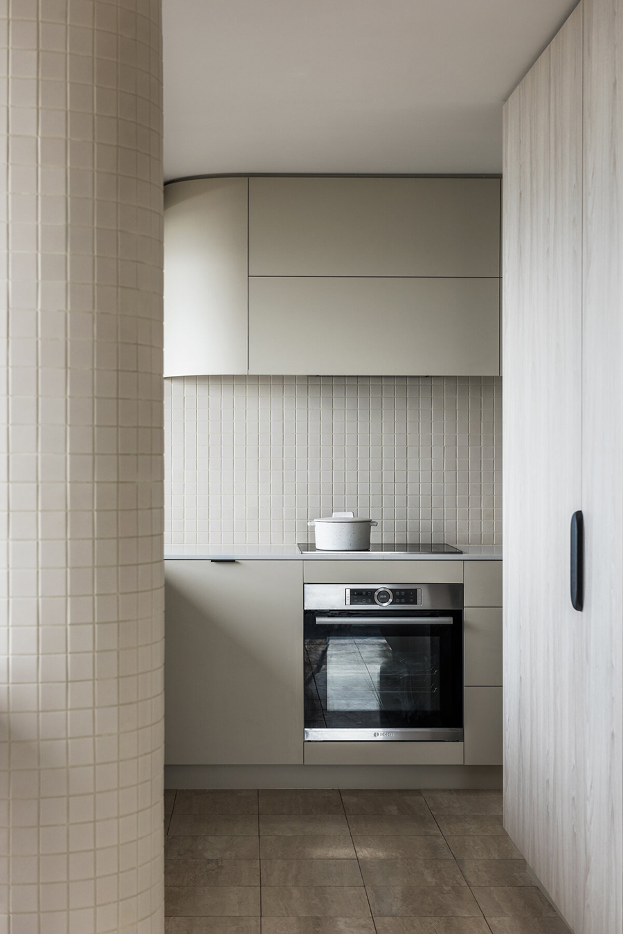
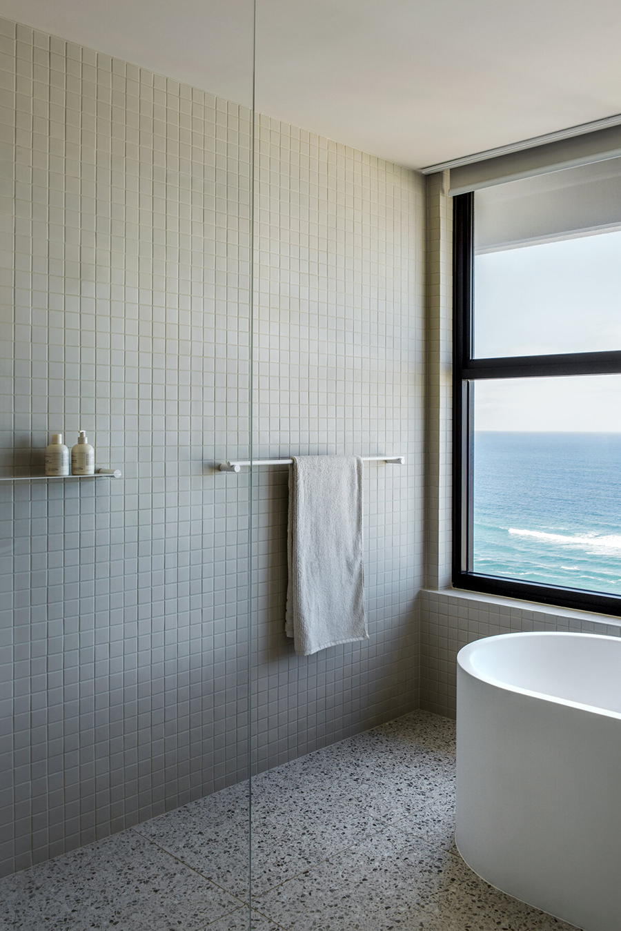
In the bathrooms CJH Studio discarded the tacky swan-shaped taps and apricot-hued bath tubs and introduced off-white square tiling and large glass bricks. Black bathroom fixtures introduce a bit of snap to the whiteness as do the black neoprene Curve pulls and hooks designed by Cassie James-Herrick for her own Linear Standard product line.
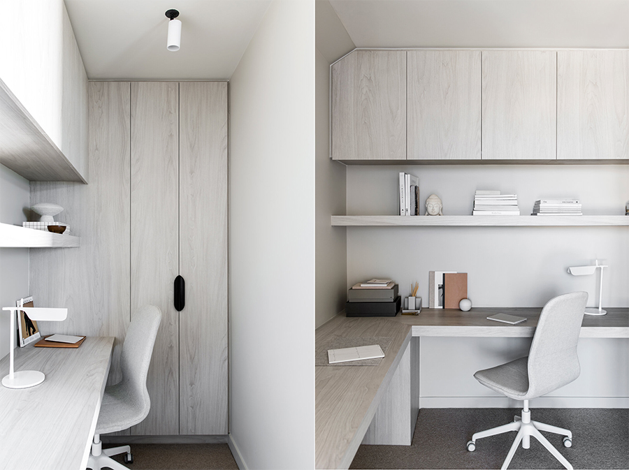
Throughout the apartment, the overall beige curviness is broken up by small angular details including the black wall version of the Flos 265 light fixture designed by Paolo Rizzatto in 1973. Tuija Seipell
Images by Cathy Schusler
