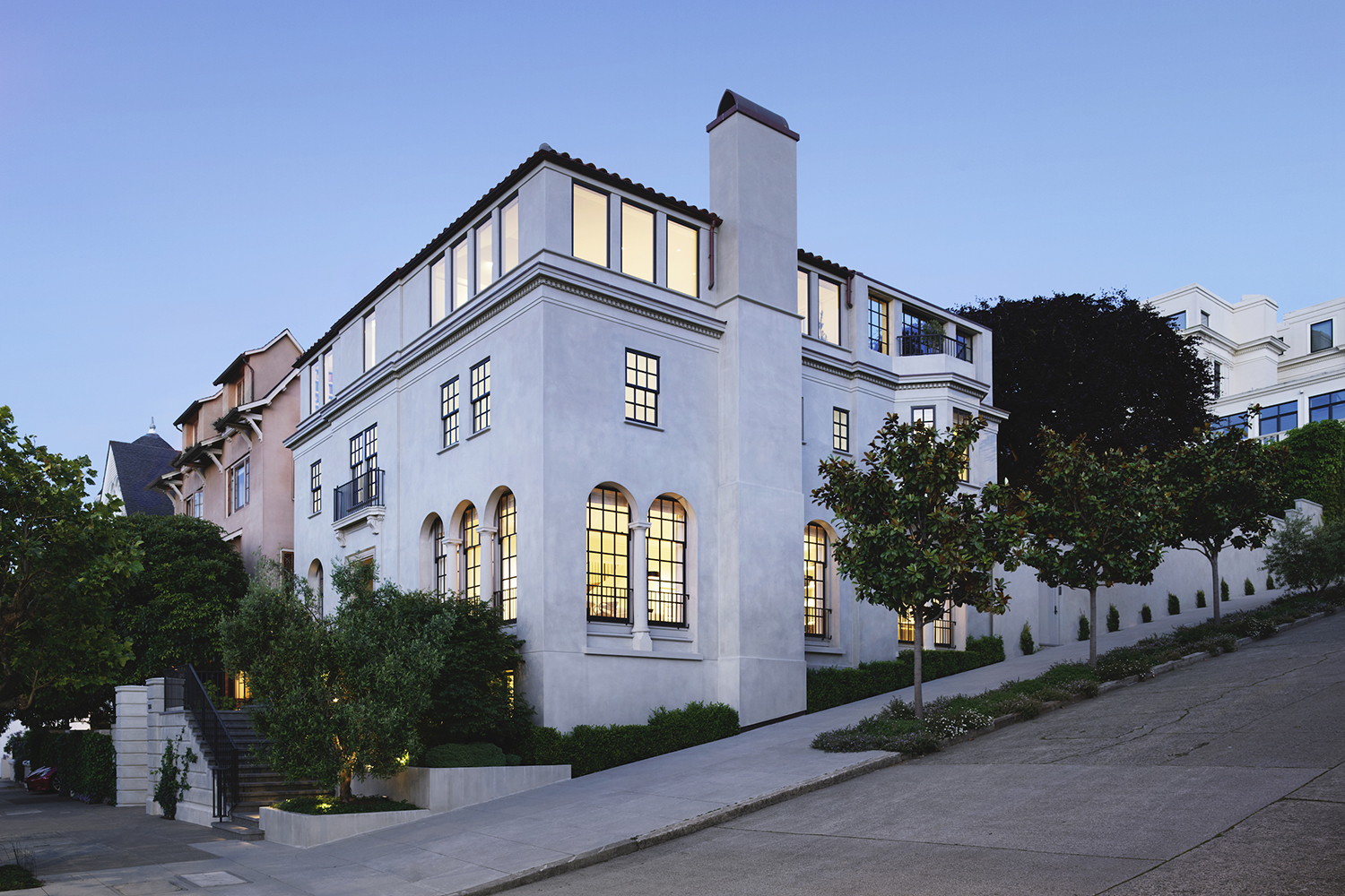
A family of four had purchased a gorgeous, white Edwardian-style building on a hilly street corner in the historic Pacific Heights area of San Francisco but the house needed a complete upgrade to meet the needs of the family that includes two busy professional adults and two young daughters.
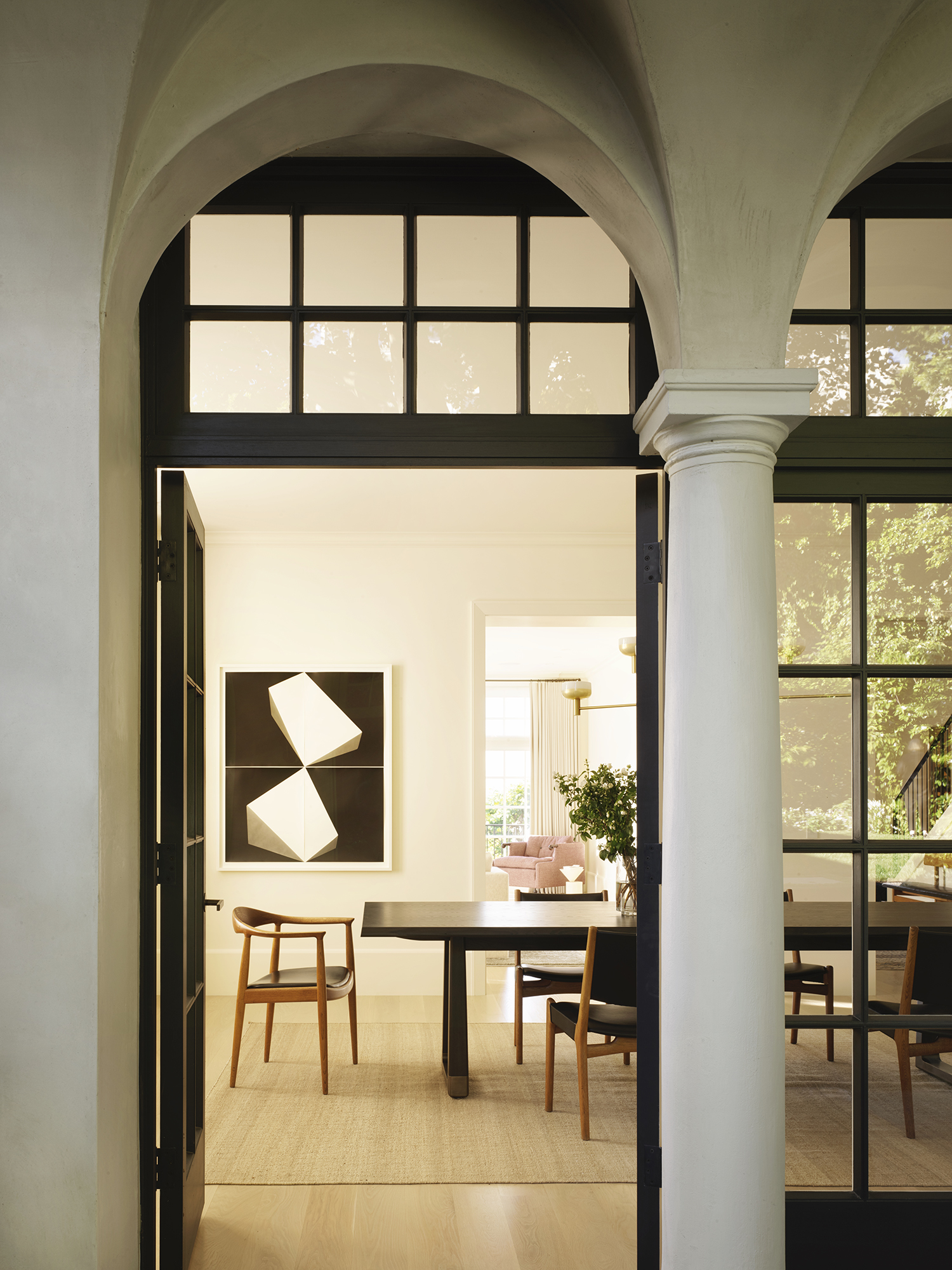
The 1925 structure was indeed beautiful and the teams involved in re-creating it had to keep its heritage and character intact while ensuring that the modern luxury living standards of the family were met.
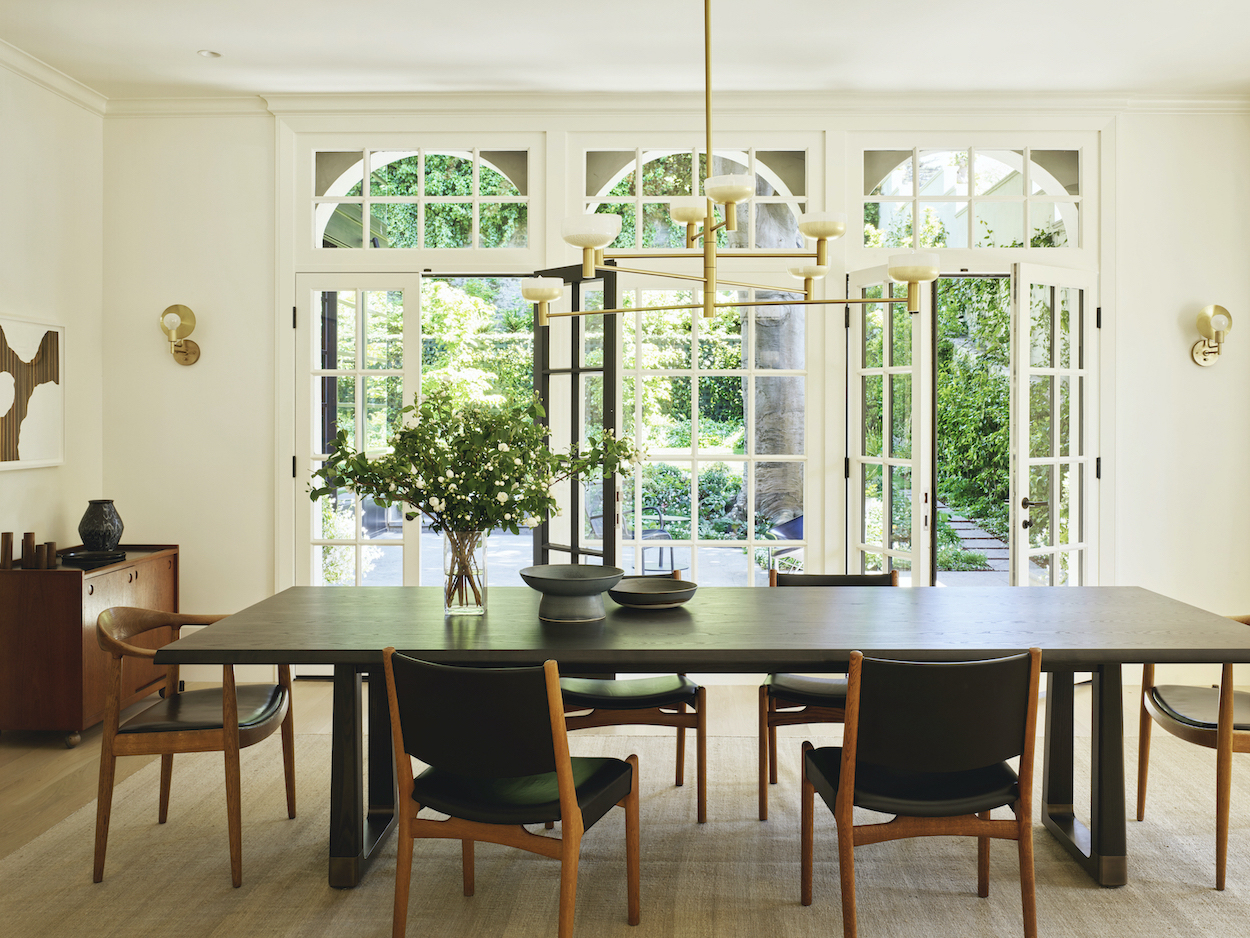
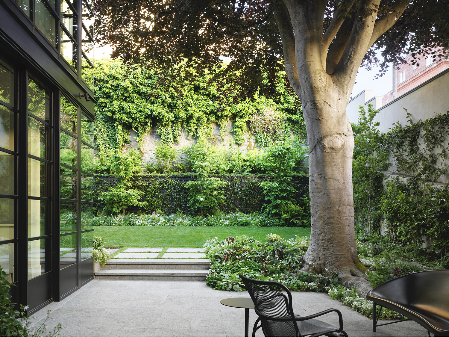
Three Californian firms handled the many aspects of the renovation and design. San Francisco-based Walker Warner Architects was in charge of the architecture, Oakland-based Redmond Aldrich Design handled the interior design and San Francisco-based Scott Lewis Landscape Architecture took care of the landscaping.
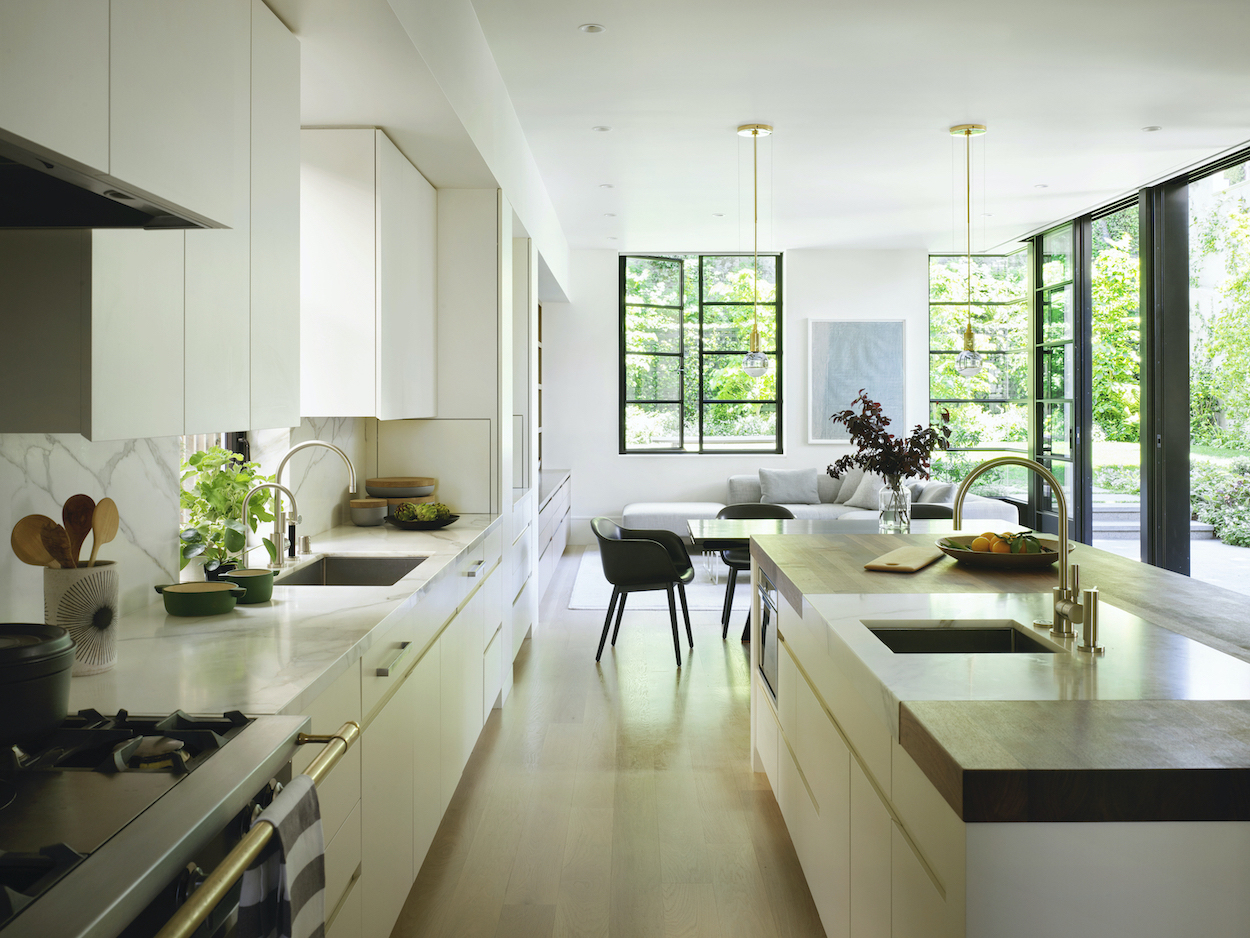
In the architecture of the project Walker Warner Architects had to ensure that the building met with the historical restrictions and that both the old and the new aspects of it were harmoniously coherent. The firm’s principal Brooks Walker has been quoted as saying that the team was inspired by the historic London townhomes where the existing features and the modernist interventions work seamlessly together yet are clearly distinct and discernable.
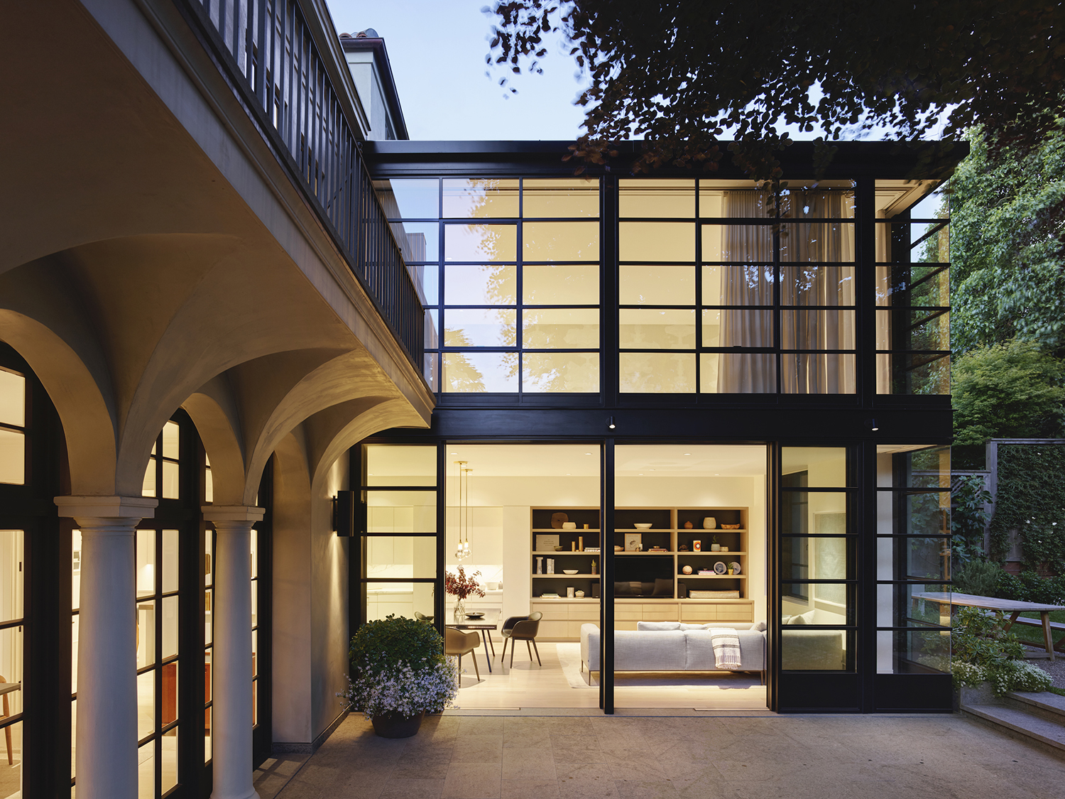
To bring the structure up to California’s earth-quake code, the house had to be pared down to its bare frame. The stucco and plaster exterior was removed and the foundation was steel-reinforced. The decorative wooden cornices and columns were replaced with fiberglass reproductions.
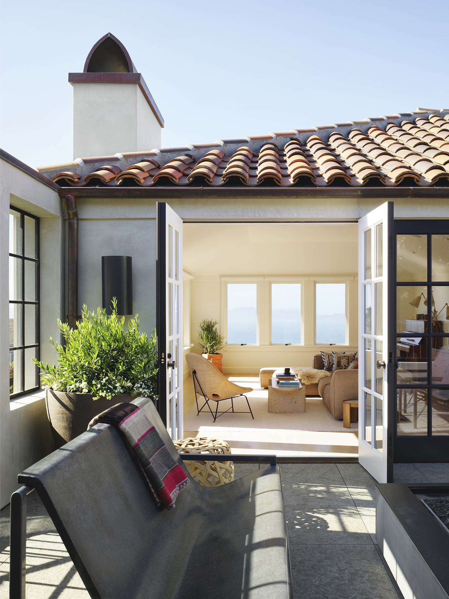
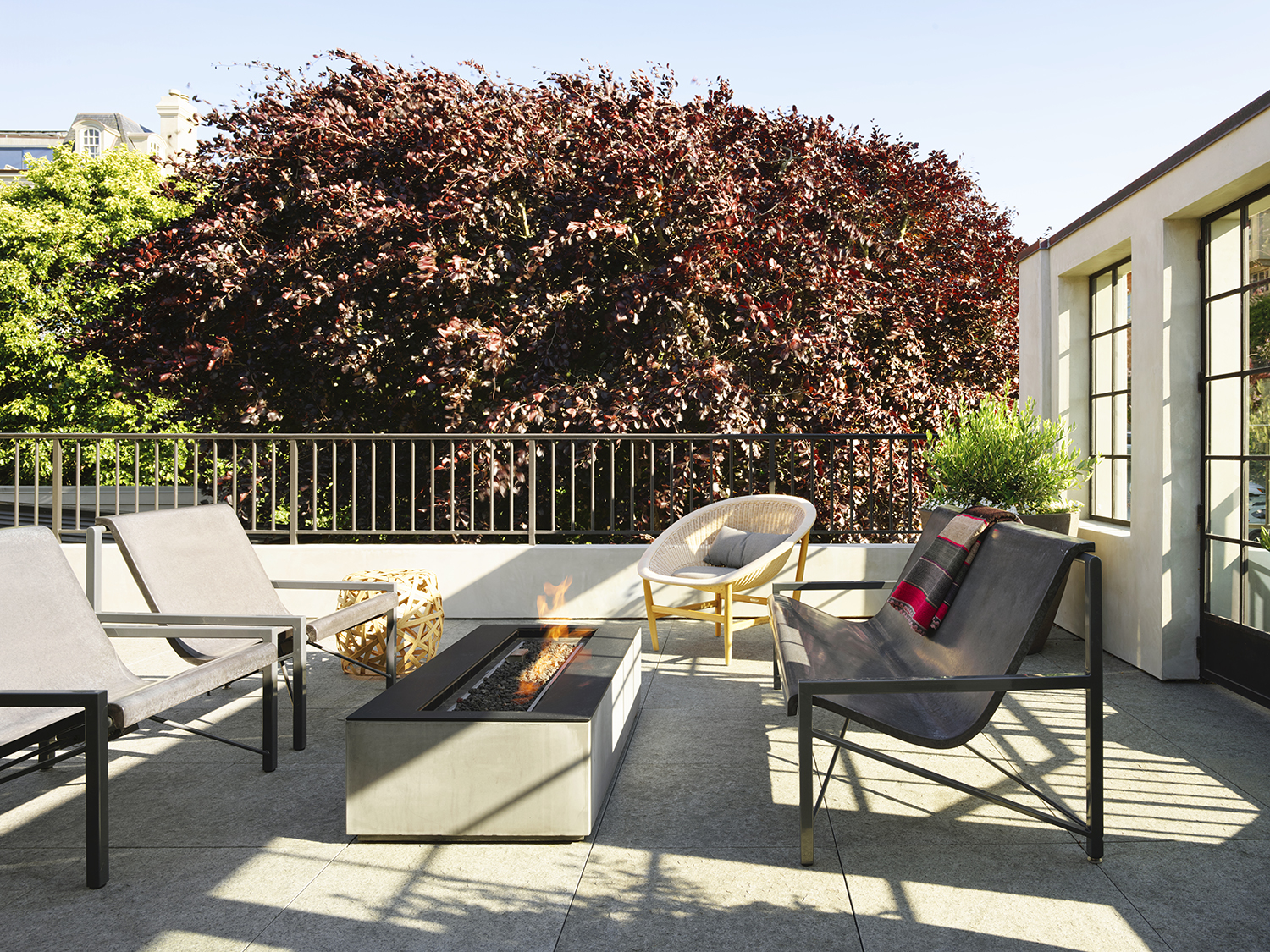
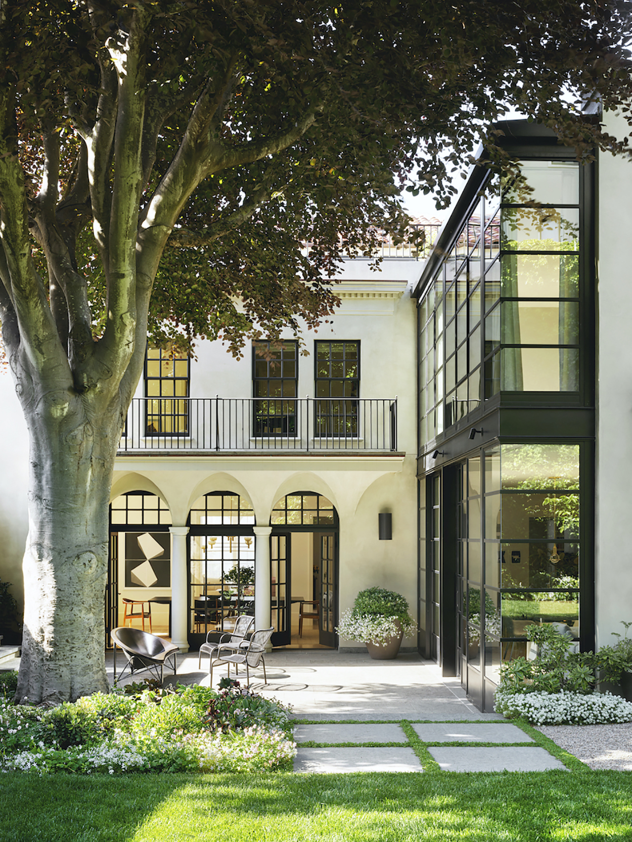
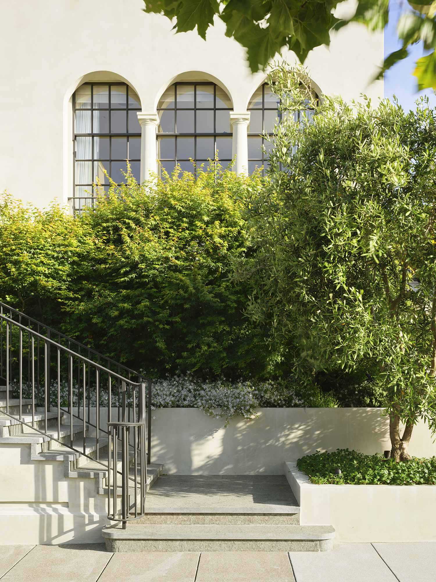
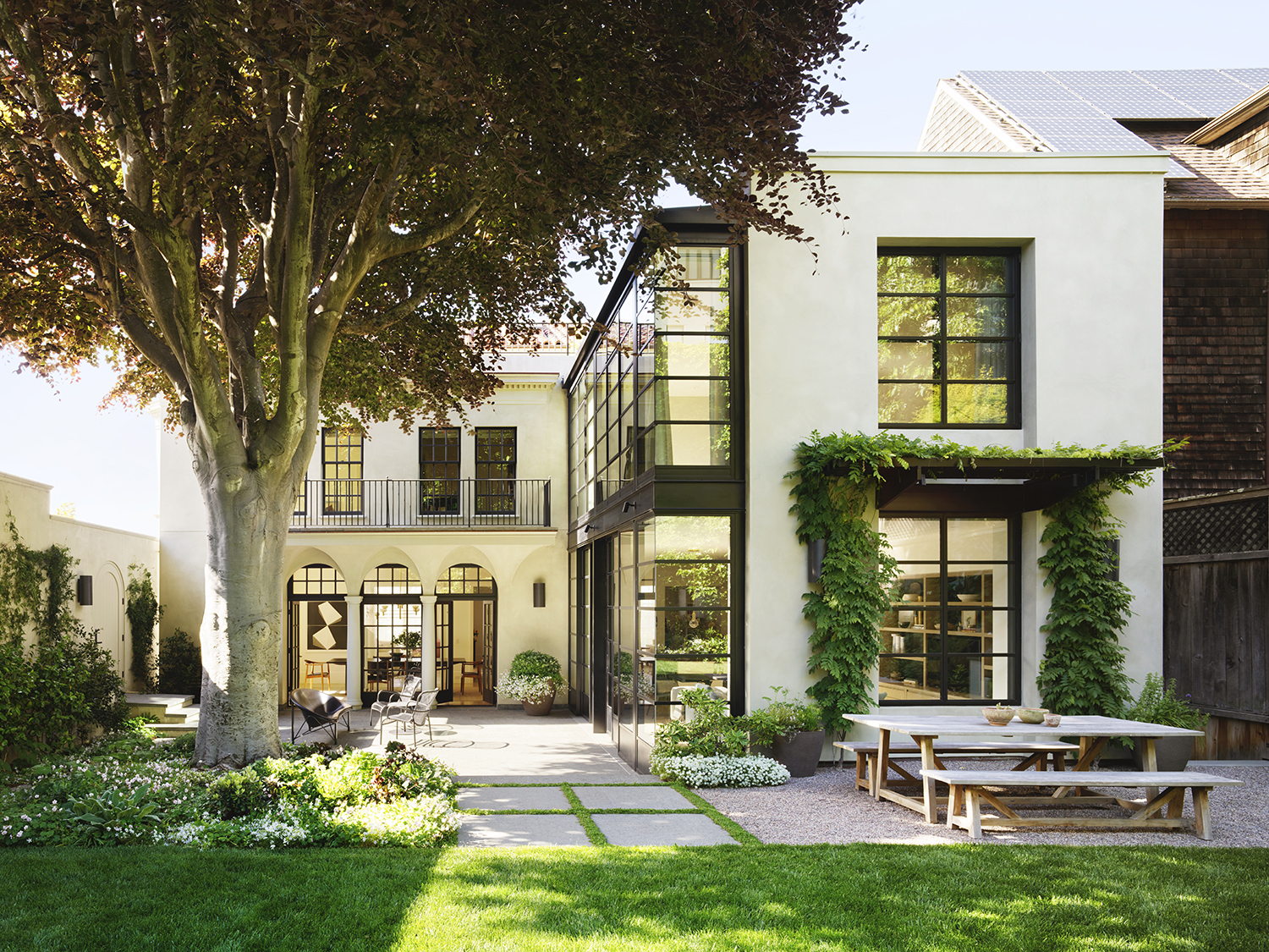
After the renovation the Pacific Heights home appears stately and contemporary while it is also clear that it has had some “work done.” Our favourite aspects of the project are the contrasts: the angular, black-steel structural frames and railings against the white exterior walls, creamy arches and columns.
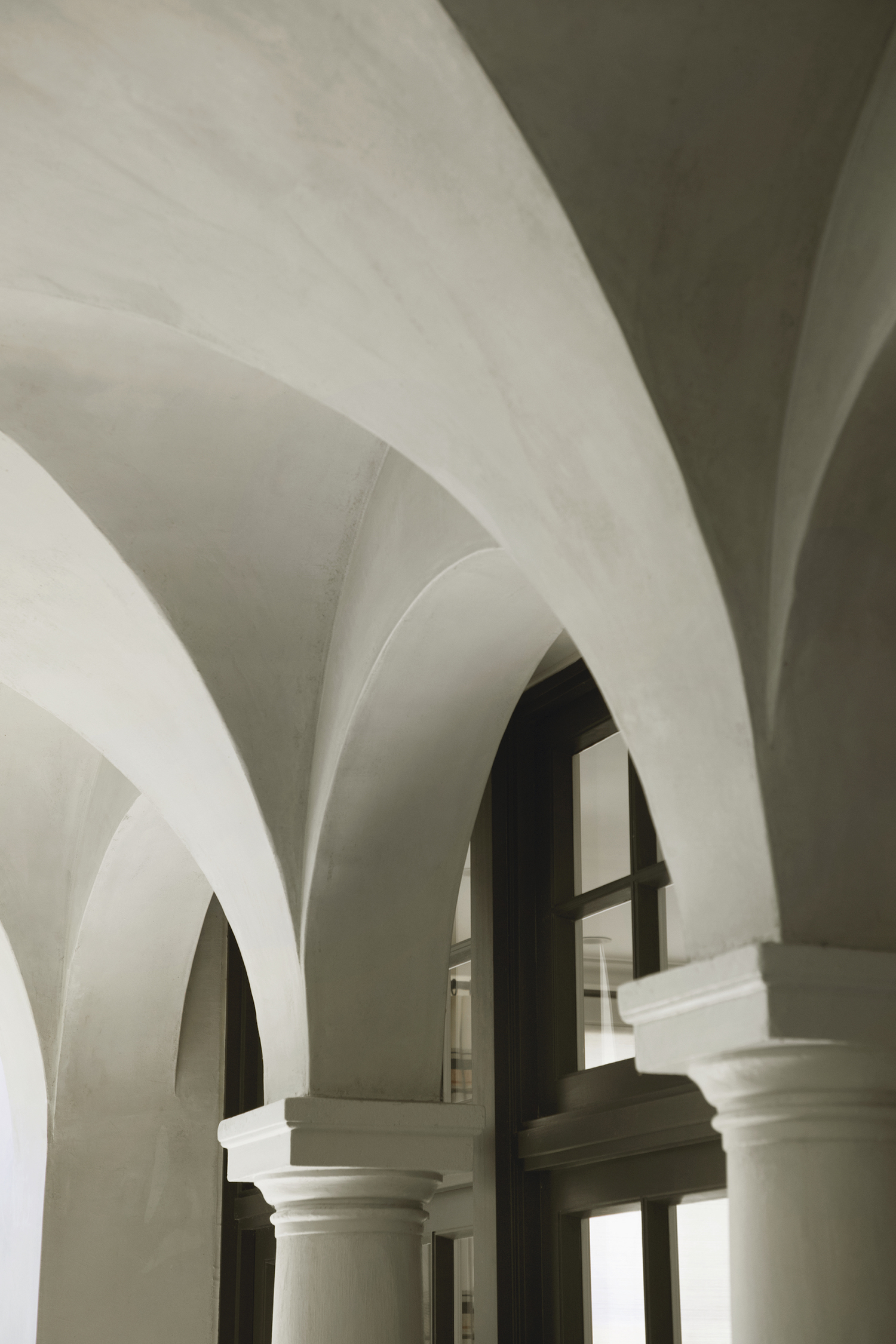
The principal functional architectural changes include a steel-encased glass-box addition at the back of the house that provides the space for the new master suite, an open-concept kitchen, a dining room and the expanded gardens.
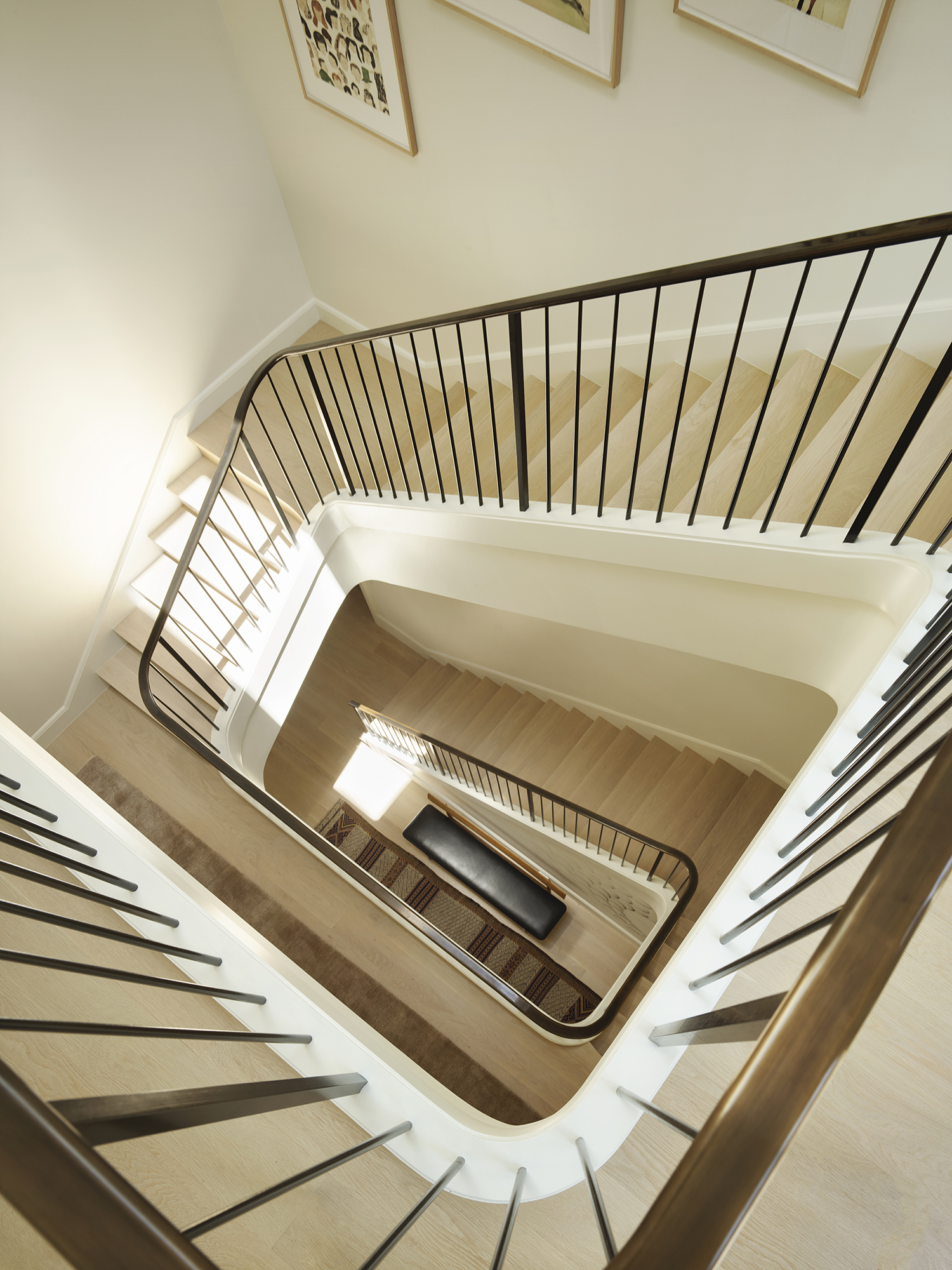
Interior designer Chloe Warner of Redmond Aldrich had the distinctive advantage of knowing the client intimately in advance. She had already completed two houses for the owners and was therefore hitting the ground running.
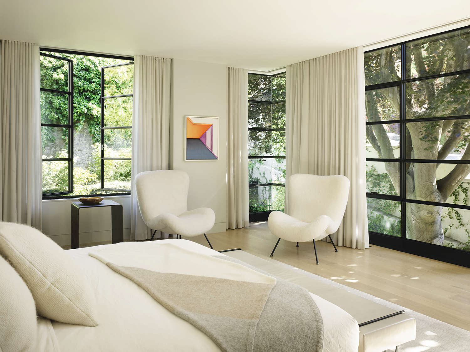
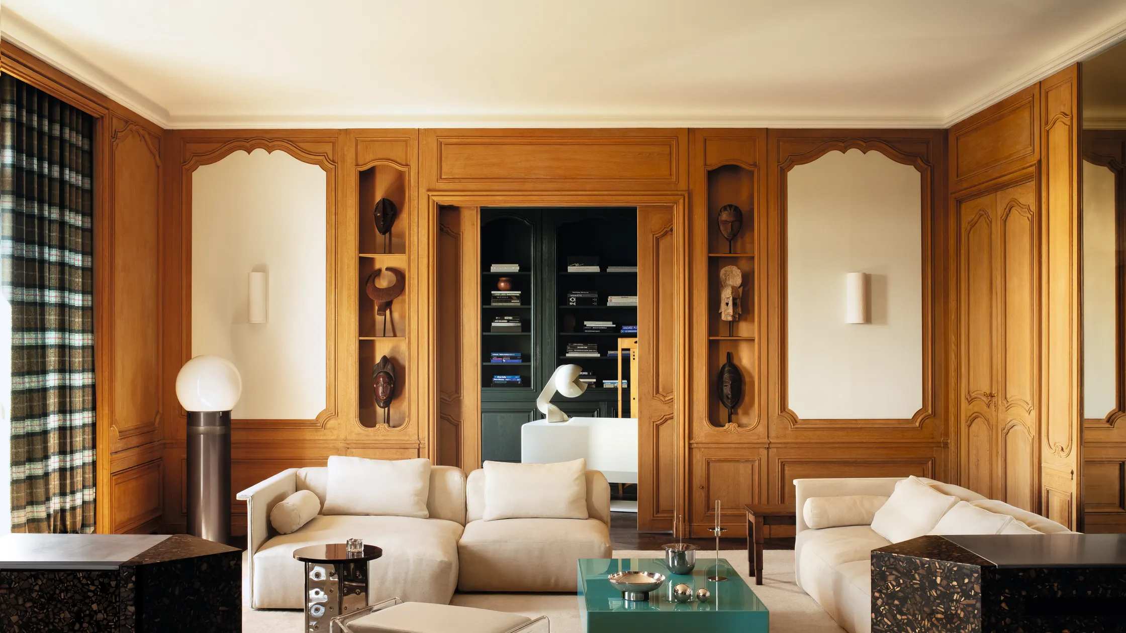
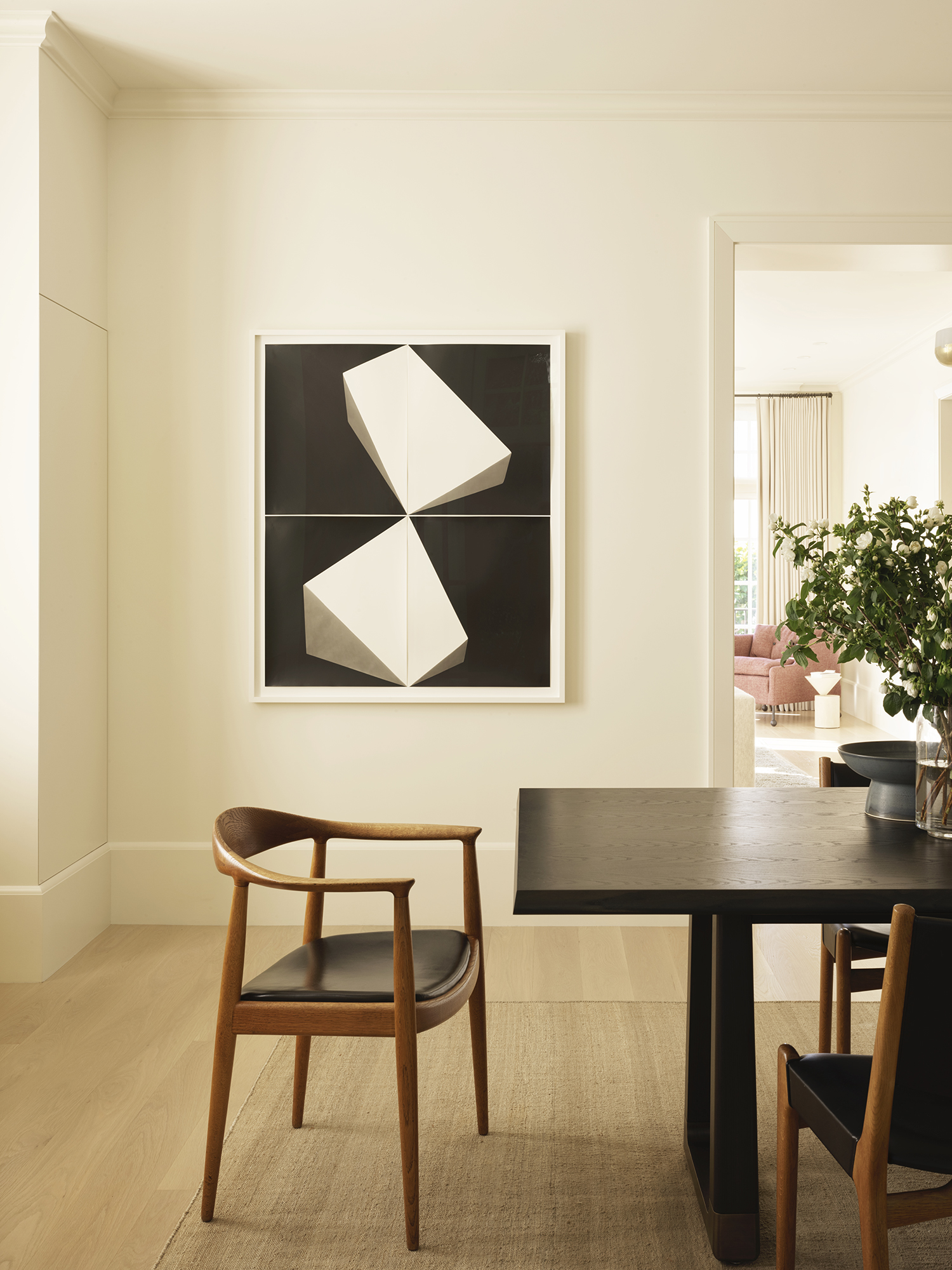
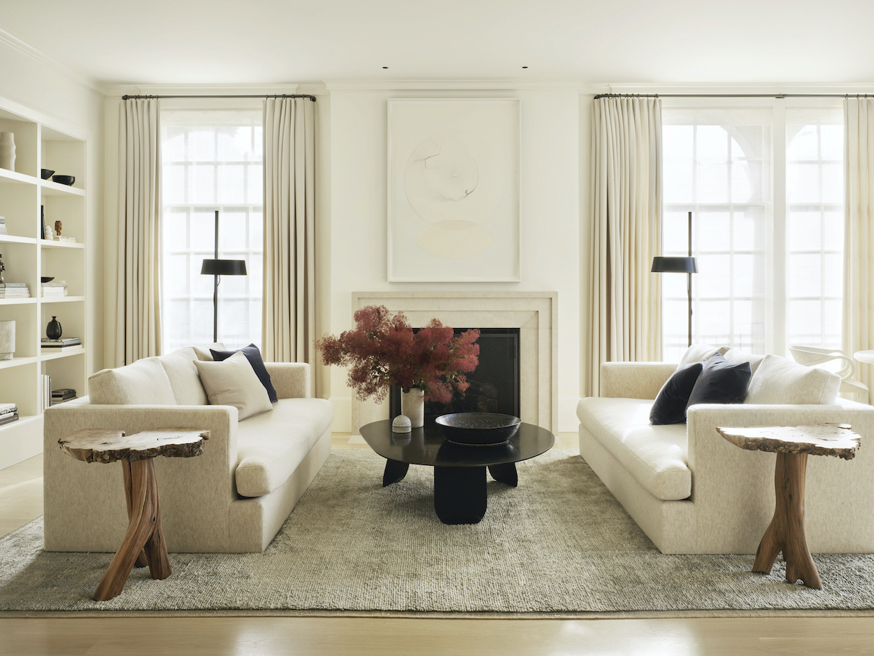
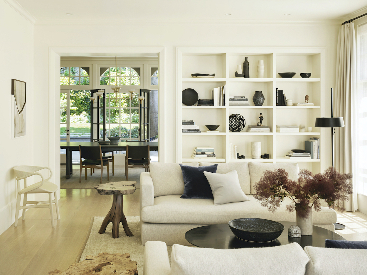
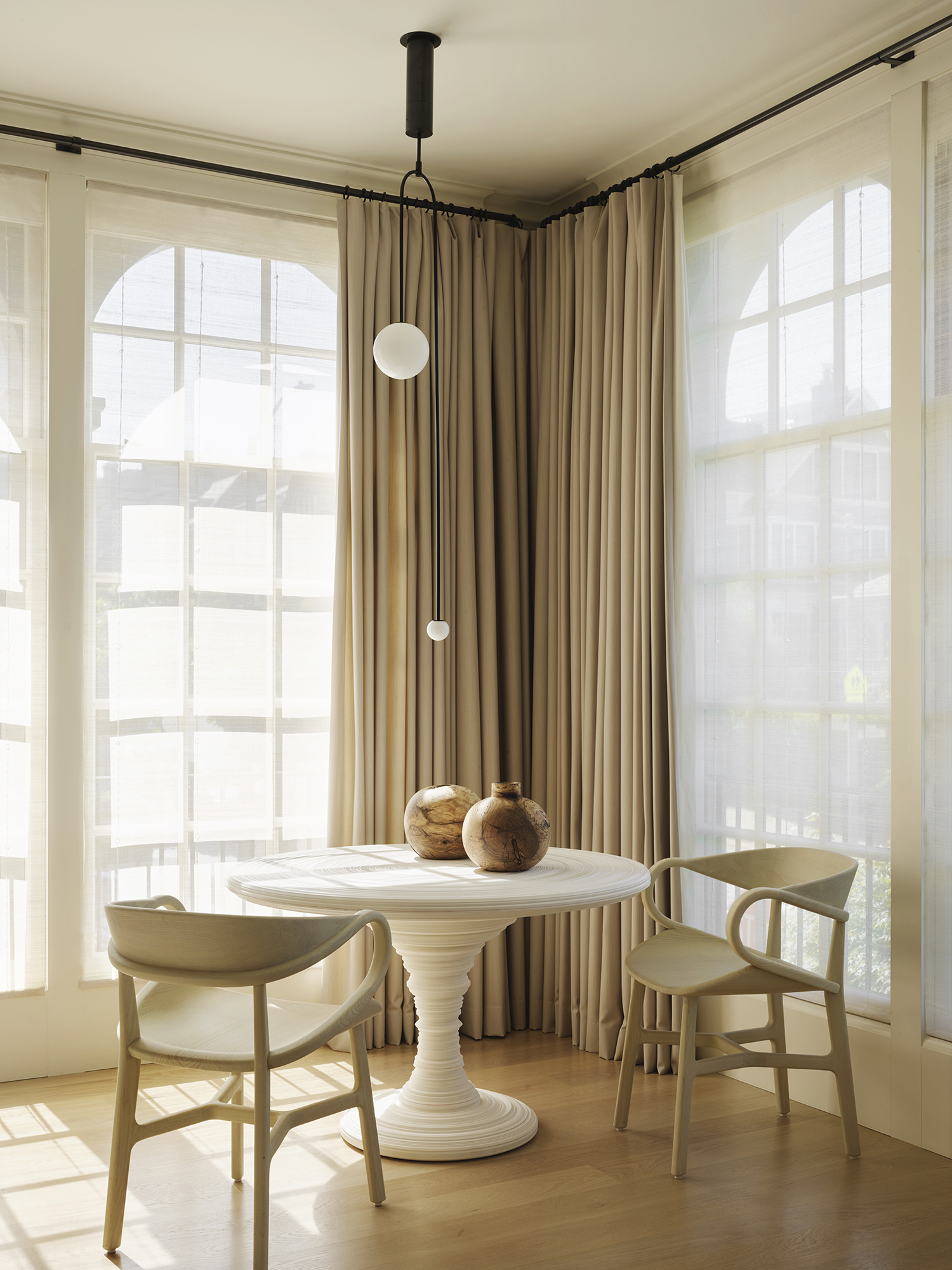
In addition to making the residence comfortably livable for a busy family, and to imbuing it with a sense of harmony and balance, the interior designers were tasked to highlight the house’s architectural character and provide a background for the owners’ extensive art collection.
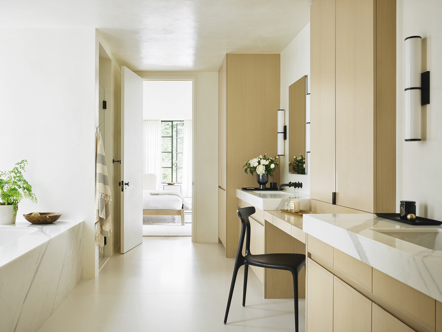
The muted hues of white, beige, cream and blond wood not just accentuate the art collection and the modern and modernist furniture, but they also allow the gorgeous views over the gardens infuse the interior with the kind of calm and harmony the owners were hoping to achieve. Tuija Seipell
Images by Matthew Millman


