Confusion is easy, clarity is difficult. We keep repeating this because we see proof of it daily. We all do. We see and experience examples of this constantly as we encounter confusing concepts and inconsistent brands.
Luckily, there are always enough great examples of clarity to contrast this chaos and chatter, and to keep us going.
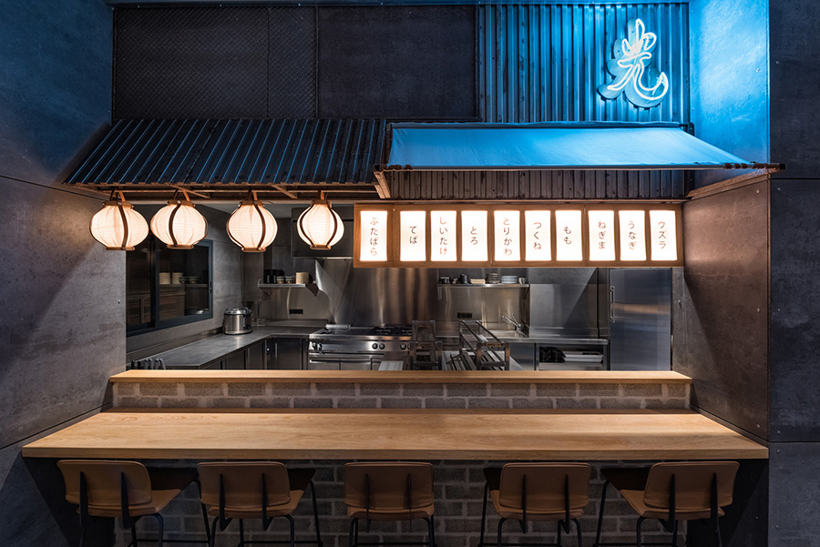
As before, Valencia, Spain-based design firm Masquepacio has delighted us with an example of this clarity.
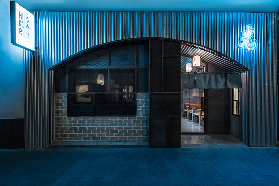
It is Hikari yakitori bar, also located in Valencia. With Hikari, restaurateur-entrepreneurs Jose Miguel Herrera, Nuria Morell and Clara Vidal are expanding their business methodically.
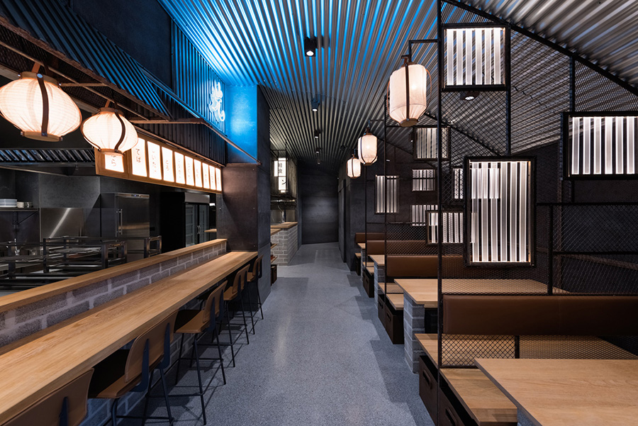
In 2015, we wrote about their Nozomi Sushi Bar, located in the same cool Ruzafa neighbourhood of Valencia as Hikari, and also designed by Masquespacio.
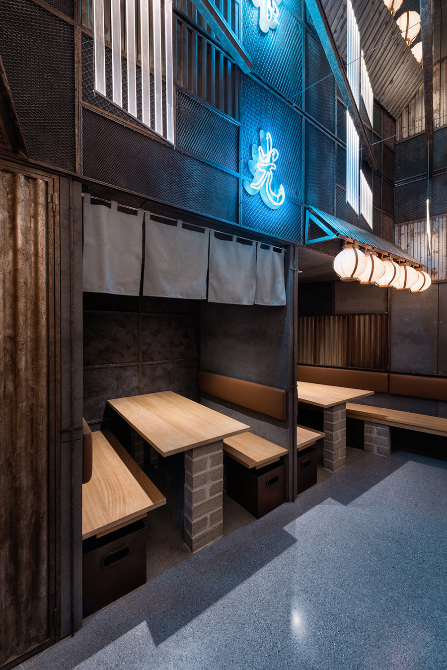
Hikari means “light” and one of the aspects of the project that attracted us from the start is the lighting. Interspersed with Masquespacio-designed, locally manufactured lighting are both neon signs and technical fixtures.
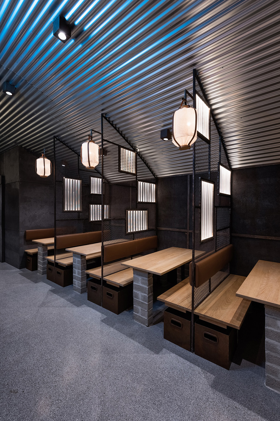
But the overall ambiance of not just the lighting, but the entire space is subdued, minimalist and slightly ascetic. Everything belongs and nothing distracts.
Those are, indeed, the definitive descriptive words for any great brand, any great environment and any great restaurant.
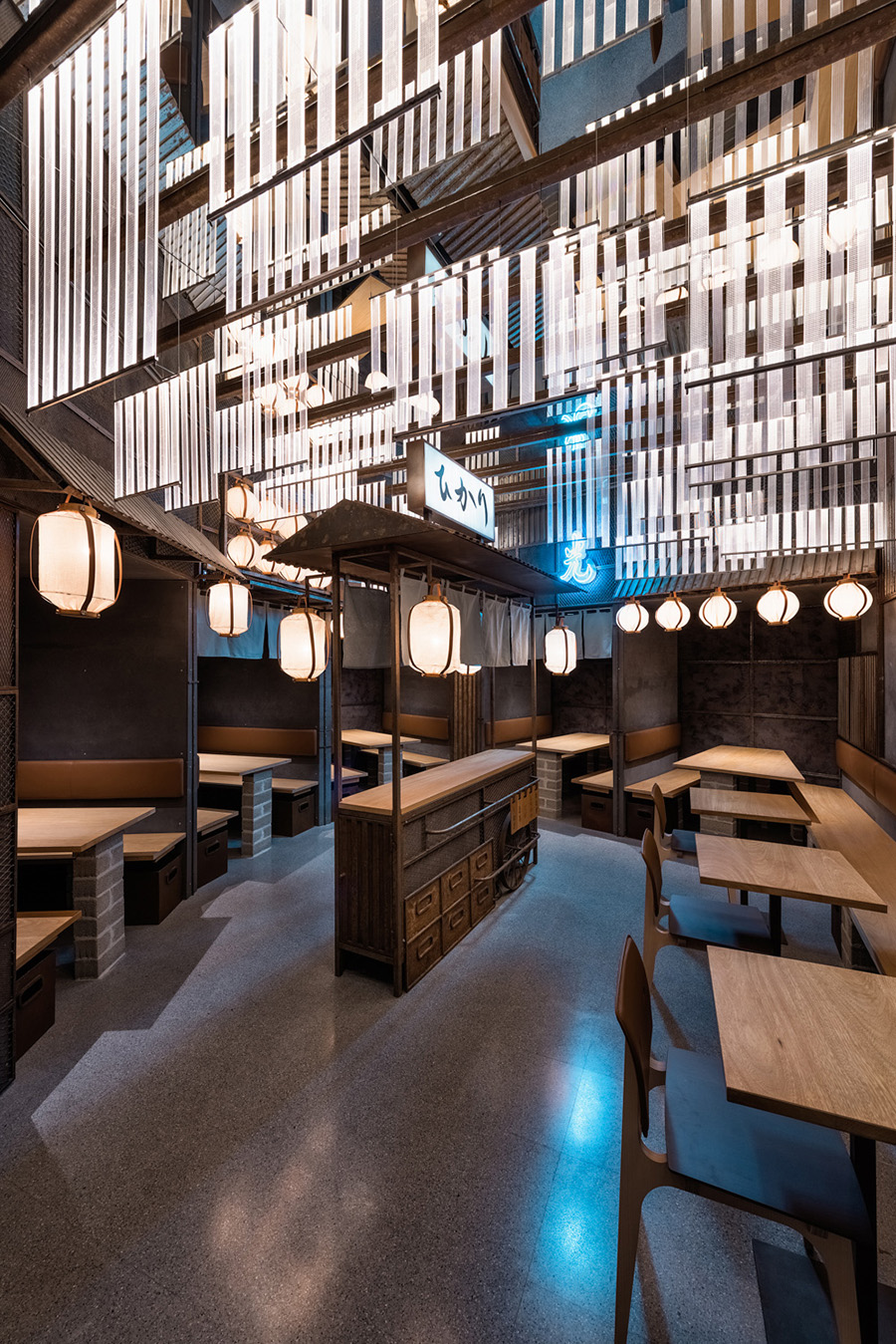
To achieve this coherence, everything in the experience must feel to the guest that it is where it should be. Interestingly, this can be achieved with all sorts of settings, from total chaos to extreme minimalism.
In the case of Hikari, Mascuespacio has emphasized this coherence with a well-edited material palette and with a visual language of orderliness and straight lines.
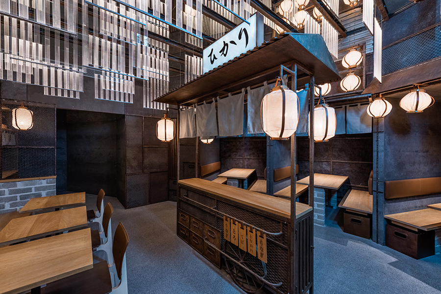
Tokyo’s chaotic alleyways and hard, urban vibes are discernible, but not overpowering. Tradition and harmony are equally present.
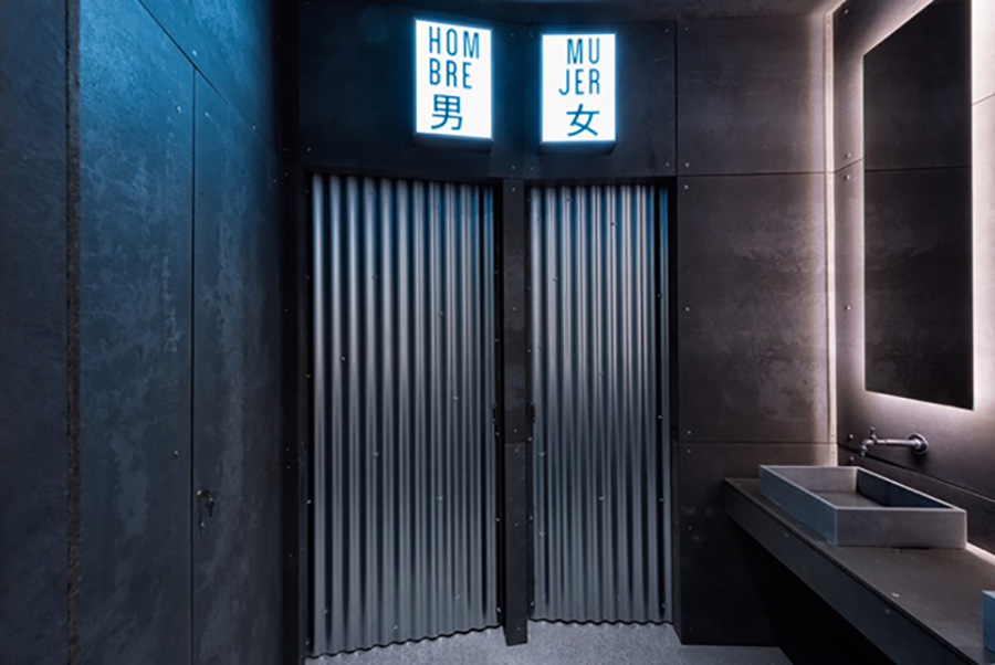
Our favourite details of Hikari are the corrugated-metal bathroom doors and the lantern-shaped lighting. – Tuija Seipell.
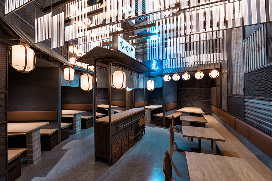 Photography: Luis Beltran
