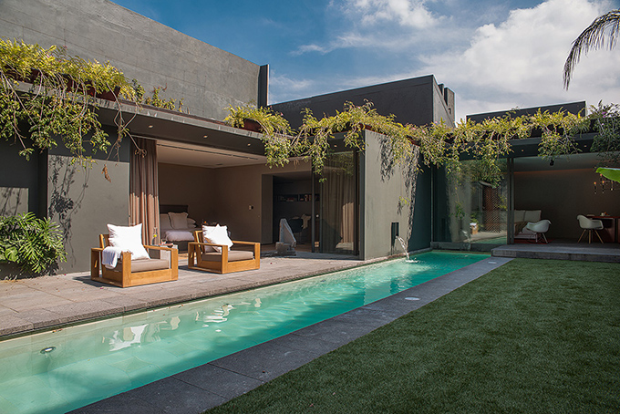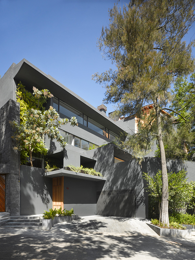
We had forgotten how beautiful grey concrete can be until we saw what Ezequiel Farca had done with a 1970s residence in Mexico City.
.jpg)
At the same time, we were also reminded of how much we love Farca’s elegant work in general.
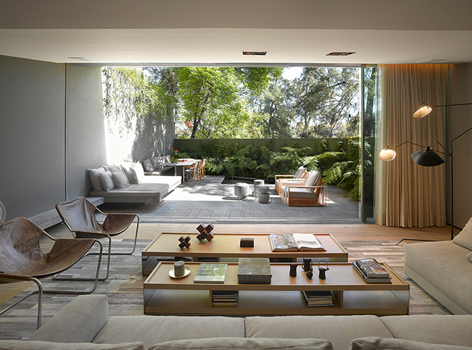
To start with, the Barrancas House in Mexico City had a lot going for it before Farca came along.
It is located on a sloped property so that the four levels of the house, from basement all the way to the top, or second, floor, are all in fact on ground level.
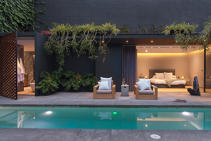
In addition, the site overlooks a great wooded area with grown trees and greenery. The house had good bones that Farca and team members Cristina Grappin and Fernanda de la Mora preserved and then took to a new level of cool, modern comfort.
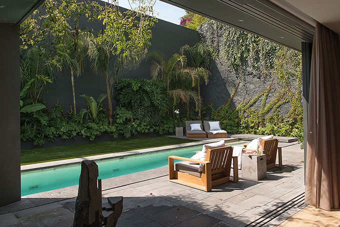
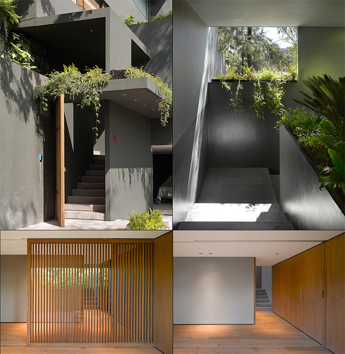
The 720 square-meter (7,750 sq ft) house is a family residence. Keeping that in mind Farca maximized the exposure to the views and daylight by opening up the rooms with floor to ceiling windows overlooking the woods. He also knocked down interior walls and replaced some with sliding screens and hidden doors and providing bay windows that open fully . All of these give the family members the option of creating specific spaces for their changing needs.
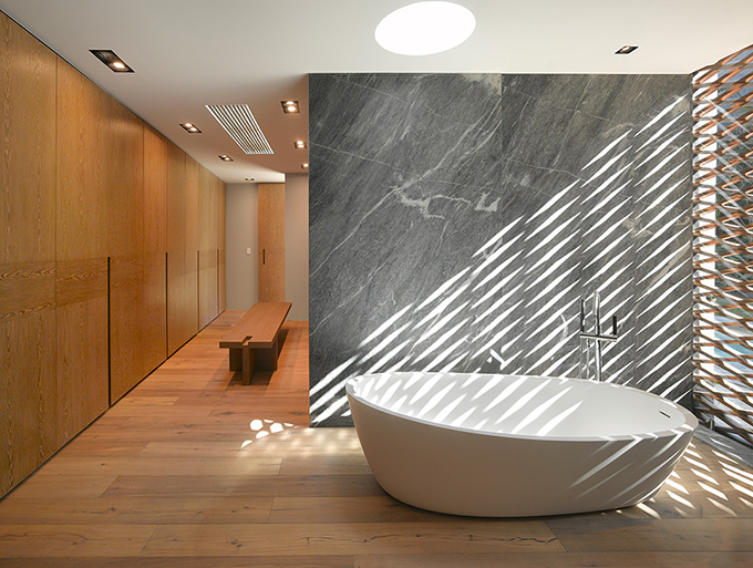
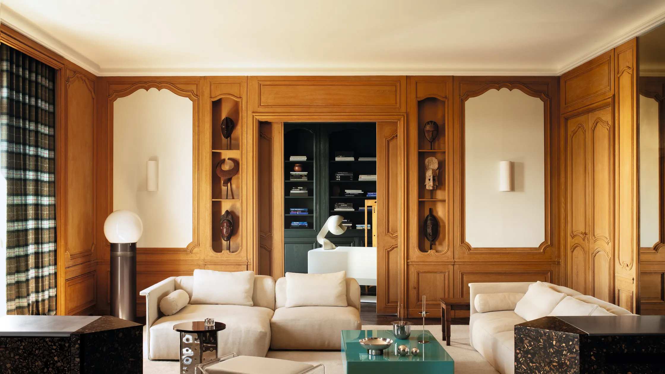
Much of the furniture was also custom-designed by Farca’s team for the Barrancas residence.
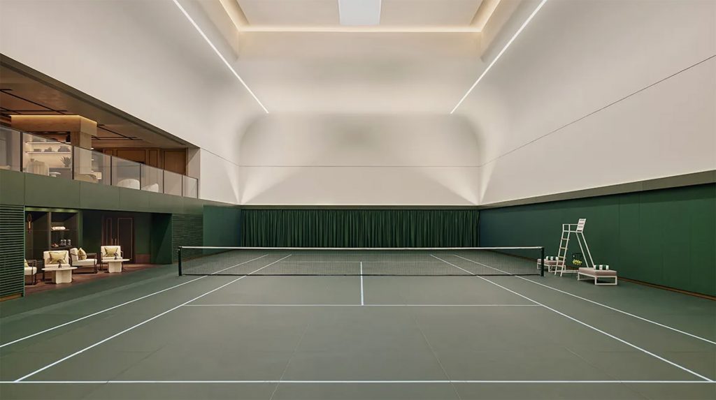
The new luxury amenities of the house now include a home theater, a wine cellar, a gym and two large terraces. Our favourite luxury features are the chic long pool on the topmost level and the skillful use of greenery both inside the residence and outside in the new garden.
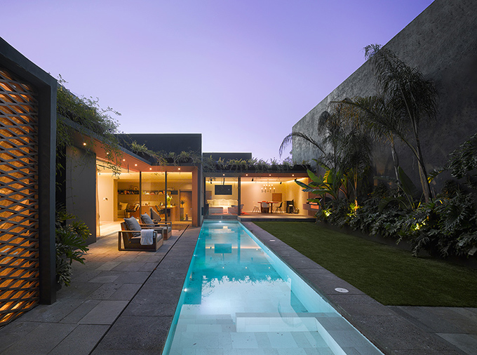
The landscape was designed with plants that adjust to the local climate, with green roof and green walls, it also has a solar energy system and a automatized water saving system.
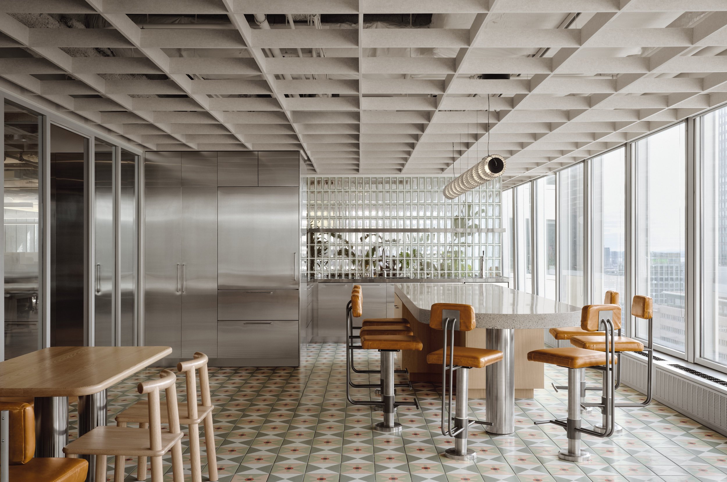
Marble, stone and wood dominate the interior, with earthy tones and neutral colours throughout. The interior flows seamlessly together with the exterior and all of that gives the sensation of expanded, unblocked freedom.
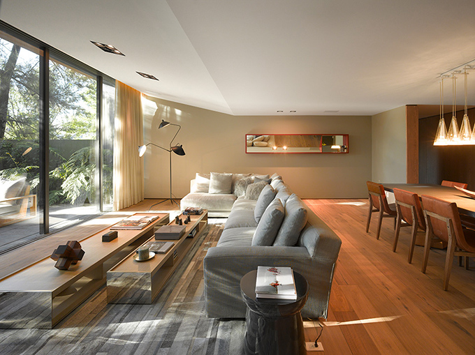
Ezequiel Farca and his team have achieved that tough-to-define and even tougher to accomplish harmony where the old and new coexist, where the exterior and interior belong together and where the meticulous design work does not honk its own horn but instead, stays stylishly in the background where it belongs. – Tuija Seipell.
Photography: Jaime Navarro, Roland Halbe
