Lyndon Neri and Rosanna Hu, the husband-and-wife team behind the Shanghai-based “design and research office” Neri & Hu have had their bold work recognized in many ways over the 12 years their office has existed.
In a Wall Street Journal article, Neri explains how he grew up in the Philippines, studied at Berkeley and Harvard and worked with his wife for the American architect Michael Graves. Yet, they returned to China and have since created a remarkable body of work in residential, hospitality and retail projects.
As an architect, Neri strives to take control of the entire project, the way architects in the early history did, so that the components do not appear to be coming from different creative directions.
Many of Neri & Hu’s projects exude a confidence and bravery that is uncommon in the retail and hospitality design world where each new project seems to be a slightly embellished copy of the ones before.
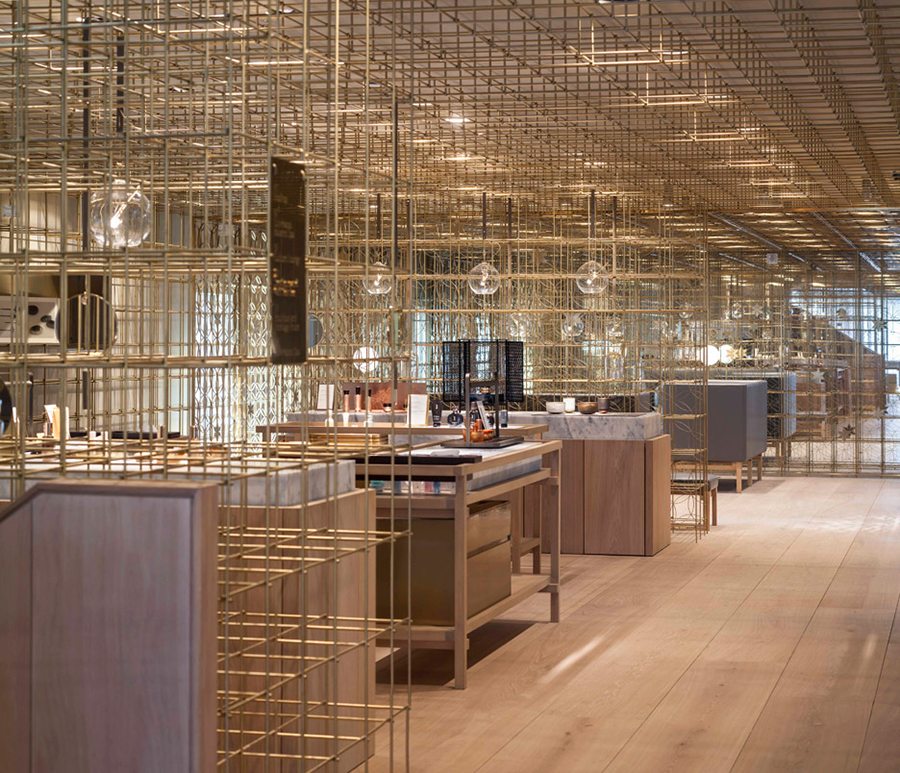
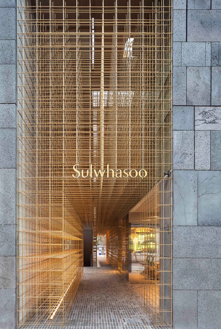
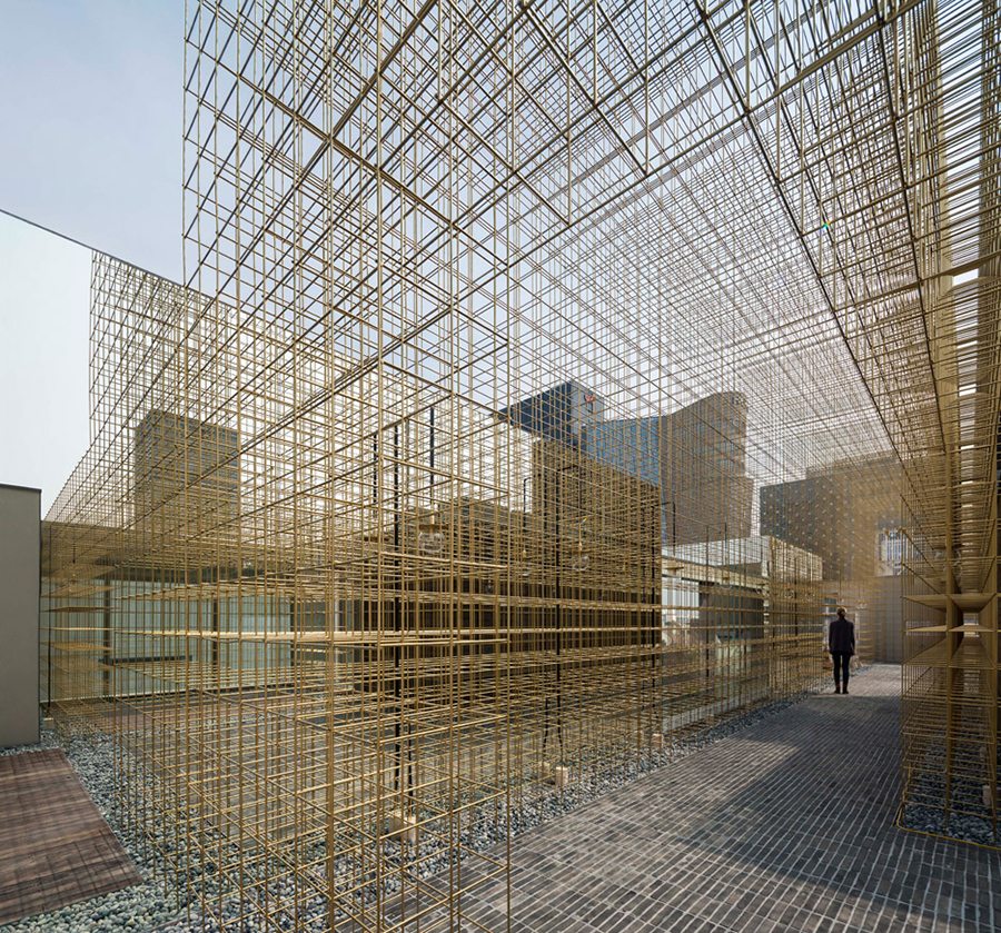
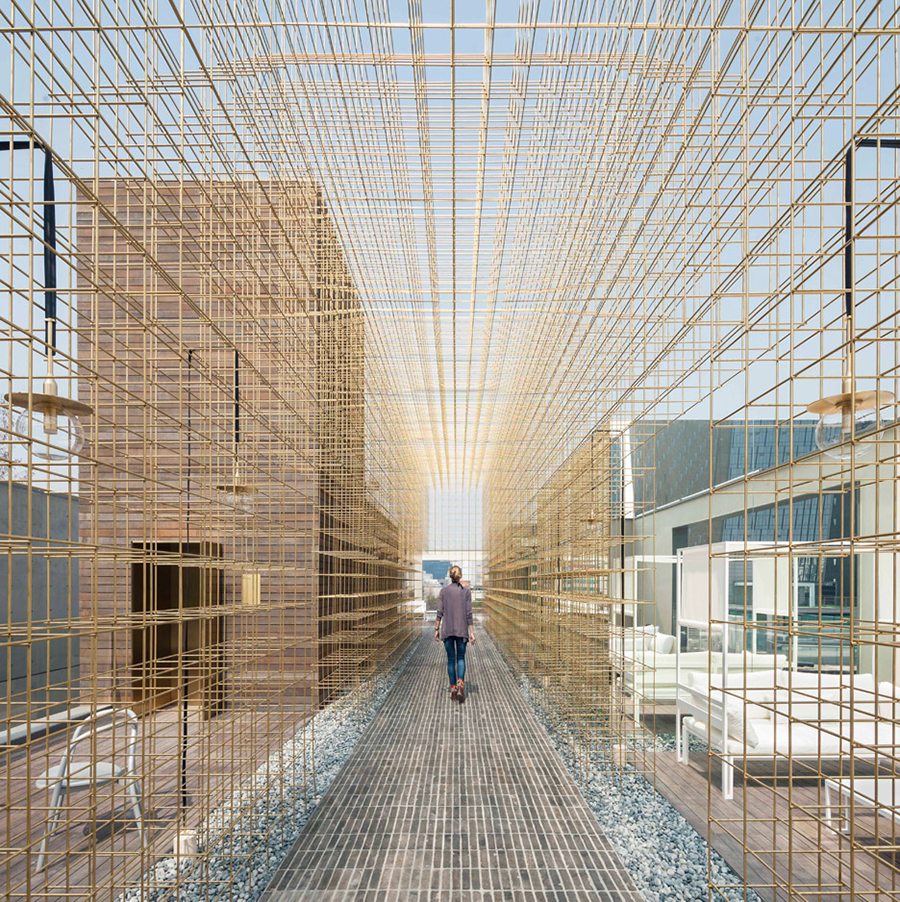
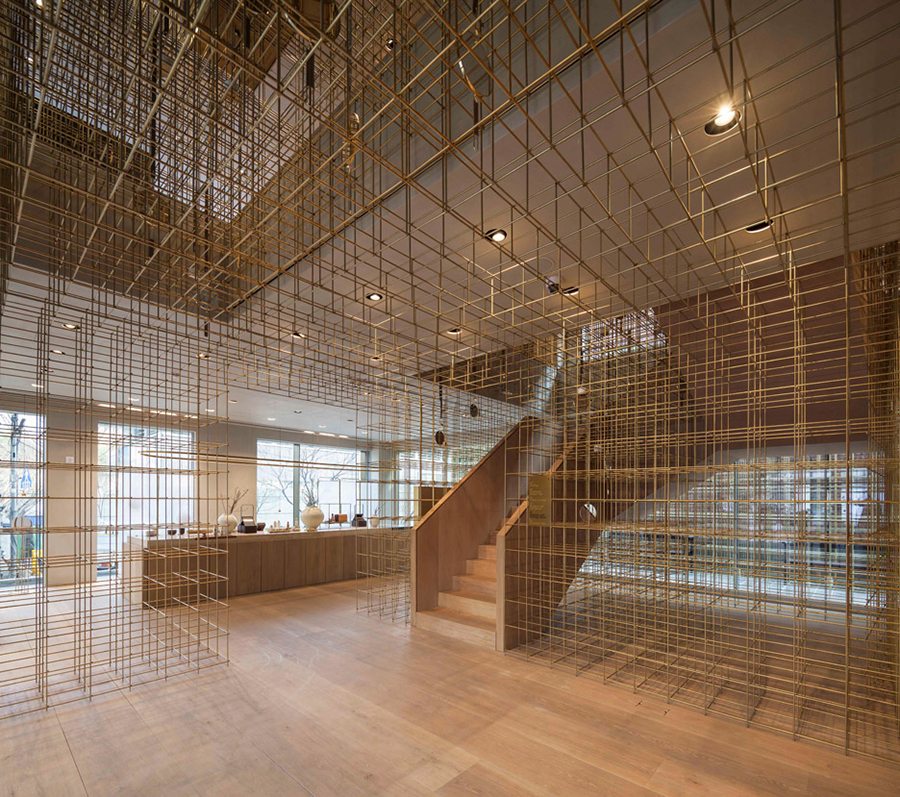
In the first-ever dedicated retail store for the well-known Korean beauty brand Sulwhasoo, Neri & Hu’s team used a startling, dense grid of brass that according to the designers refers to the importance of lanterns in Asian culture as illuminators of travel and markers of beginnings and endings.
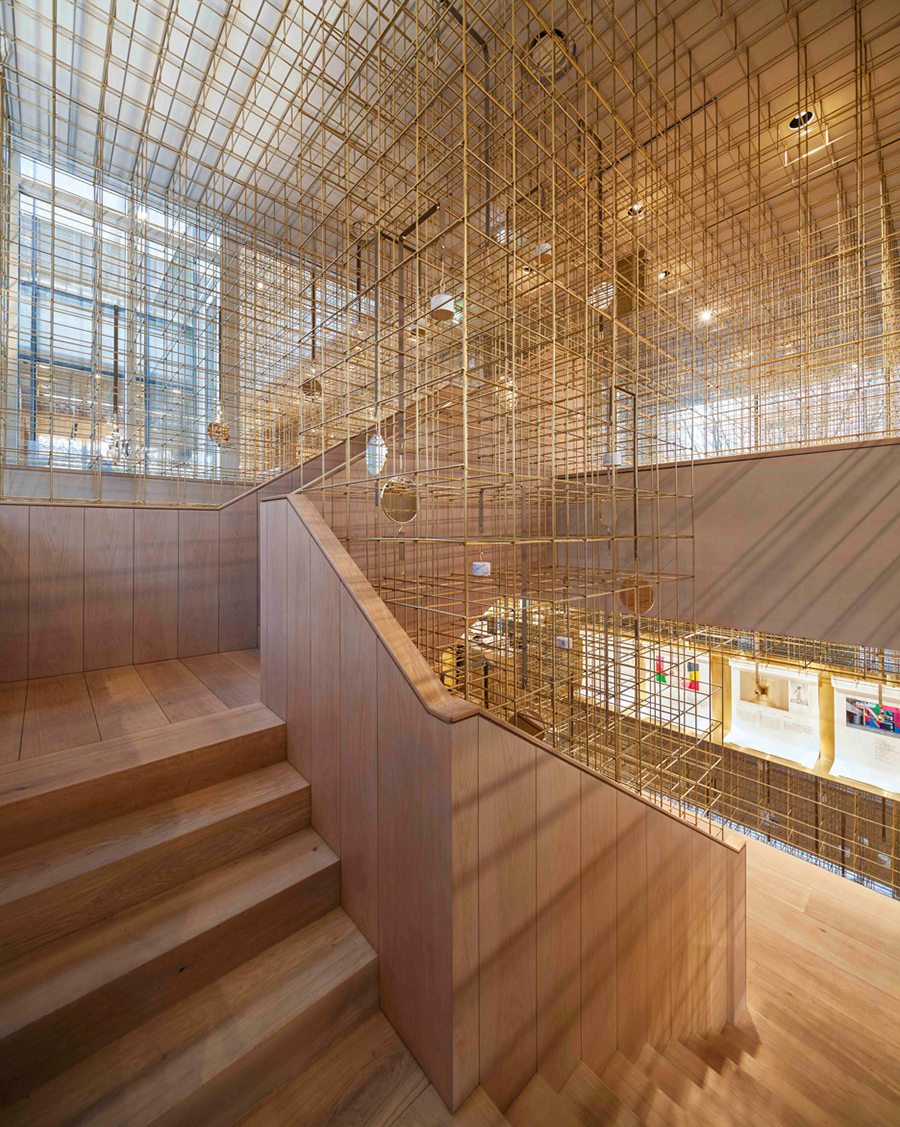
More specifically, the design concept seems to fly in the face of the “known facts of retail” especially the ideas that every square inch counts and merchandise should be the main focal point.
In Neri & Hu’s concept for Sulwhasoo, the dense lattice grid wastes space with abandon and overpowers the entire multi-level structure that is slightly softened by the wooden floors, round mirrors and suspended light fixtures. Merchandise takes a secondary position to the structure, yet the lattice leads the customers to each of the display section and spa in a determined fashion.
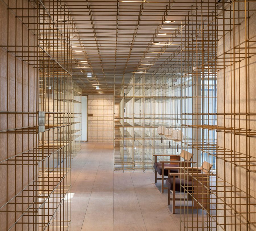
The first floor houses the main boutique, gift-wrapping and auditorium, while VIP rooms, lounges and spas are located above and below. The colour palette becomes lighter and lighter as the visitors move from the dark basement floor with the main spa toward the roof terrace with city views.
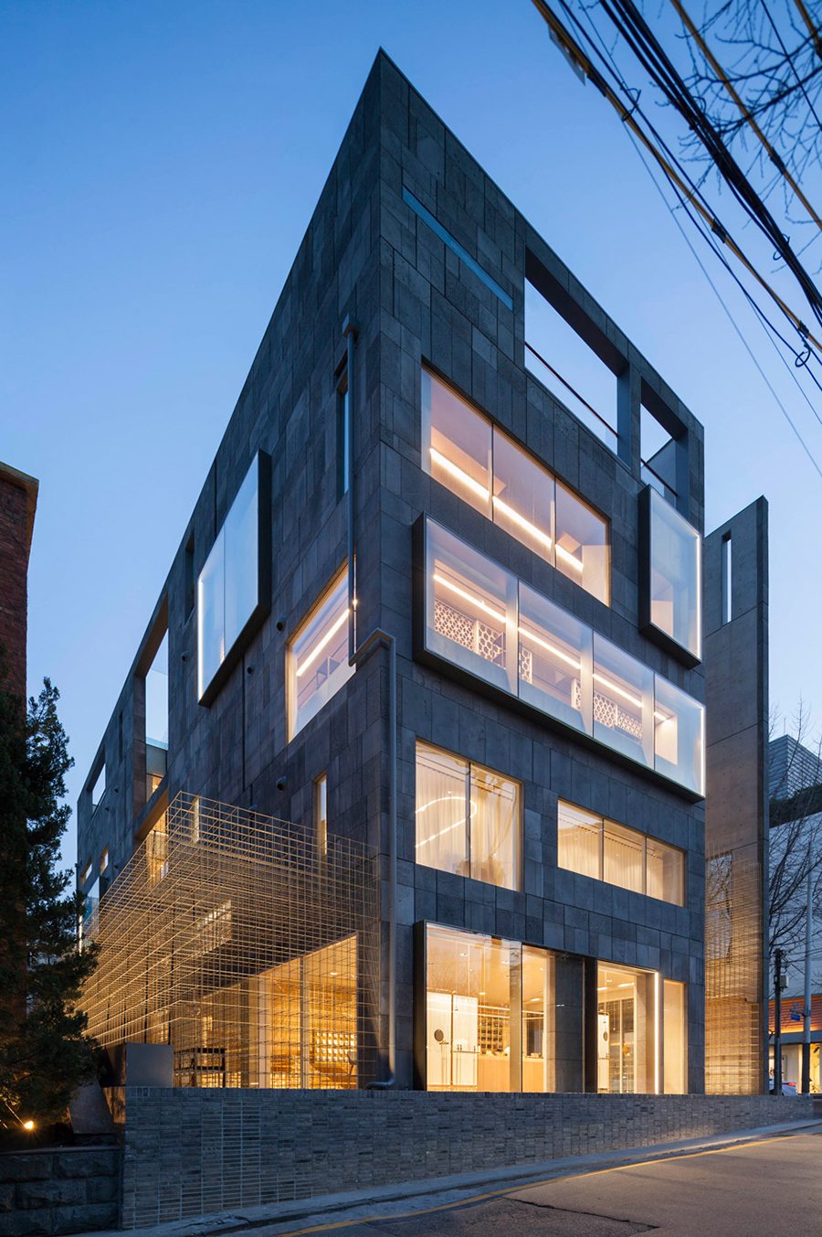
“The journey is a constant contradiction between two counterparts: enclosed to open, dark to light, delicate to massive,” the architects wrote in their statement. – Tuija Seipell.


