Last fall, José Miguel Herrera and Nuria Morell closed their popular SushiHome restaurant in Valencia, Spain. Fans and patrons were surprised, but they did not have to wait long for the answer.
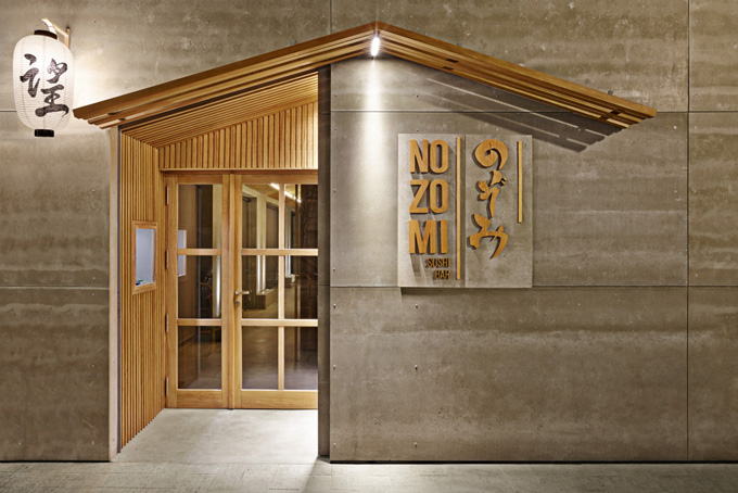
In December, the couple opened Nozomi Sushi Bar in the funky Ruzafa neighbourhood of the city.
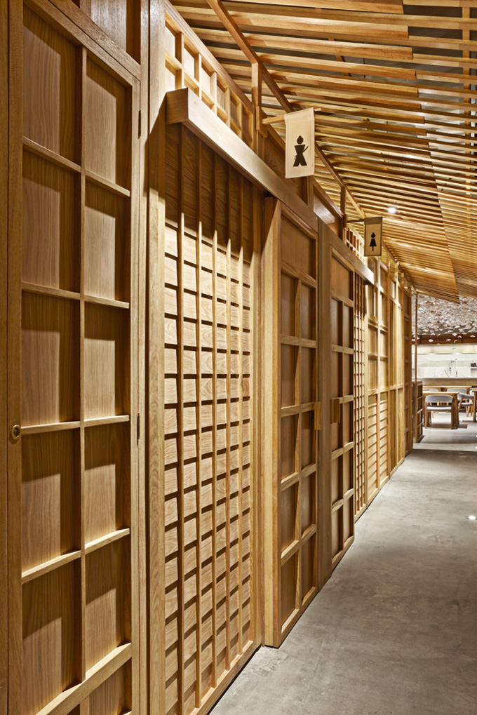
For interior design and branding of their new venture, they employed Valencia-based creative consultancy Masquespacio established in 2010 by Ana Milena Hernández Palacios and Christophe Penasse.
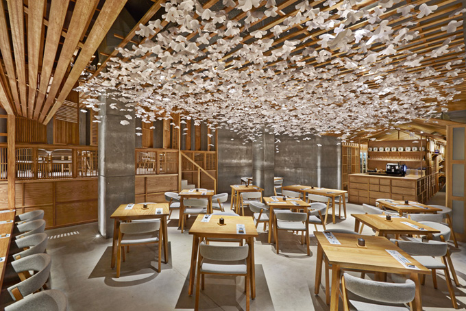
The founders selected the name Nozomi, popular for restaurants and businesses, including the Japanese bullet train. It is a lovely word with dual connotations. The word itself means wish or hope in Japanese and with the bullet-train implications, it also signifies efficiency and modern lifestyle. The whole project was then envisioned around two concepts, ’emotional classic’ and ‘rational contemporary.’
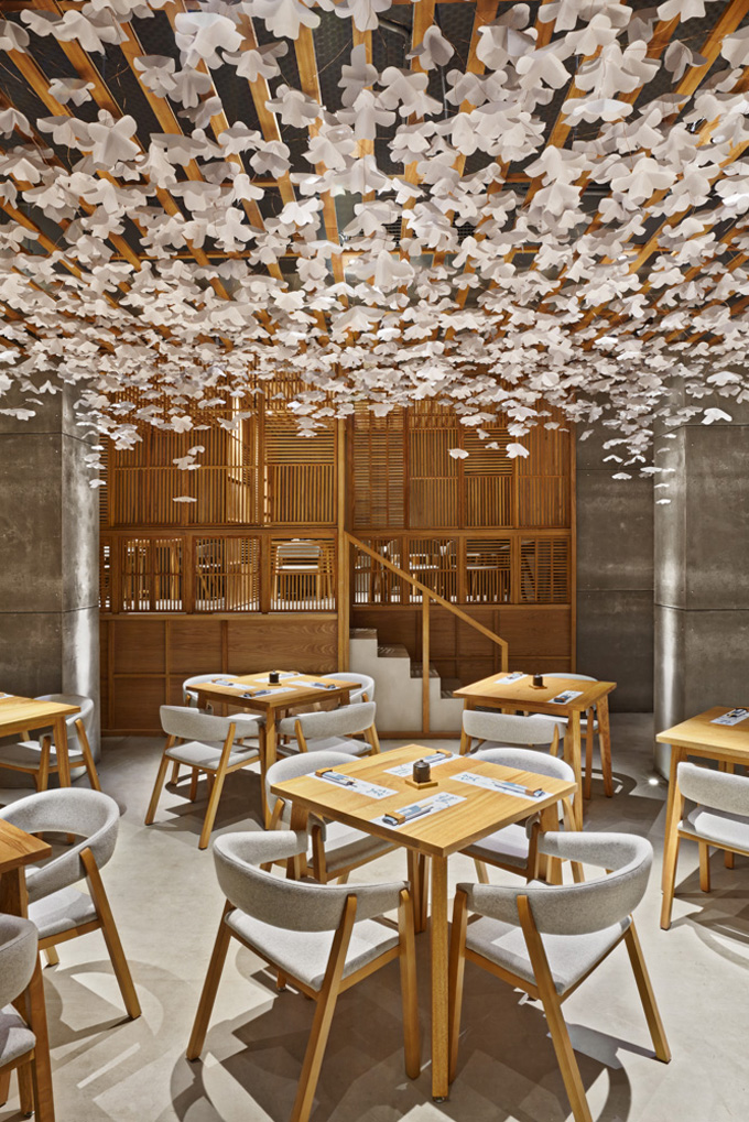
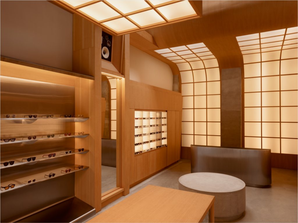
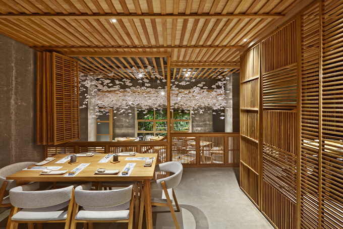
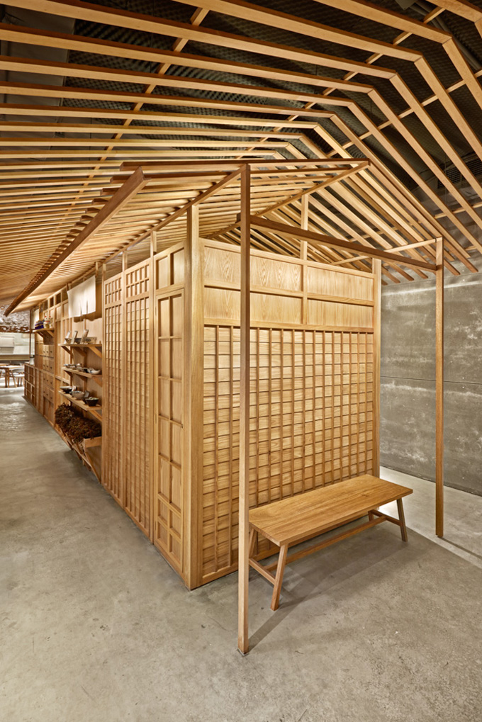
In the 233 square-metre (2508 sq.ft) space, Hernández Palacios, creative director for this project, managed to evoke the feel of a Japanese street. ‘We have been studying photography from the most authentic Japanese streets with the aim to create a reinterpretation on a metaphoric way of those streets,’ she says. Nozomi Sushi reminds many people of a typical street in Kyoto where traditional Japanese houses are well preserved.
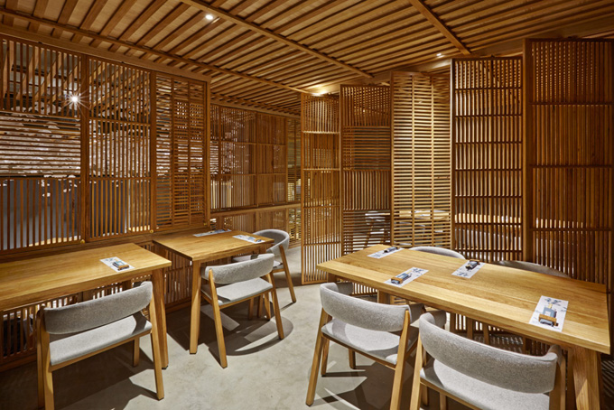
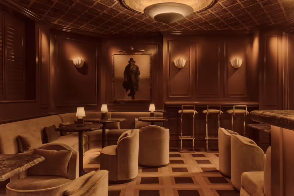
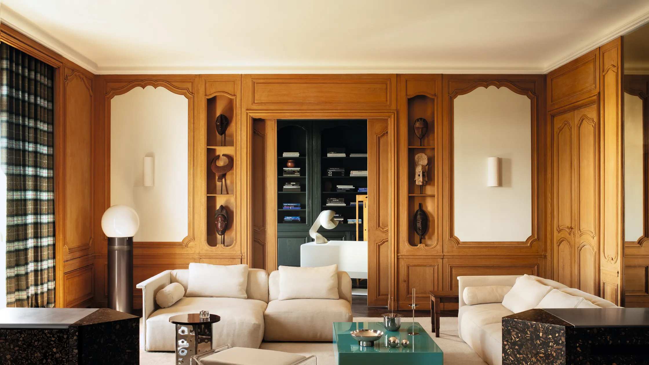
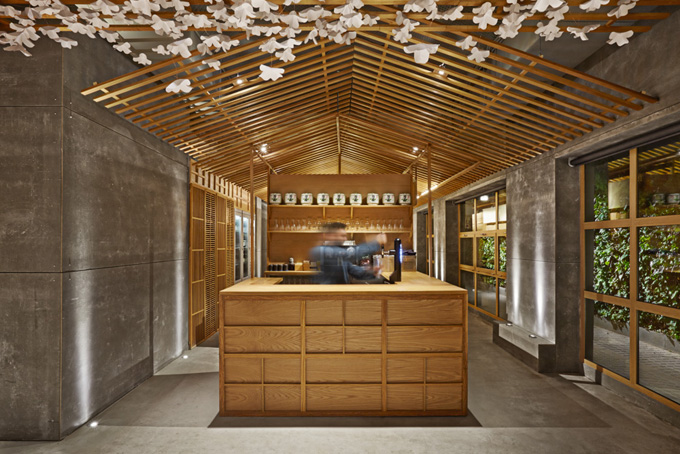
The best feature of the restaurant is the overall quiet balance. It does not appear to be trying too hard like so many concepts today. Instead, it feels natural and coherent with its light-weight wood slats, shelves and partitions contrasted with the strong and solid concrete features.
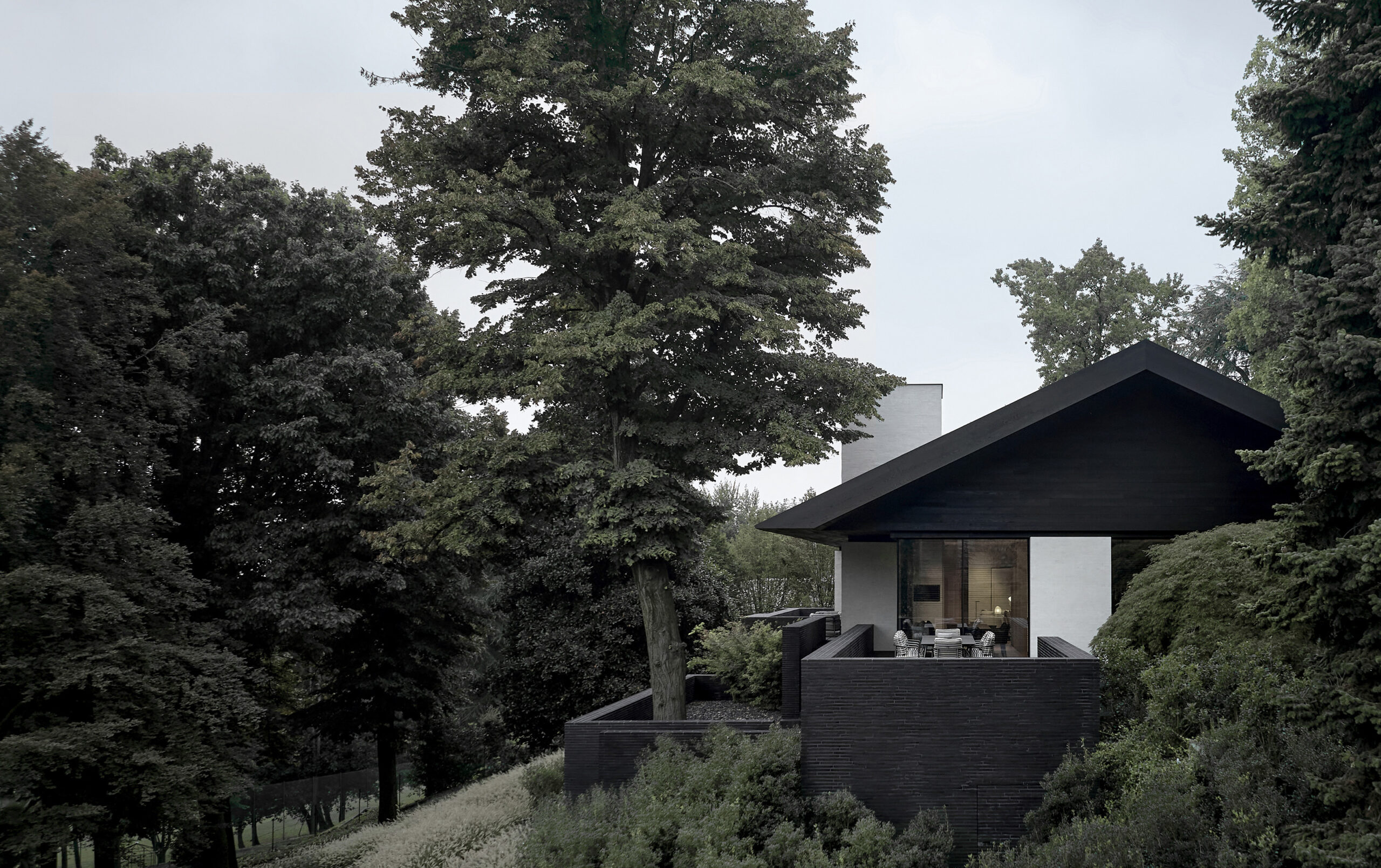
We love the entrance where the slanted-roof overhang creates a nice play with scale. The otherwise quite basic doorway now appears both inviting and intriguing.
Inside, the chefs ply the ancient trade of sushi – the original fast food – behind a neutral bar with a fantastic origami-inspired cherry-tree-blossom ceiling above them. – Tuija Seipell.
Photography: David Rodríguez y Carlos Huecas.


