Chinese cosmetics firm Harmay began in 2013 as an online-only operation selling its own brand and international imports via the Alibaba-owned shopping platform Taobao.
By 2015, company CEO Damien Zhong was convinced that a real-life Harmay shopping experience would fit perfectly into the lifestyles of the brand’s young and adventurous target clientele. This was not the opinion many held about the future of cosmetics retailing. Many were predicting the end of brick-and-mortar stores in this category.
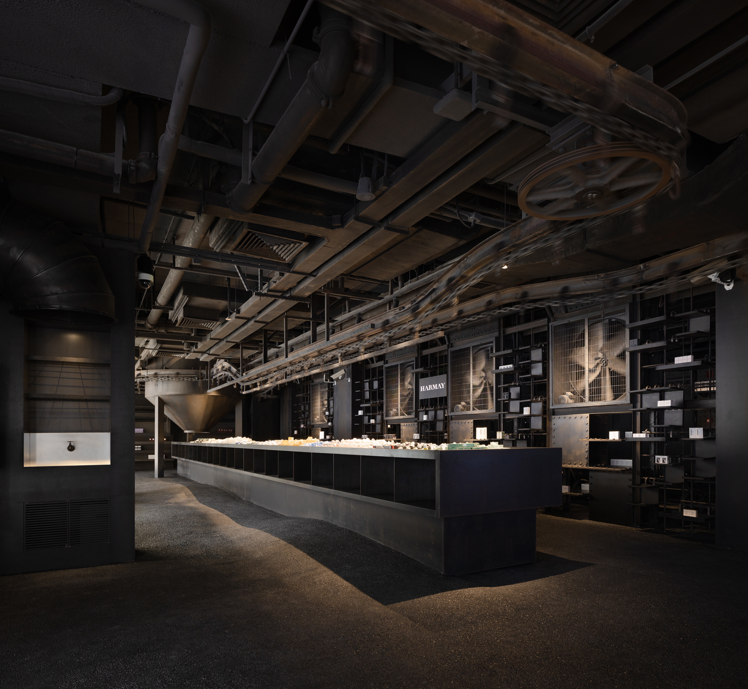
Now, having just opened Harmay’s newest store in the mainly underground shopping centre at the completely reconfigured Xidan Cultural Plaza in Beijing, Zhong has been proven to be more than right. Harmay’s customer base is steadily growing and this, the brand’s sixth retail store, is yet another testimony to the correctness of its bold approach to cosmetics retailing and to retail design specifically.
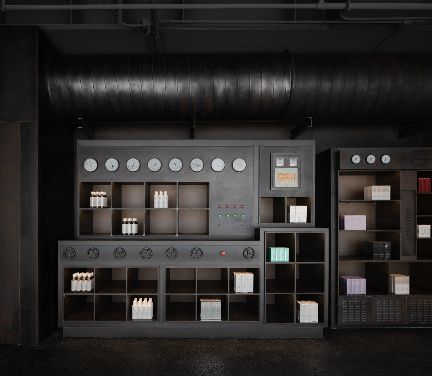
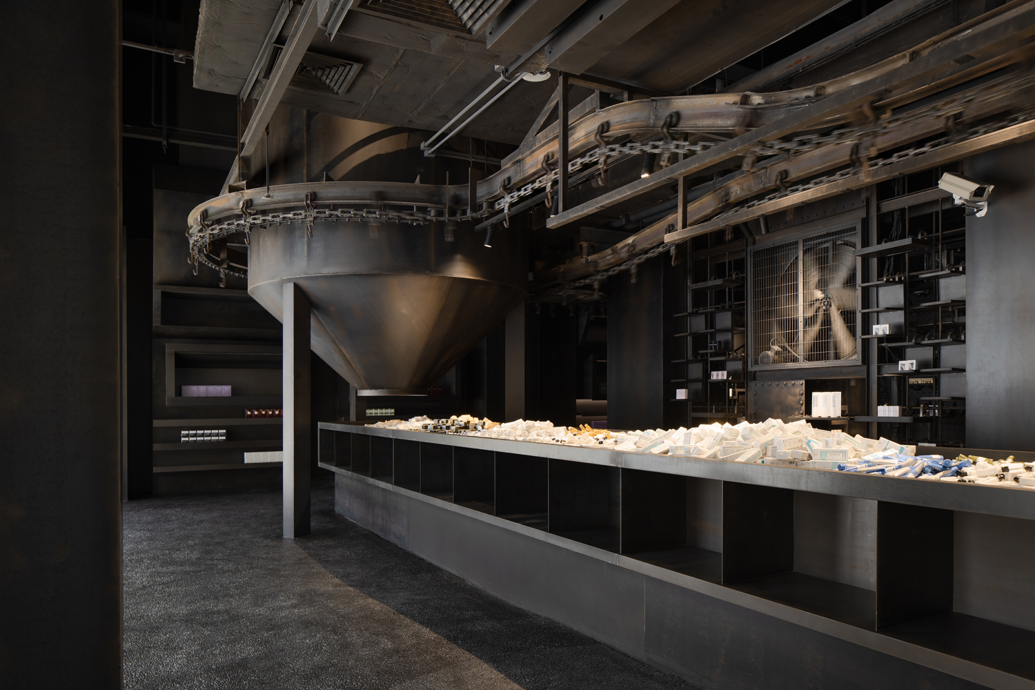
As all of the Harmay stores, the new 880 square-metre (9,473 sq. ft) store was designed by Shanghai-based AIM Architecture. The store’s theme is ‘chaos and order’ and the designers channelled the underground location by imagining an apocalyptic space ship dug up from the deep soil of Beijing.
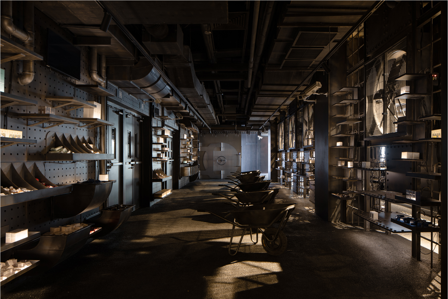
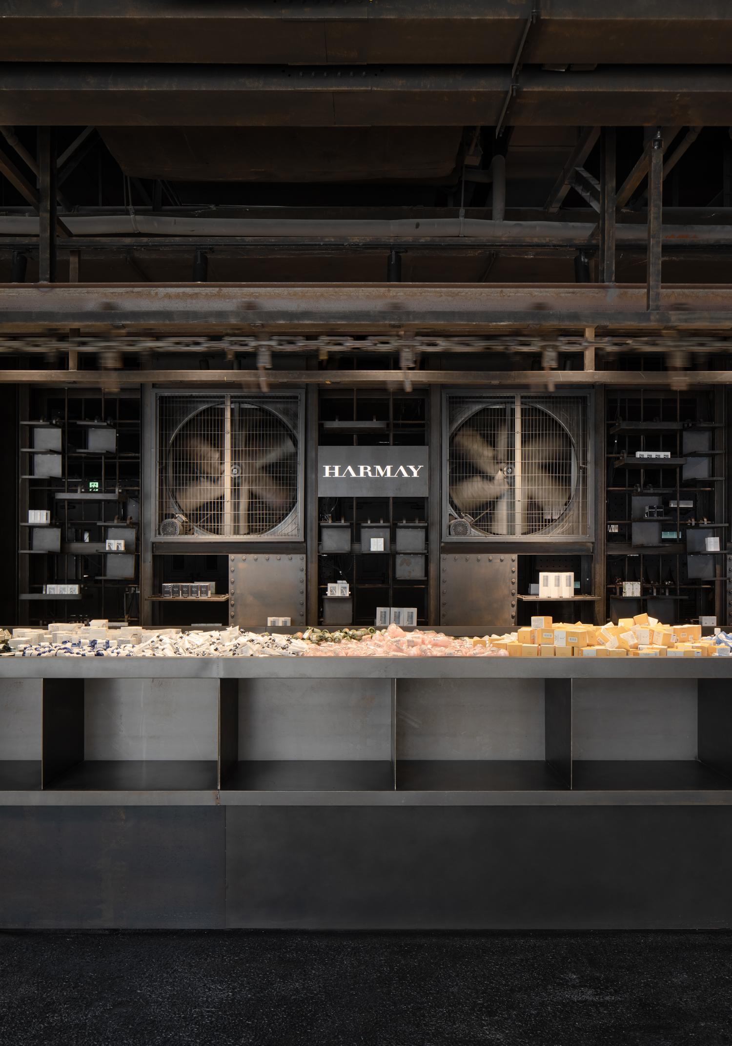
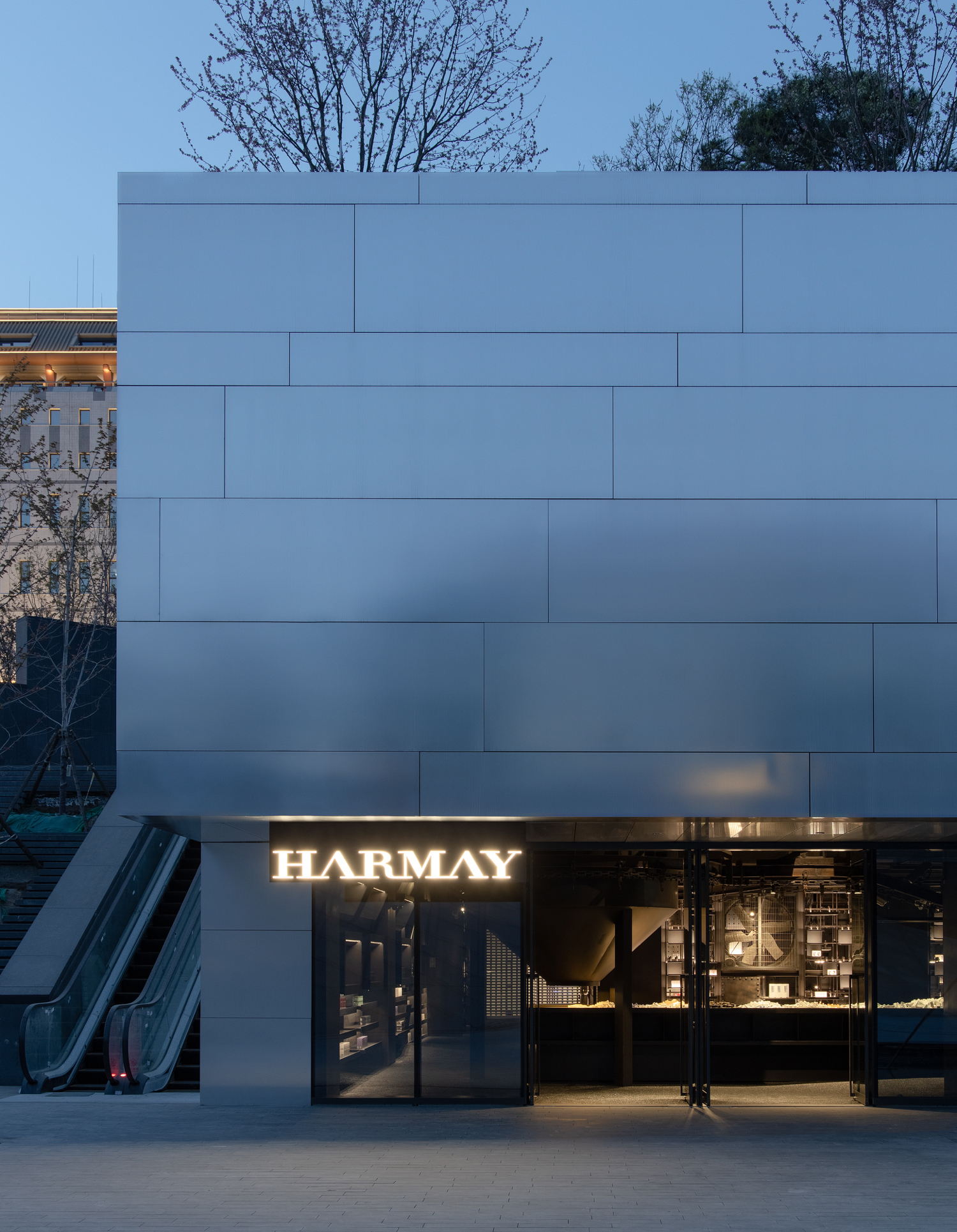
The unassuming front entrance does not predict what is inside. There is a crude, steam-punky feel of dark, industrial toil in the main ‘factory’ hall where a row of wheel barrows and a 14-metre-long metal work table are laden with product. There are chains and rails above, funnels and fans on the sides, all part of the faux factory setup that invites the customer to “work” on the conveyer belt and touch the products on the long counter.
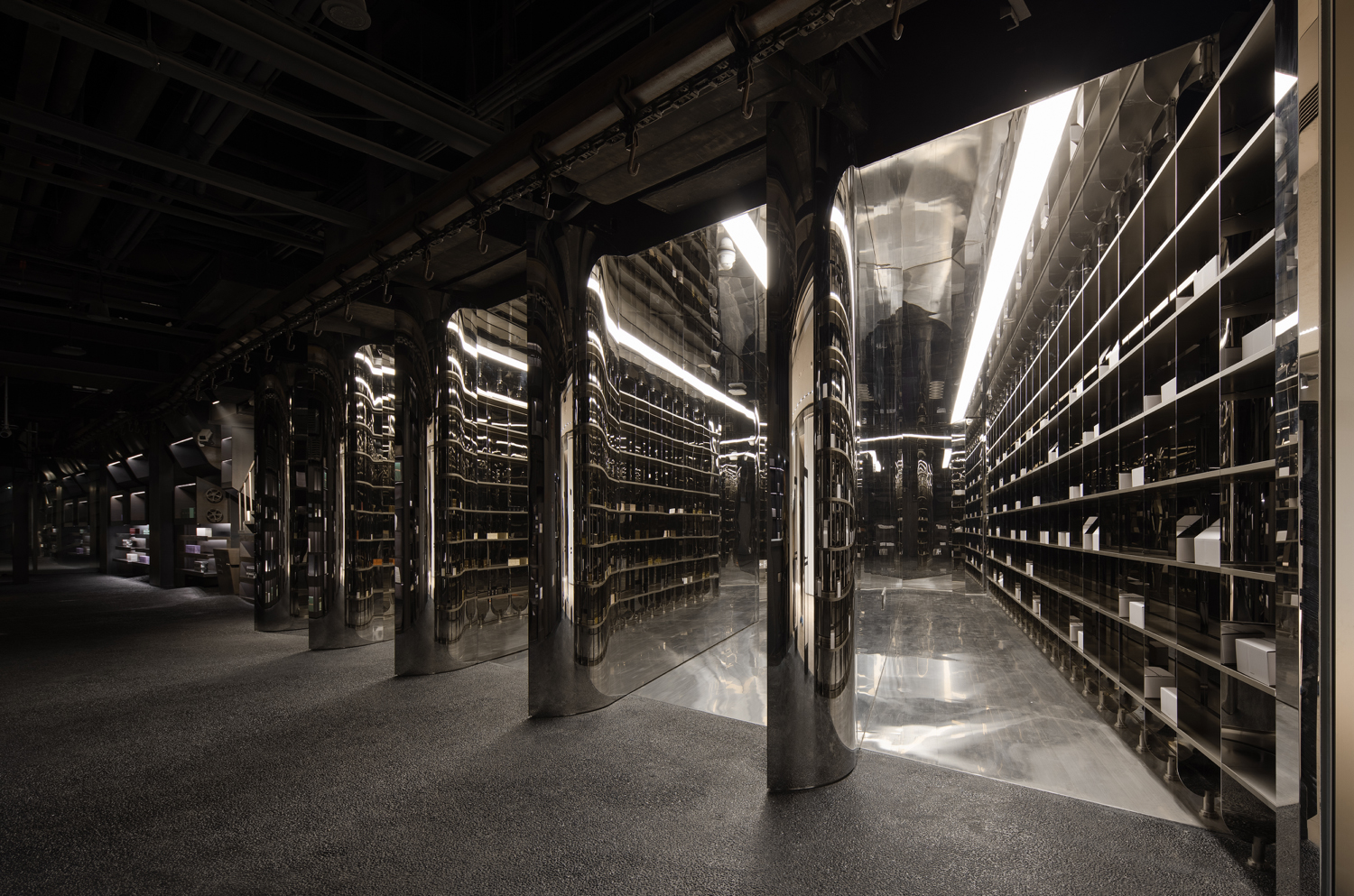
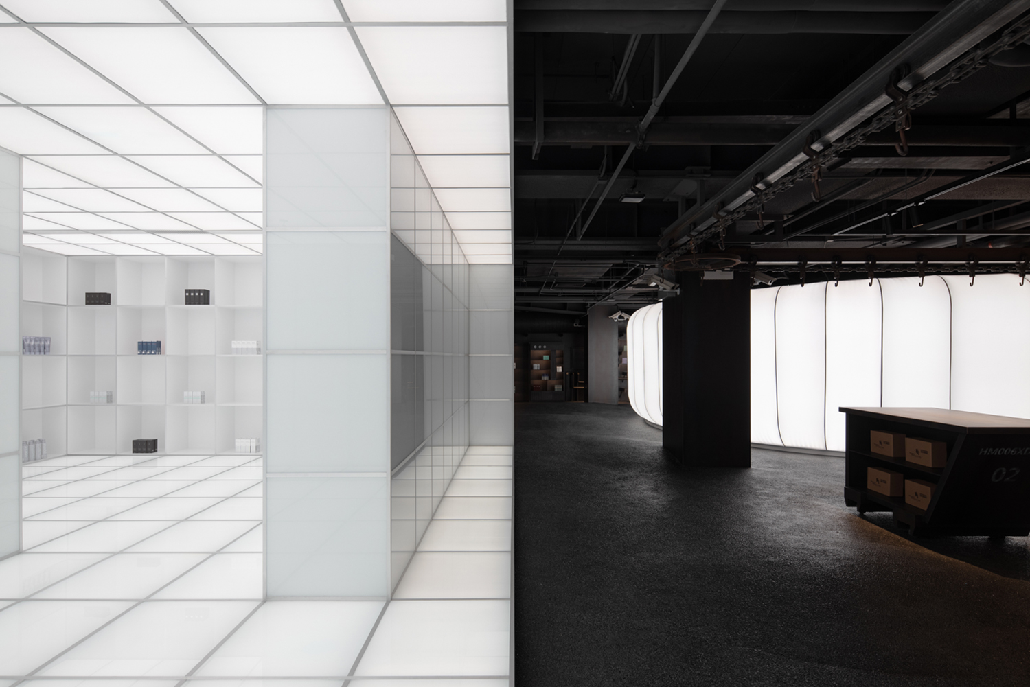
In total contradiction to this, there are areas of over-lit whiteness, starkly sterile, Space Odyssey-like spaces with scarce product displays in extreme order on unadorned shelves. Unpredictability is one of the hallmarks the Harmay brand’s.
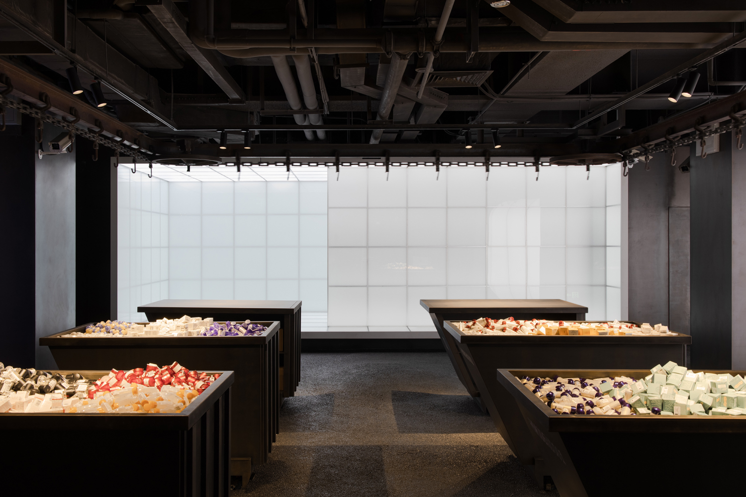
What is also remarkable in all of Harmay’s stores is the dissimilarity between them. Each has its own visual language that channels the location but also tells a fun story and invites discovery. In the Hong Kong store the inspiration was a traditional apothecary but interpreted in a new way. One of the Shanghai stores was inspired by what the space was before – a hotel kitchen. The first Beijing store took its inspiration from an airport with ‘luggage’ belts and check-in counters.

What is consistent in all Harmay stores is that the customers are left alone to test and touch and experience shopping in a tactile and participatory way with no pushy sales people hovering above them.
The name Harmay comes from CEO Damien Zhong’s favourite Chinese treat, prune-flavoured gum drops called hua mei tang – -tangy, sour and sweet. Loosely phoneticized, hua mei sounds like Harmay. The brand now has two stores in Shanghai, two in Beijing, one in Chengdu and one in Hong Kong.
AIM Architecture was established in 2005 by Wendy Saunders and Vincent de Graaf. Saunders was born in Bruges, Belgium, and graduated from architecture school in Ghent. Dutch-born De Graaf holds a Masters in Interior Design from Maastricht and a Masters in Architecture and Urban Planning in Amsterdam. Tuija Seipell


