Black and white are the safe choices in the design world. The colour of luxury is elegant and subdued. Yet, at the same time, even top-tier designers, artists and luxury brands have always used bright colours as well. It is not about either or. It is not black-and-white or colour.
Just try telling those who love Dale Chihuly’s art, Versace interiors, Karim Rashid’s Corian eco-house or Renzo Piano’s Central St Giles facades in London that the ‘designer look’ is always predominantly black and white.
.jpg)
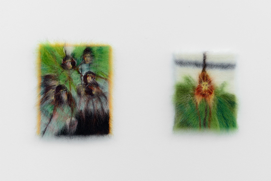
And although bright colour is often associated with being a sort of primitive, wild, folk-art aesthetic, and therefore black and white would seem the serious and civilized alternative, colour is not just wild, frivolous, and primitive.
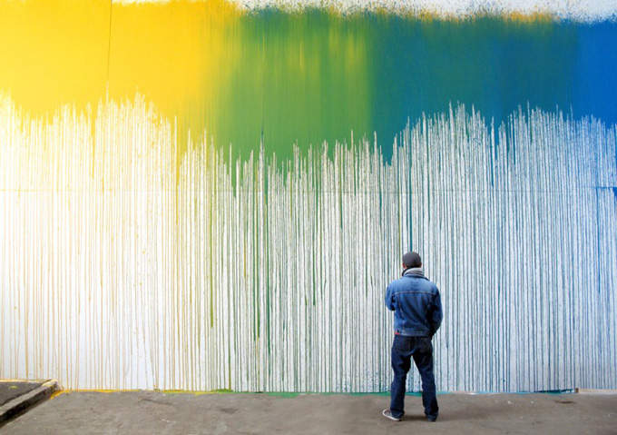
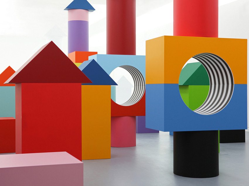
Just think of your favourite brand’s logo and you will most likely visualize some colour. Imagine a weekly market at a Peruvian mountain town, an Indian wedding party, a Norwegian fishing town, Marimekko fabrics, a Cirque du Soleil show or Avatar, and you cannot avoid feeling uplifted and happy because of the colours.
.jpg)
.jpg)
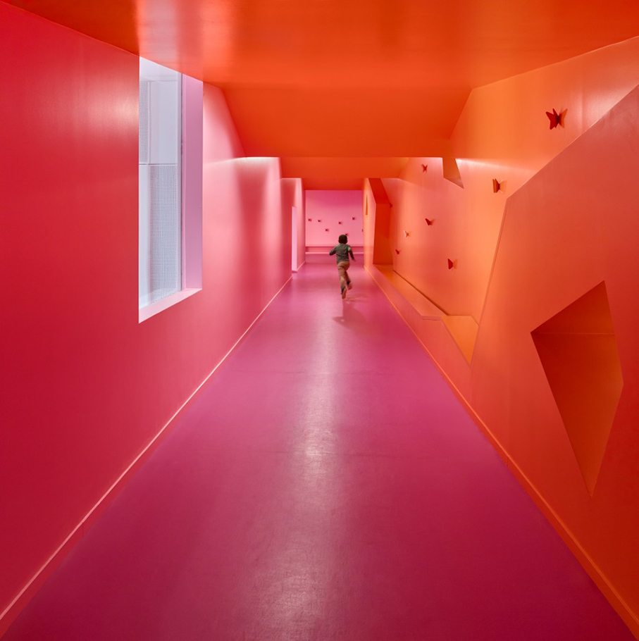
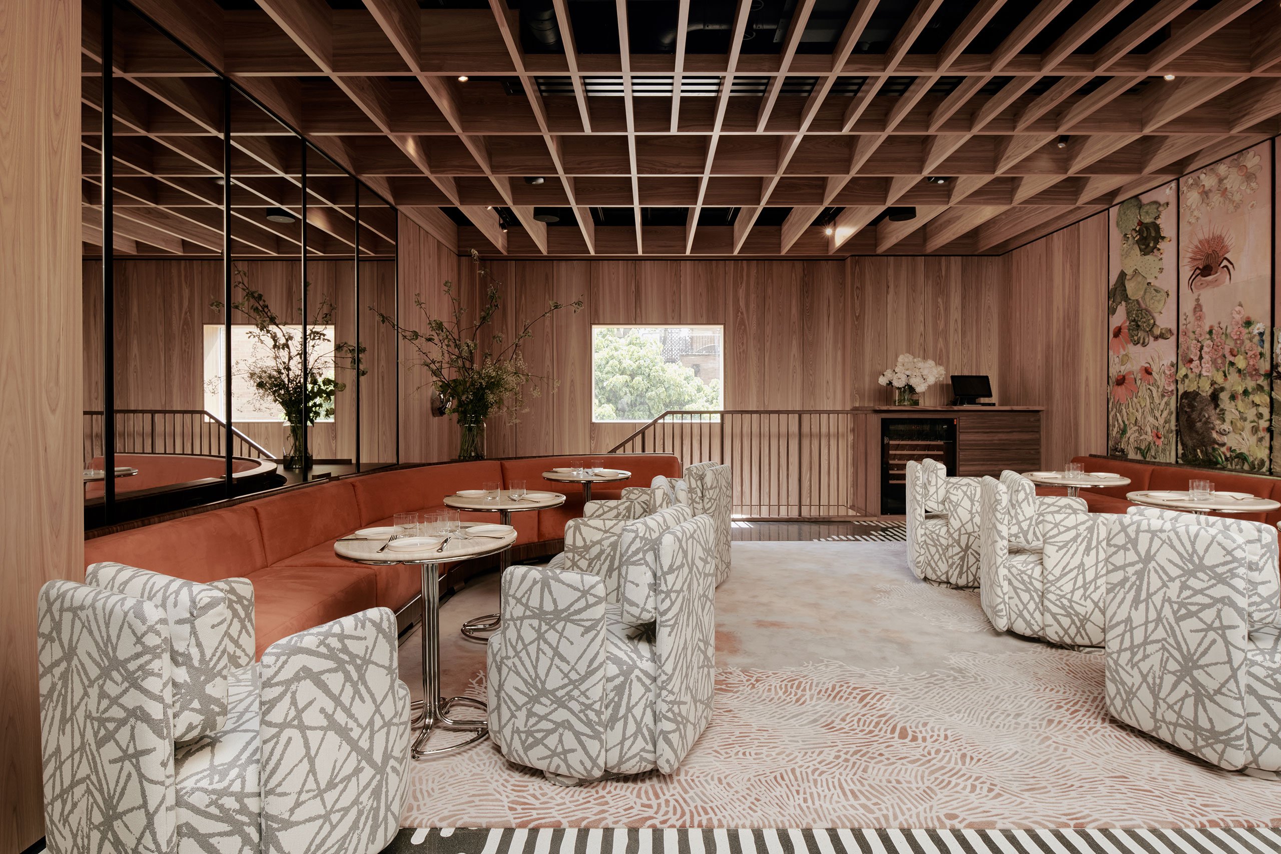
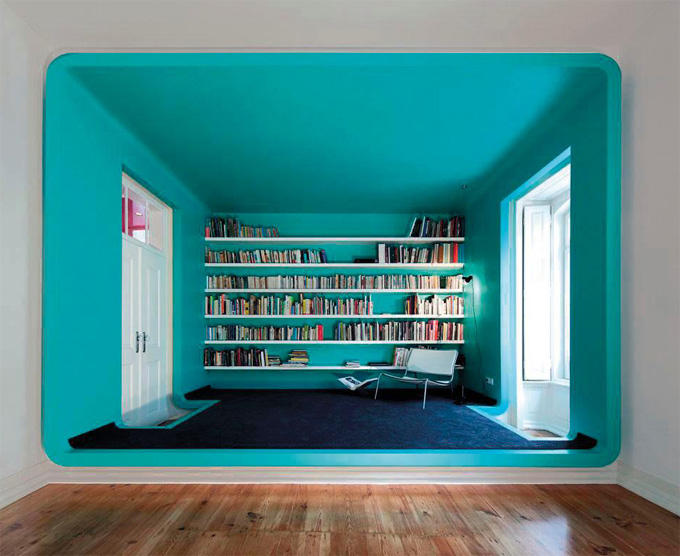
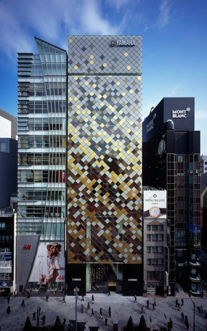
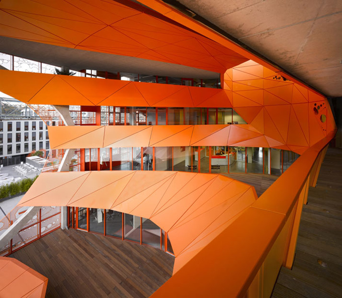
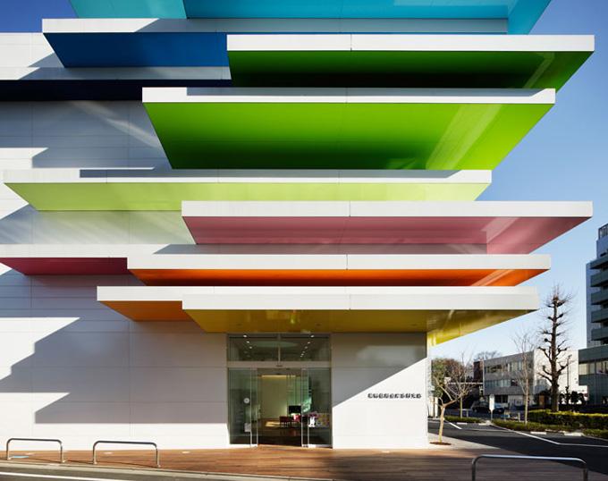
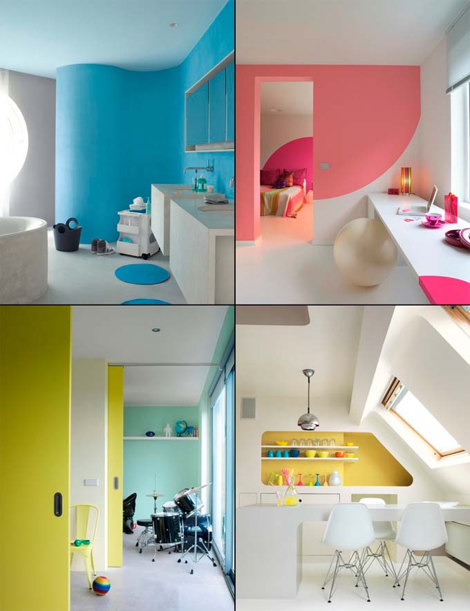
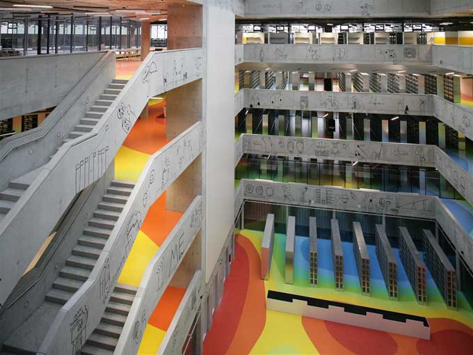
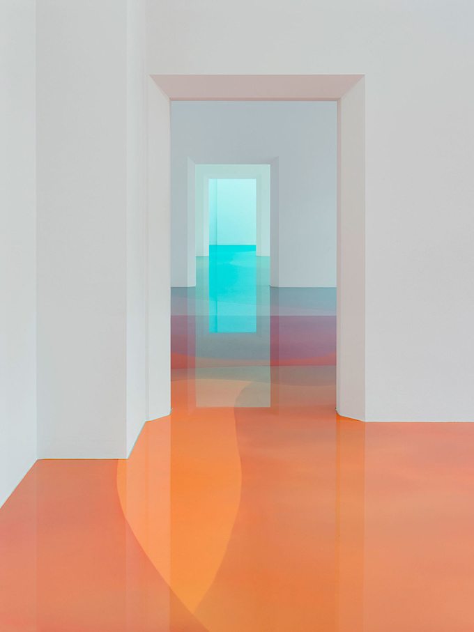
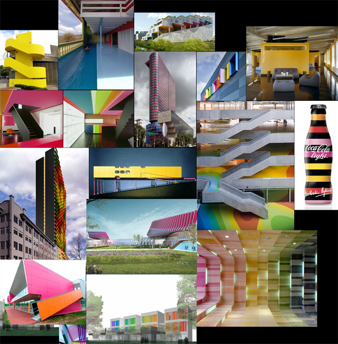
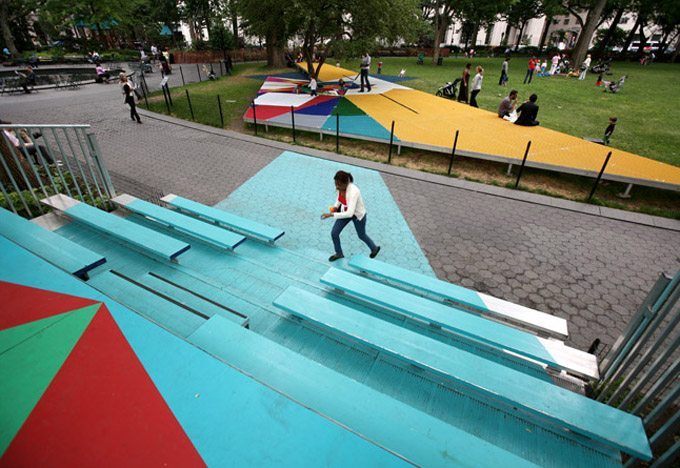
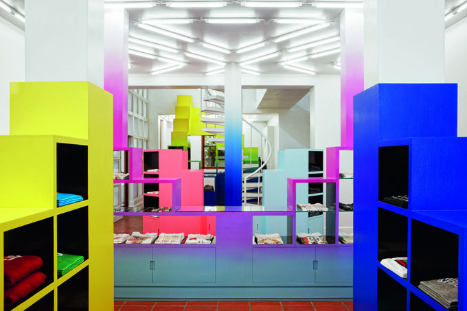
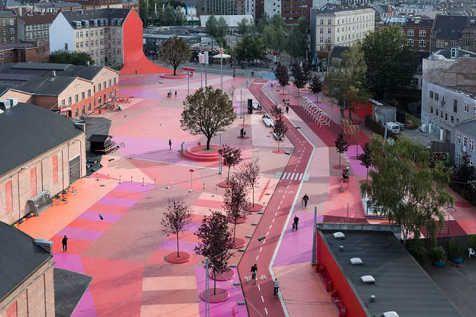
In fact, we are seeing a clear increase in the use of colour in the broad design world.
We see more colour in commercial and residential architecture, interior design, art and installations, events, retail and hospitality. We also see more colour in products — from aircraft to fashion to everyday items — and in marketing and communications as well.
All you need to do is click through the various categories on this site – architecture, design, art, kids, Lifestyle, fashion etc. – and you’ll get a sense of how colour is gaining ground.
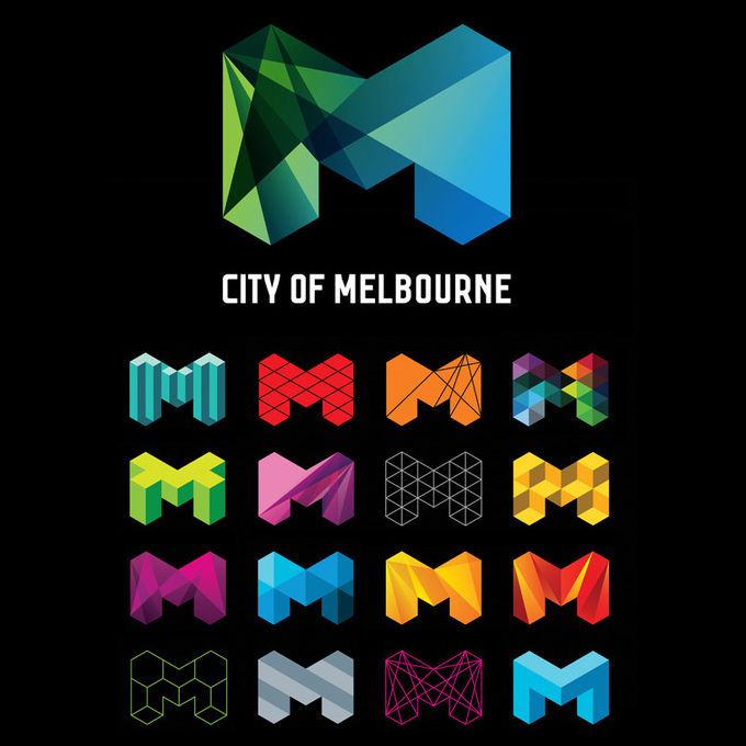
The recent super-enthusiastic online reaction to the redesign of the logo of the City of Melbourne is a good example of this. People are interested and they do see the difference. When did people last get that excited about a city logo? Disneyland’s soon-to-open World of Colour and the Dubai Fountain are also great examples of what technology and color are bringing to entertainment experiences.
We are hard-wired to notice and react to colour, and marketers (and Pantone and the Colour Marketing Group) and psychologists have long known this. Children generally love bright colours. Fast-food restaurants use bright colours because they want us to notice, grab and go. Red is stop, green is go. Colours affect and express our everyday lives, even when we don’t notice it.
Throughout history, colour has expressed and represented status, religion, origin, feelings and many other things, and its use has been dependent on resources. To be able to afford clothing or other possessions in certain colours meant you were wealthier than most, as some ingredients to produce specific colours were not available everywhere.
As we have seen so vividly in the widely circulated ‘colour wheel‘ by David McCandless and Always with Honor, different colours mean different things in various cultures. And apparently, people from warm climates respond favorably to warm colors while northerners like cooler colours.
Perhaps it was the recessionary economy that enticed designers to use more colour, and attracted the rest of us to it. Whatever the underlying reasons, we see more colour and we love it. – Tuija Seipell
Brands wanting to see ideas and concepts about how to use colour effectively, contact our marketing agency, ACCESS AGENCY.
.jpg)