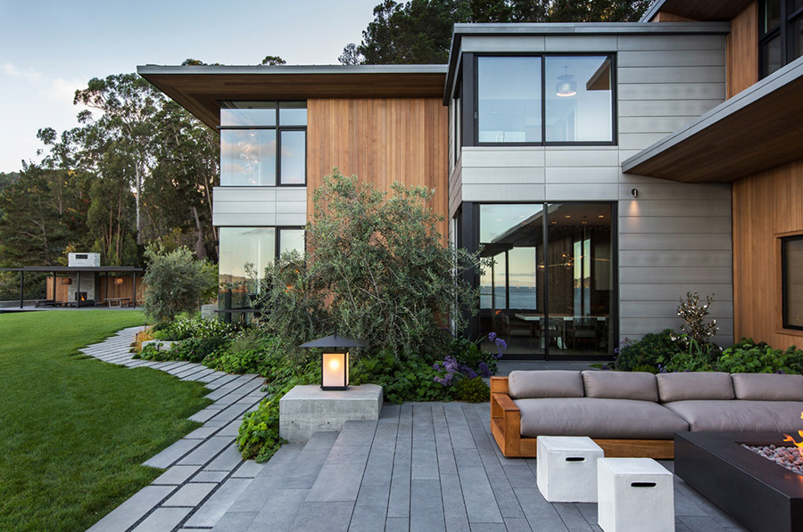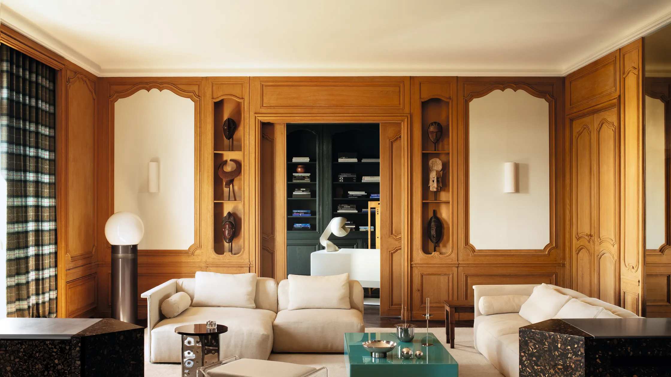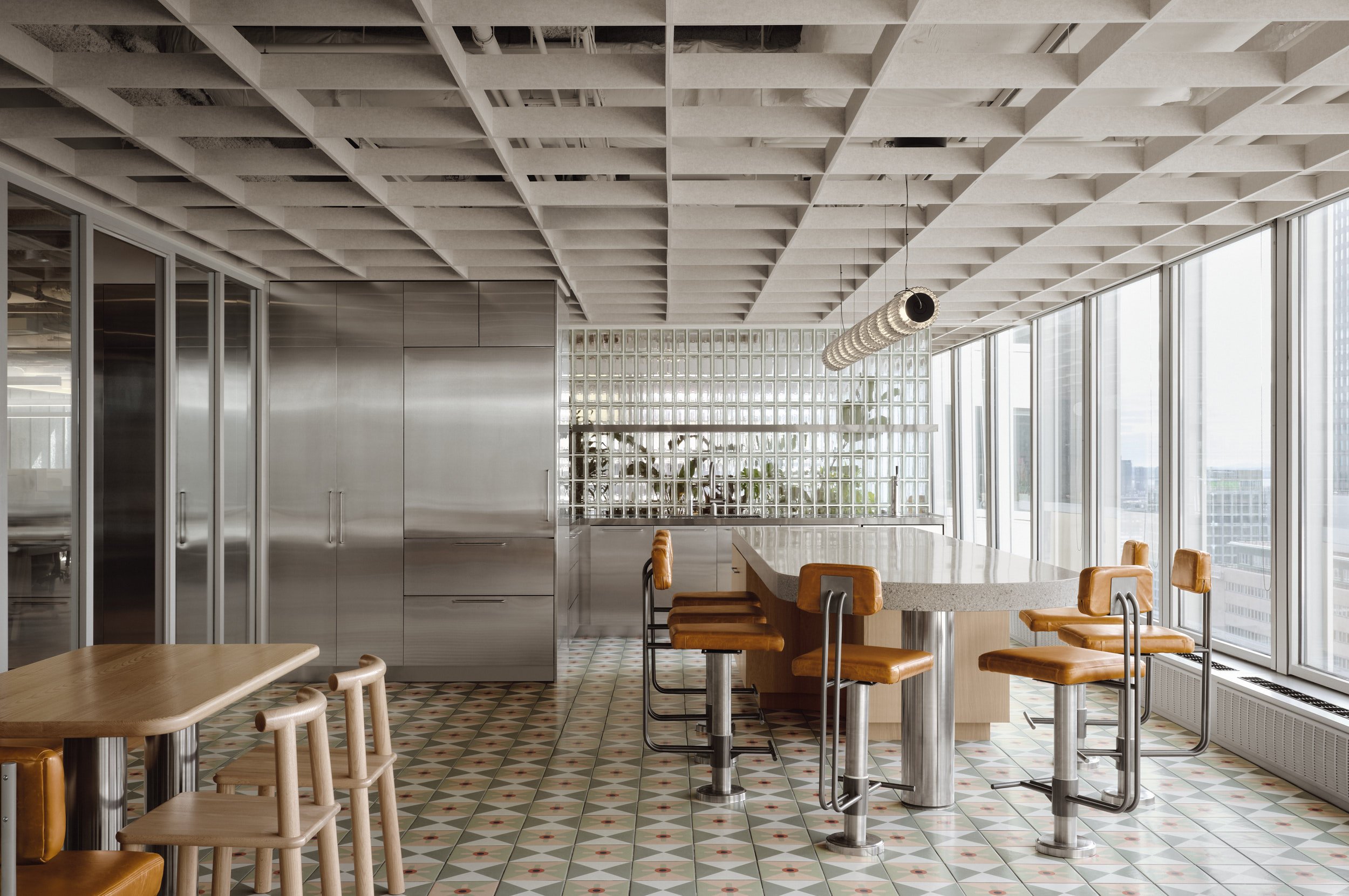
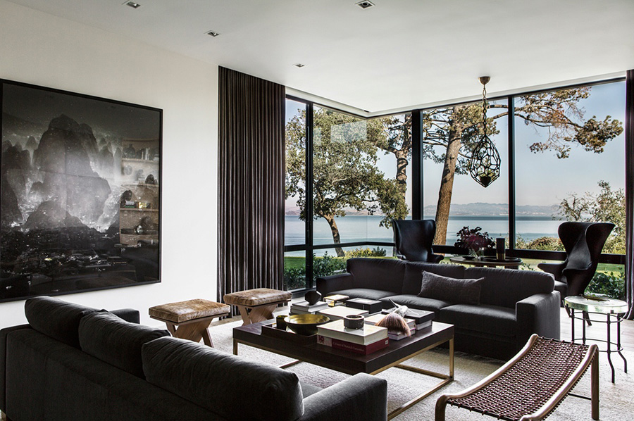
Three features attracted us to this multi-generational Northern California home. First we noticed the harmonious interplay of subtle patterns and textures inside.
Second, we were delighted by the eye-catching but ‘on-brand’ lighting fixtures throughout the residence.
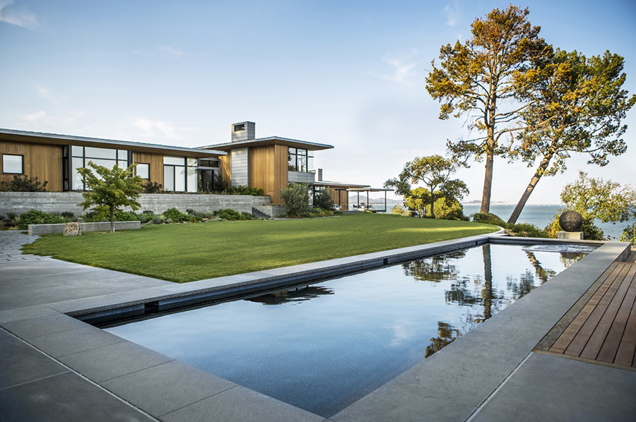
And third, the understated luxury of the house inside, but especially outside, speaks of a deep understanding of style.
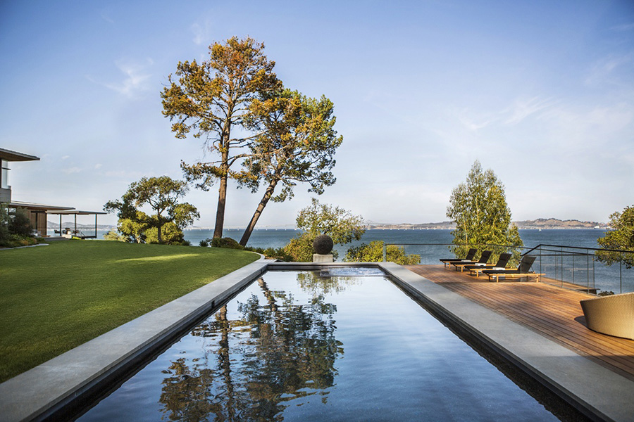
The house is a testament to how a mutual agreement between architect, designer and owners about their specific definition of style is reflected in how the residents’ wishes are met and their lifestyle accommodated, and how this all is synchronized with the surrounding nature.
And perhaps we should add a fourth to which all three contribute directly: There is an overall sense of fluidity; that elusive balance again, the one thing we find ourselves looking for and being drawn to more and more frequently.
Working in finance in Hong Kong for a time, a couple returned home to California’s Bay Area. They spent vacations in a rented property on a Pacific-facing hillside in Tiburon. Eventually they bought the property, demolished the existing house and embarked on building their dream home.
They selected two San Francisco-based professionals, architect Brooks Walker of Walker Warner Architects, and designer Nicole Hollis to help them realize their dream.
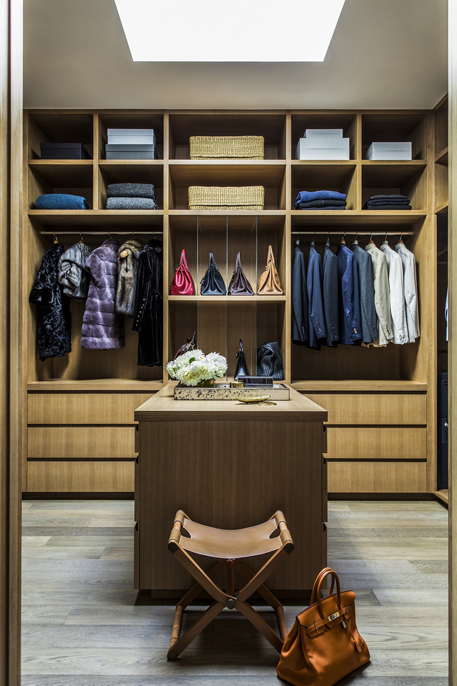
The couple wanted a seamless inclusion of their extensive collection of contemporary Asian art in the home. They wanted the house to sit on the site as if it truly belonged there. Most important, they wanted the home to accommodate their teenage son, parents, grandparents, other relatives and the frequent guests to their poolside parties.
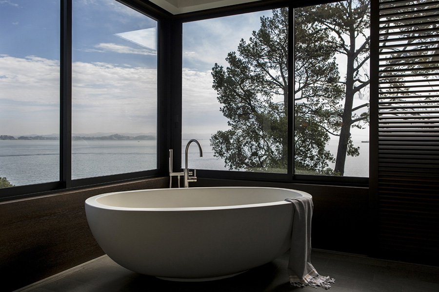
The architect and designer had not worked together before but both were known for their ability to create understated luxury. Together with the owners, they have worked their magic while channelling Frank Lloyd Wright and Californian architects William Wurster and Cliff May, according to an article quoting Walker.
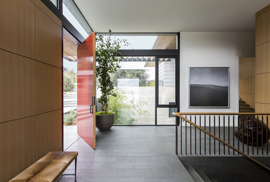
Inside the house, there are several examples of their skilful use of pattern and texture. One is the entryway area where the walls of white oak paneling and Aegean limestone, and the Basaltina stone floors, create subtle variations of texture and an angular forms, all of which is echoed in the Christian Liaigre hide-upholstered bench.
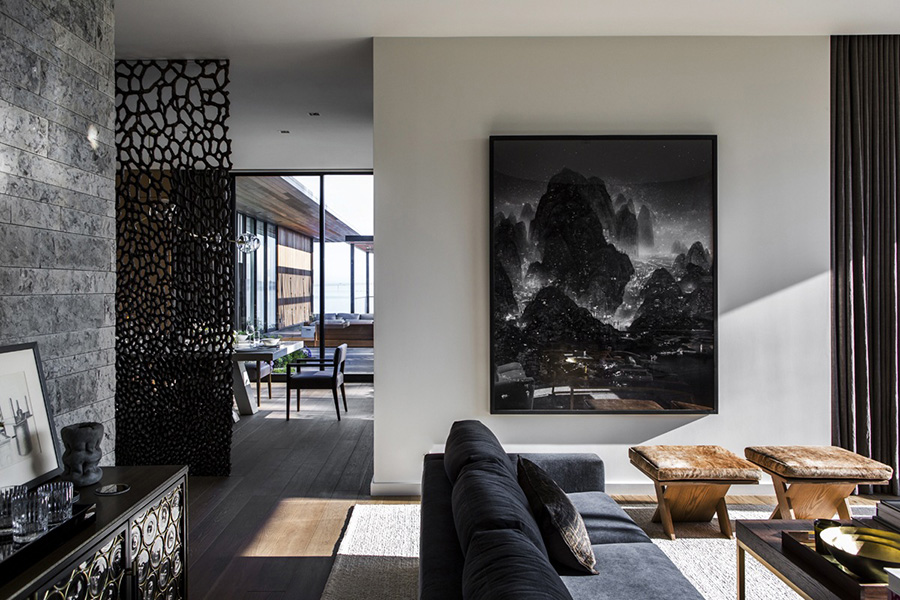
Another, yet completely different example of texture is in the dining room. Its most prominent feature is a Michele Oka Doner bronze screen created to divide the formal and informal dining areas. It weighs two tons and, to ensure adequate foundational support, it had to be assembled in pieces before the house frame around it was completed.
It is an architectural element and a piece of art and it creates ever-changing patterns on the walls and floor based on light.
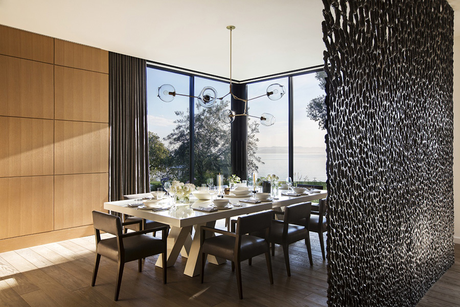
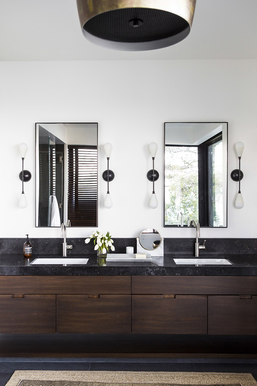
A great example of the custom lighting program of this residence is the Lindsey Adelman chandelier above the dining table. Other noteworthy light fixtures come from the Portland, Oregon-based Esque Studio and New York-based Apparatus Studio.
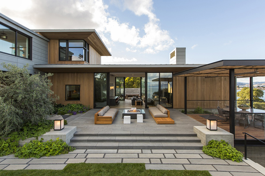
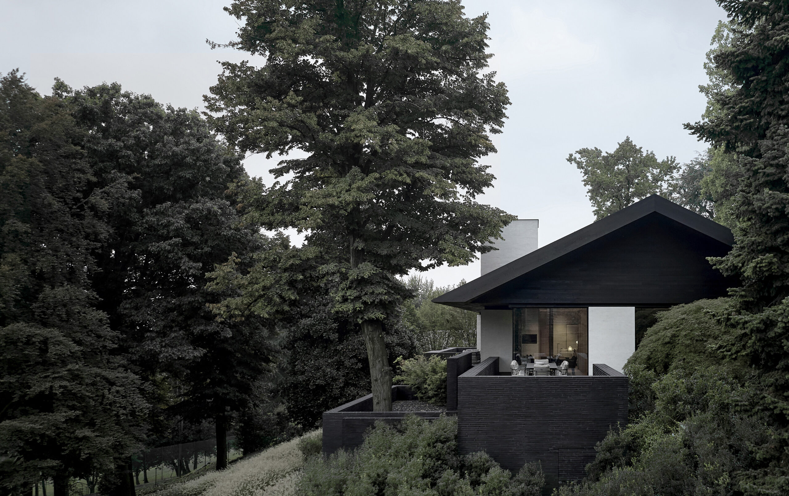
In spite of its considerable size, the residence does not appear massive or monumental. And, although it houses a significant art collection and has numerous features of opulence, it manages to feel like a home.
Its scale and proportions are in that enviable balance that is so rare and so elusive. Tuija Seipell.
