We are seeing arches everywhere. In newly built spaces, in restored hybrids and, of course, in a historical context.
Even more surprising, at least to us, is that we like them.
Perhaps our former arch-fobia was the result of old images of American suburbia with cookie-cutter bungalows with their hideous arched indoor doorways – but we are definitely starting to forget them.
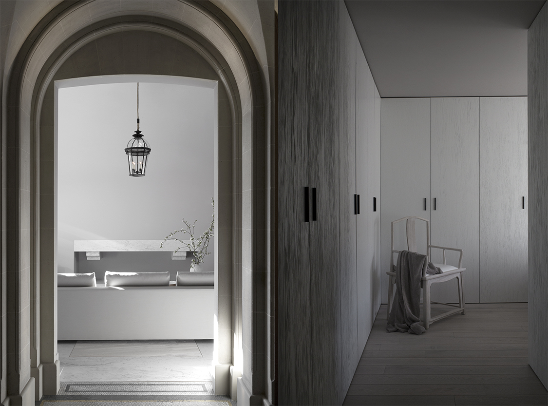
The new arch is a completely different feature; elegant, well-thought out, perfectly space-aware.
The Kennedy apartment in Paris is a perfect example of how to do arches well, and how to give them the visual space they need to really make an impact.
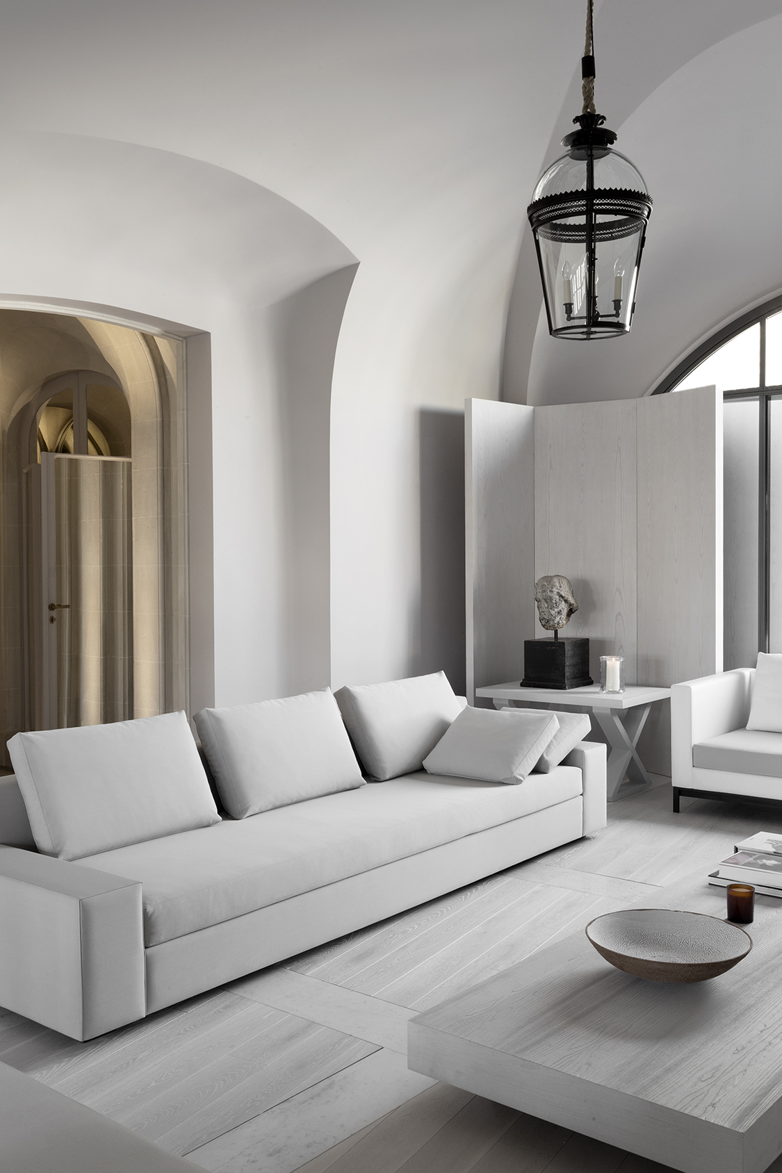
Paris and London-based Guillaume Alan created the architecture, design and furniture design for the 180 square metre (1,937 sq.ft) residence of a busy professional French couple that travels the world.
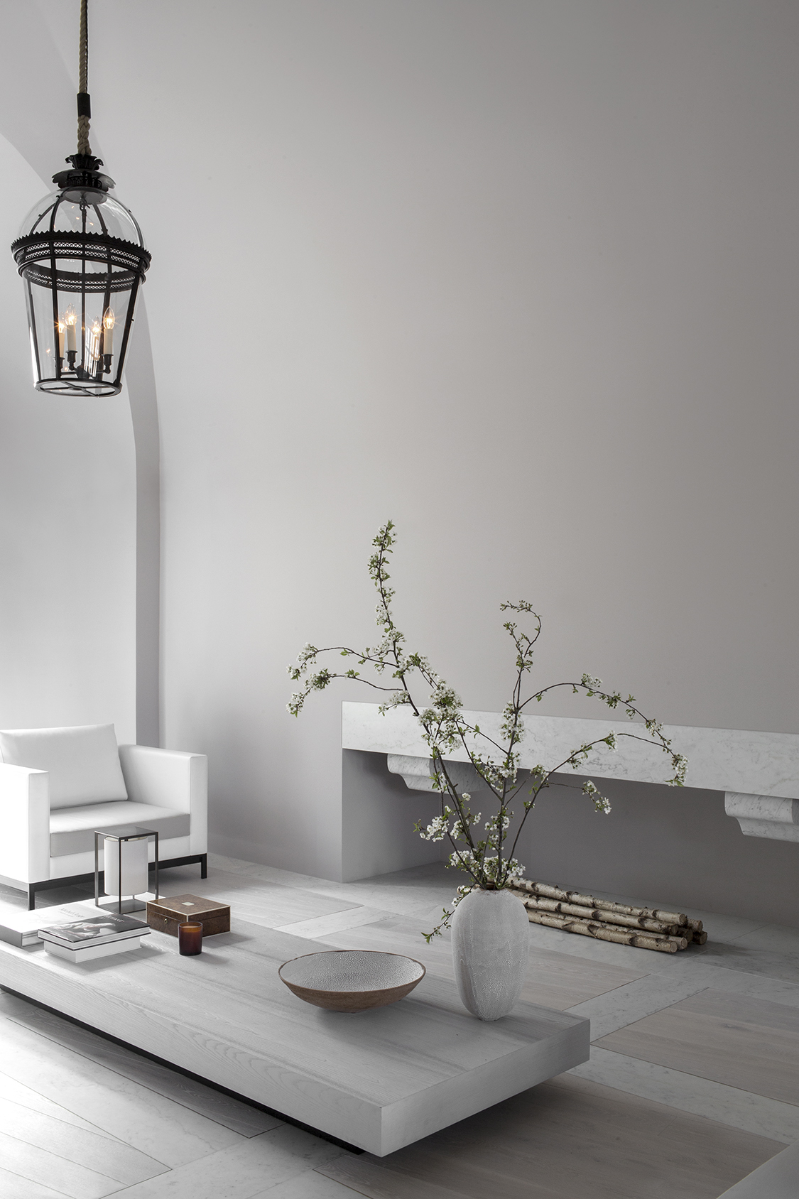 The couple has been a long-time furniture client of Guillaume Alan and this project gave them an opportunity to work together more comprehensively.
The apartment would be their main residence and it would need to exude elegance and serenity. However, it would also need to be inviting for the guests of the wine-loving owners who love to organize parties.
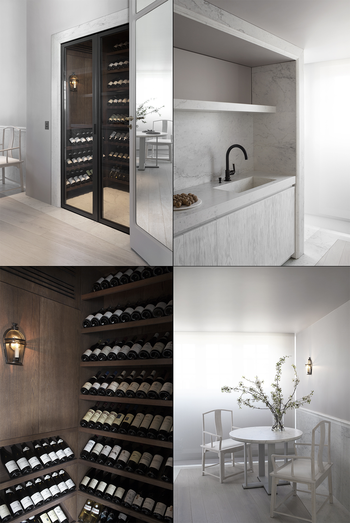
As a result opulence and a calm balance are apparent in each room of the Trocadero-area top-floor residence with 360-degree views of the Seine and the Eiffel Tower.
The building is one of the many Haussmannian structures from the early 19th century that have given central Paris its cohesive elegance.
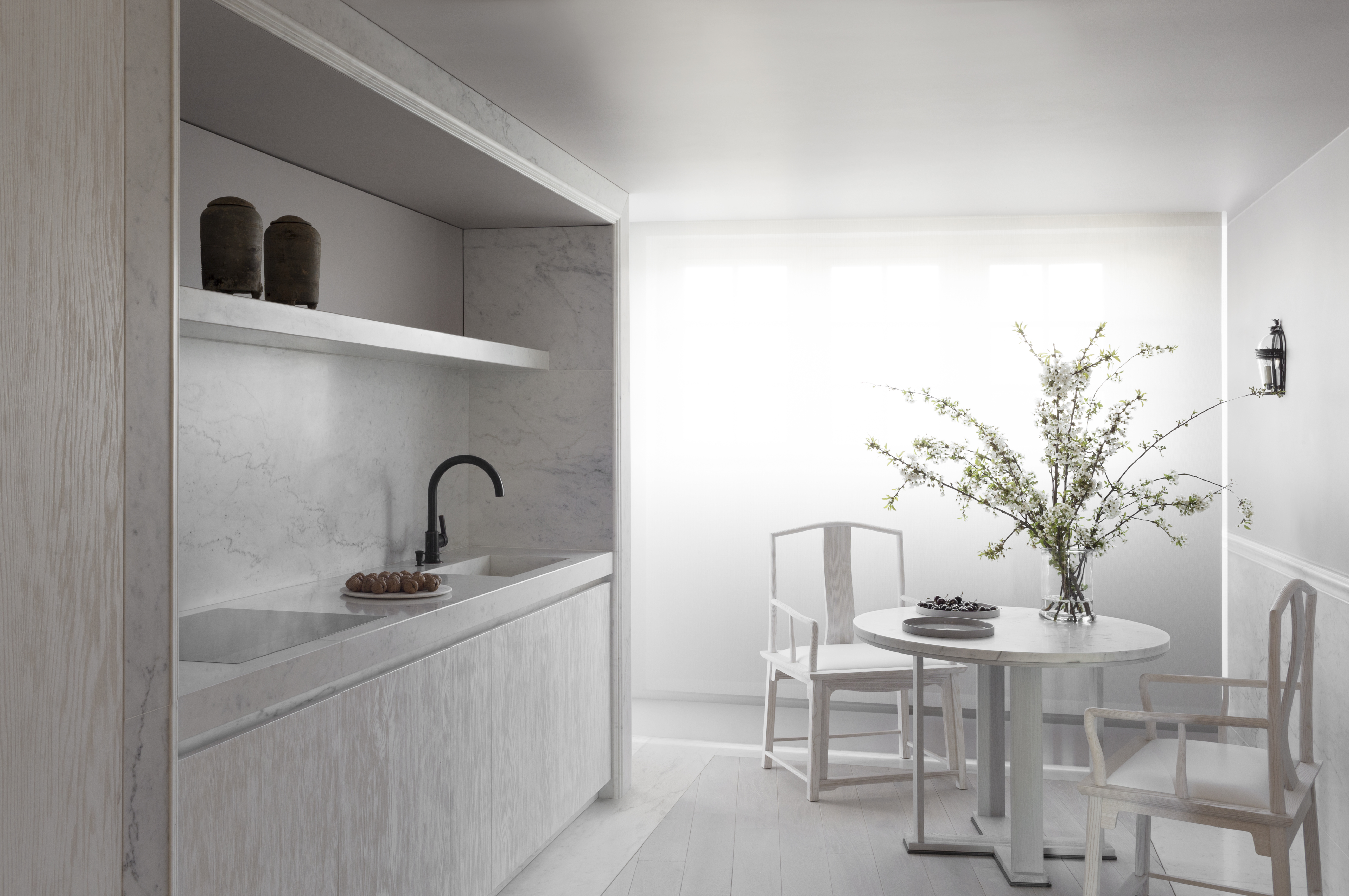
Guillaume Alan re-configured the entire floorplan to maximise the use of natural light and light does, indeed, play an extremely important role in creating the rhythm and the atmosphere of the entire home.
This is something that is noticeable in most Guillaume Alan projects. One of our favourite views of the apartment is of the entrance hall, inspired by the Orangery in Versailles.
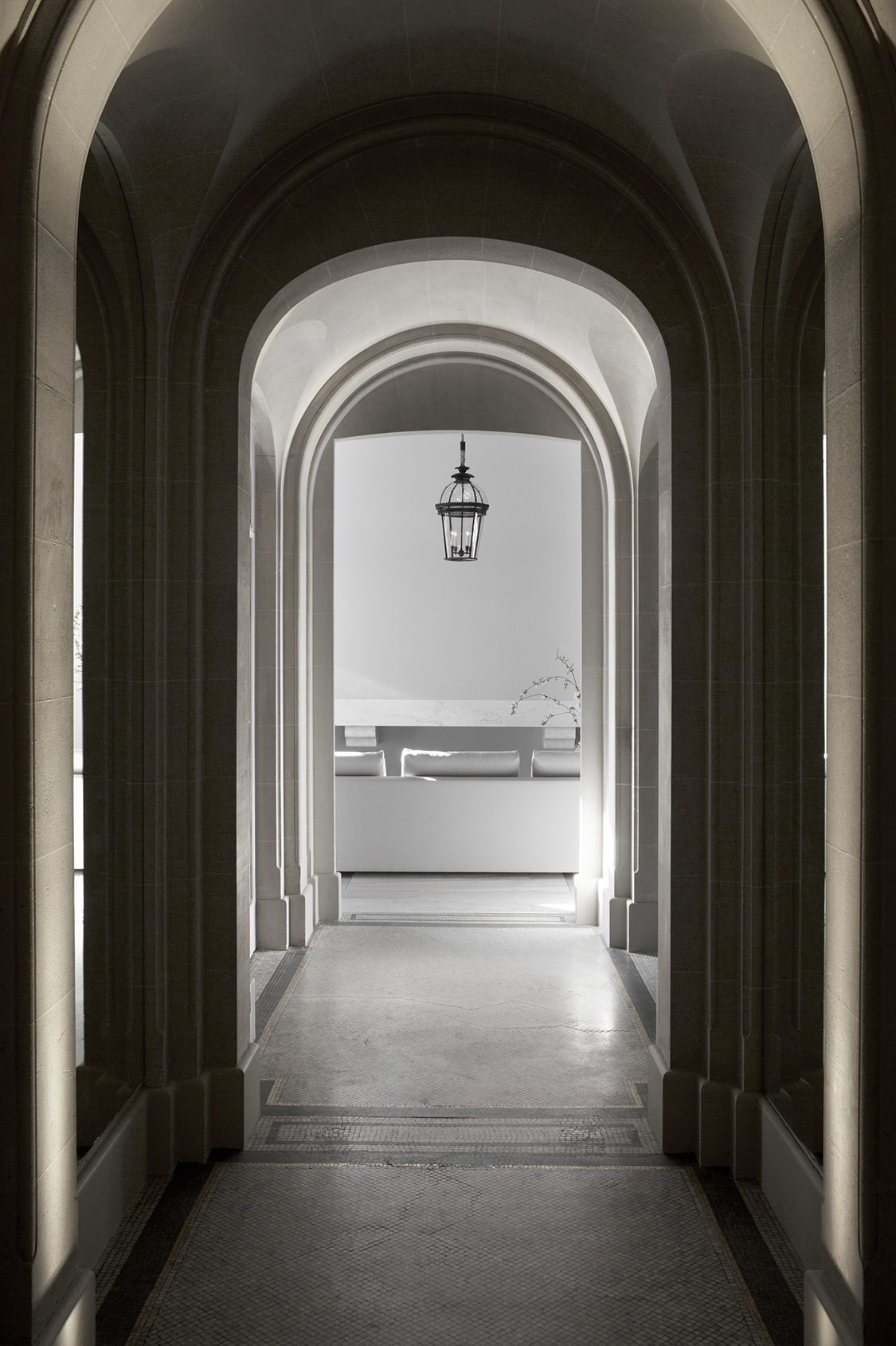 A series of high arches with recessed mirrors creates a feeling of unlimited space while elegantly dividing the space as well. The existing well-worn mosaic floor takes an important role here as well with its beautiful muted tones of bronze, gold and grey.
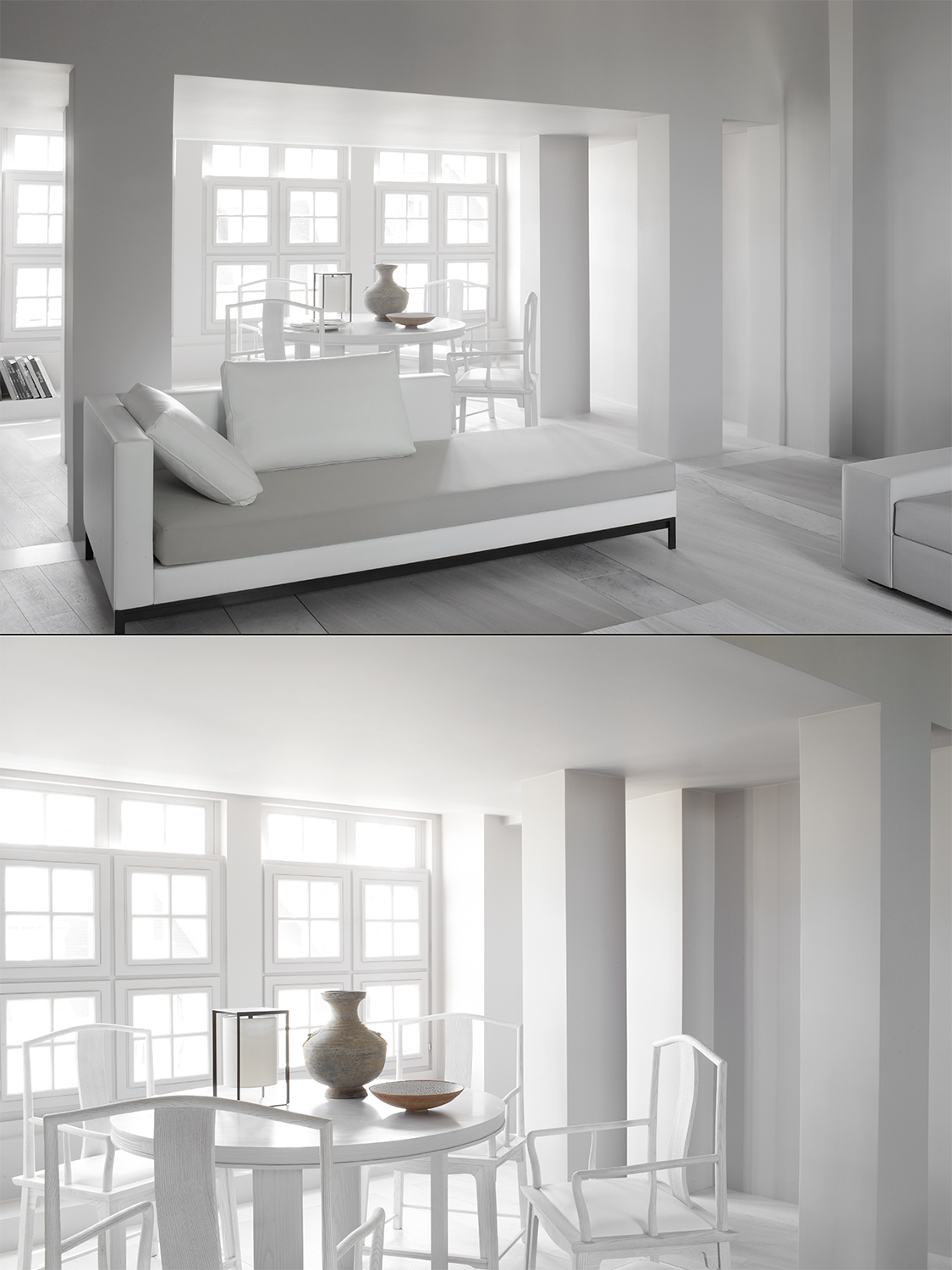
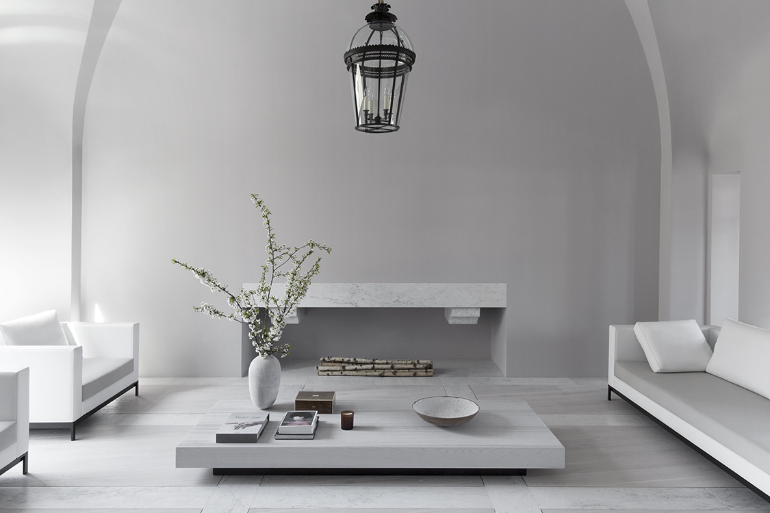
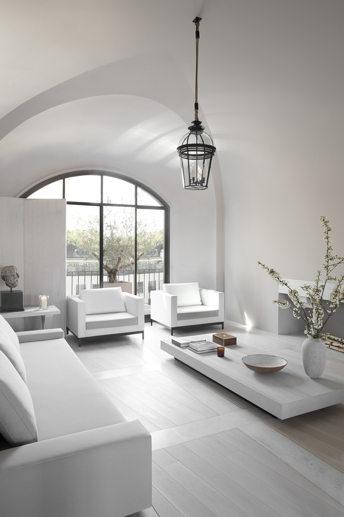
In the living room, startling elements create a cohesive whole: more magnificent high vaults, a window inspired by an old door found in Oxford, and a three-metre high fireplace cared into a massive piece of Carrara marble.
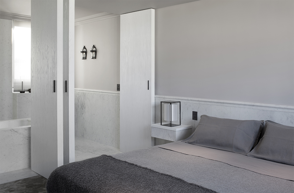
Each of the bedrooms, bathrooms and the kitchen carry a similar balanced sense of calm, but we cannot get our eyes off those elegant arches. 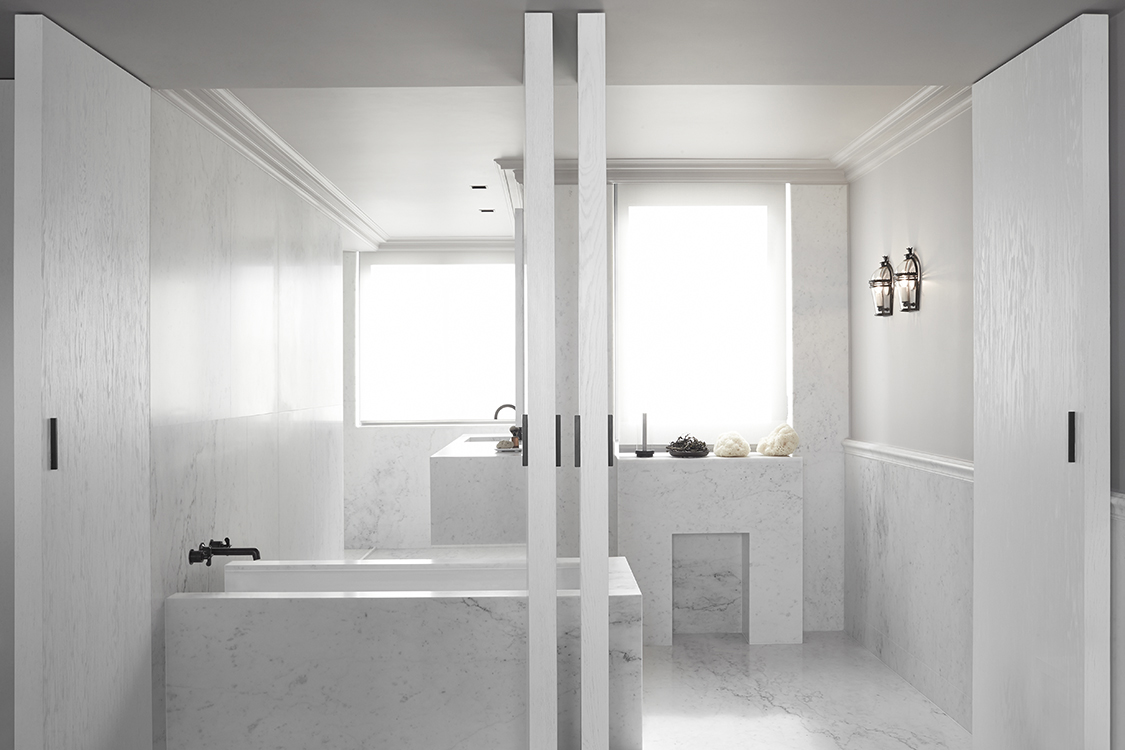
We are convinced that they – together with the artful manipulation of light – are the grandest feature of this decidedly cool residence. Tuija Seipell.


